pinterest board titled structure.
|
|
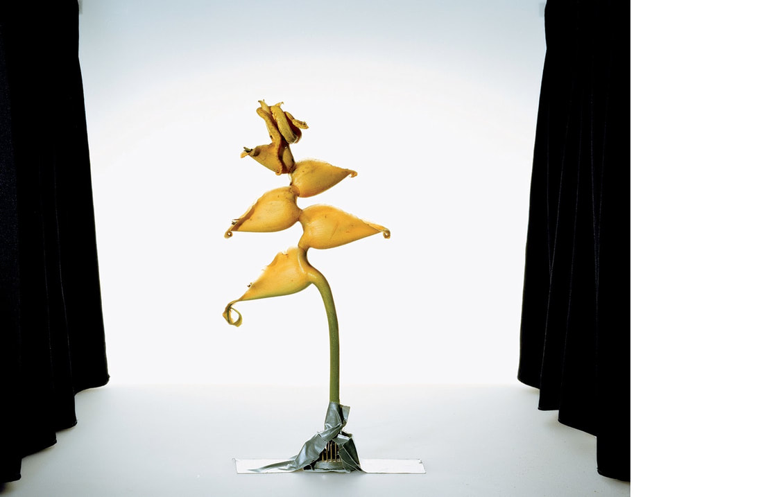
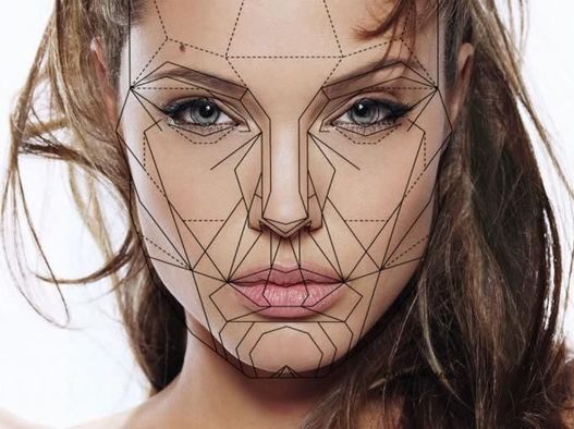
Structure In Nature
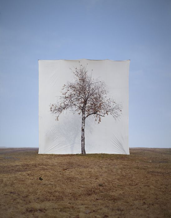
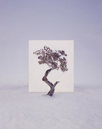
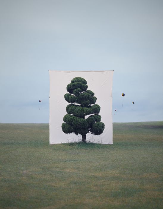
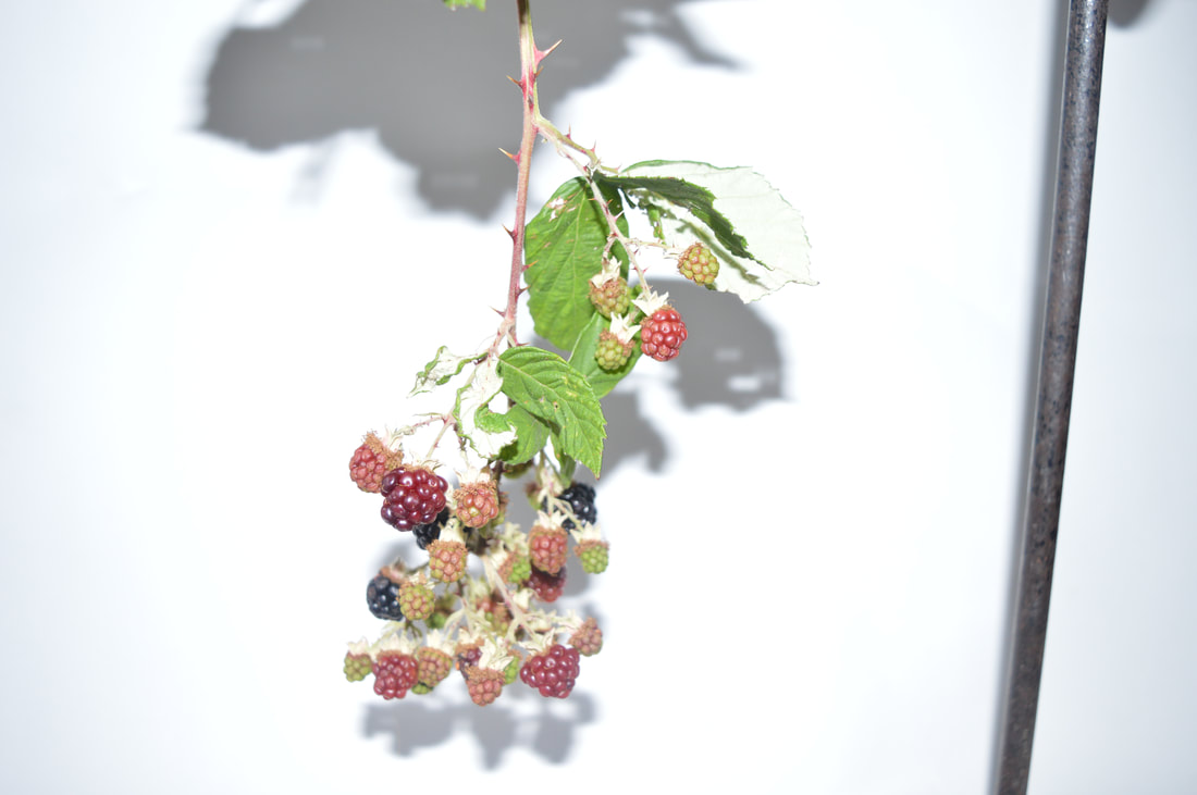
artist - myoung ho lee
- Myoung Ho Lee, a young artist from South Korea, has produced an elaborate series of photographs that pose some unusual questions about representation, reality, art, environment and seeing. Simple in concept, complex in execution, he makes us look at a tree in its natural surroundings, but separates the tree artificially from nature by presenting it on an immense white ground, as one would see a painting or photograph on a billboard.
- I really like these shots, having an isolated background ad then having the object right in the centre of the image, your eye automatically focuses on it. The pastel and light colours in the photo makes the atmosphere look dreamy and sort of faint. Each plant colour compliments the background colour. The tones of the photo are soft and pleasant.
|
|
|
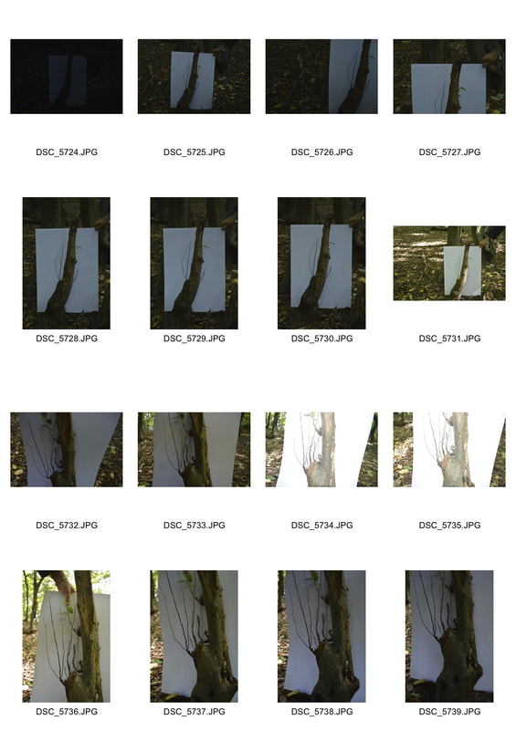
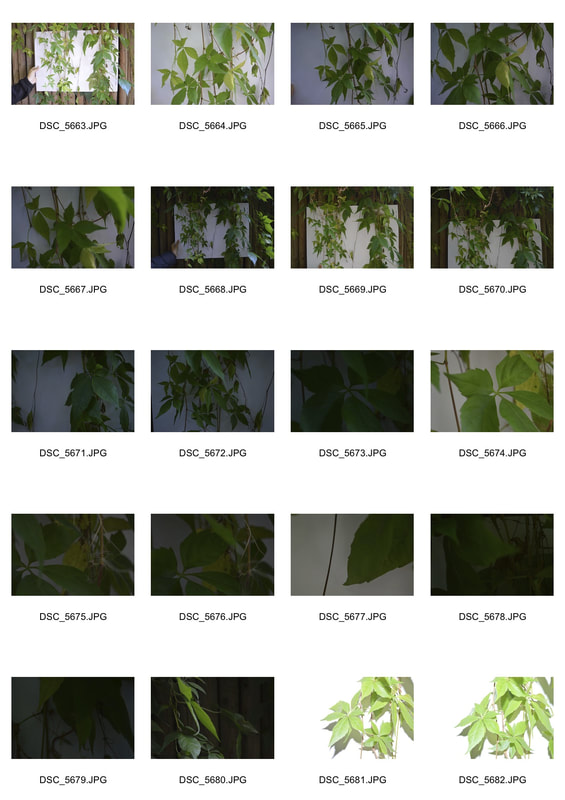
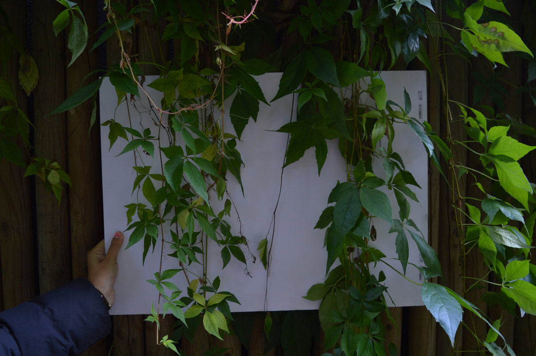
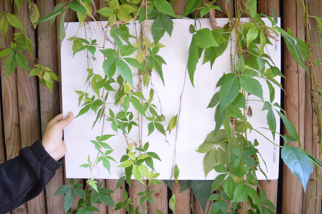
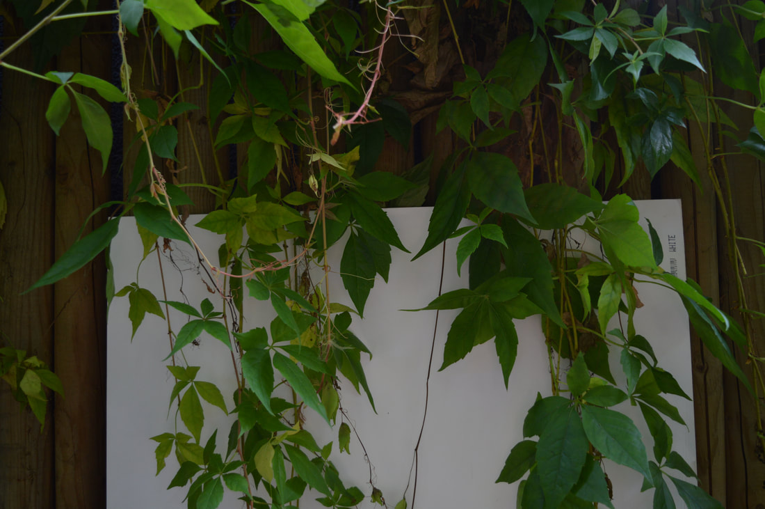
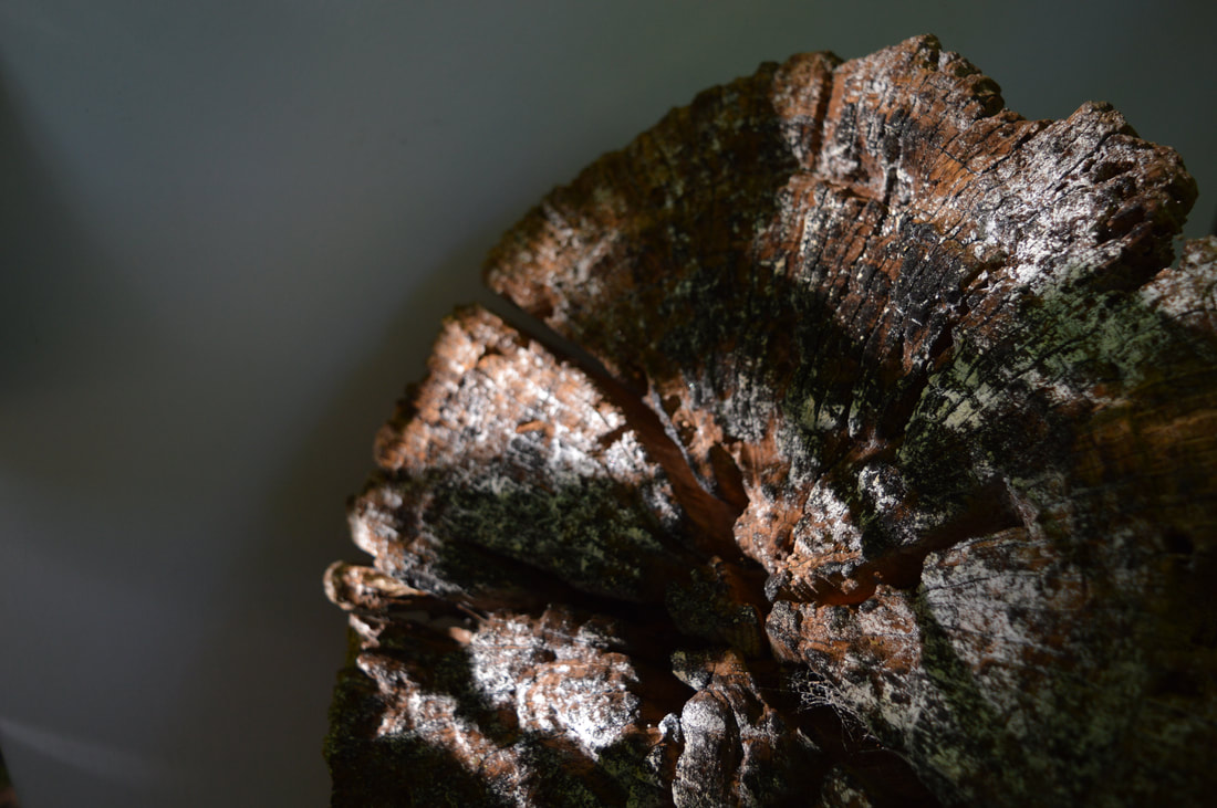
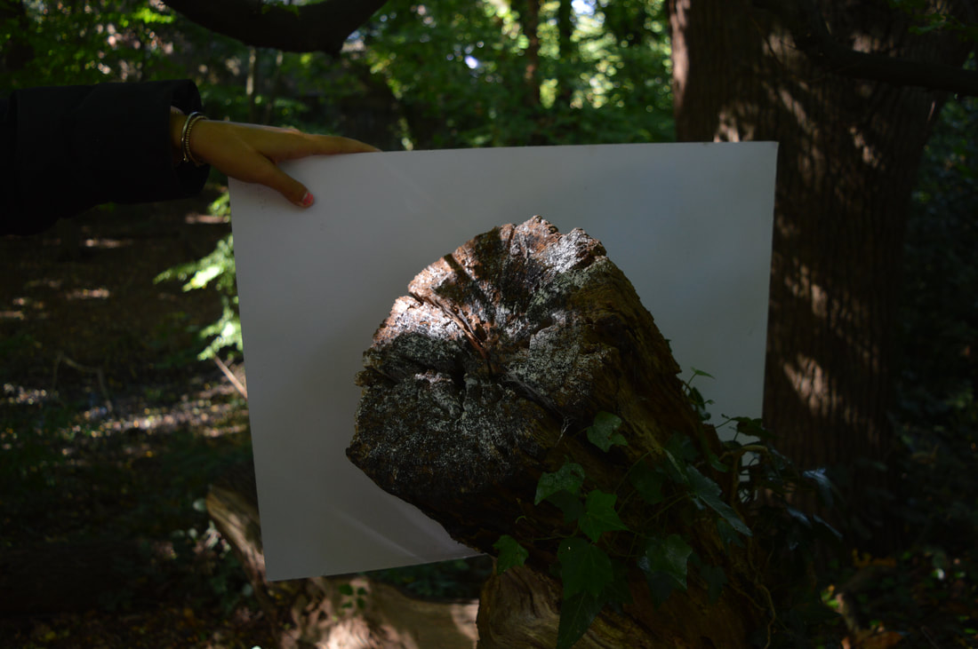
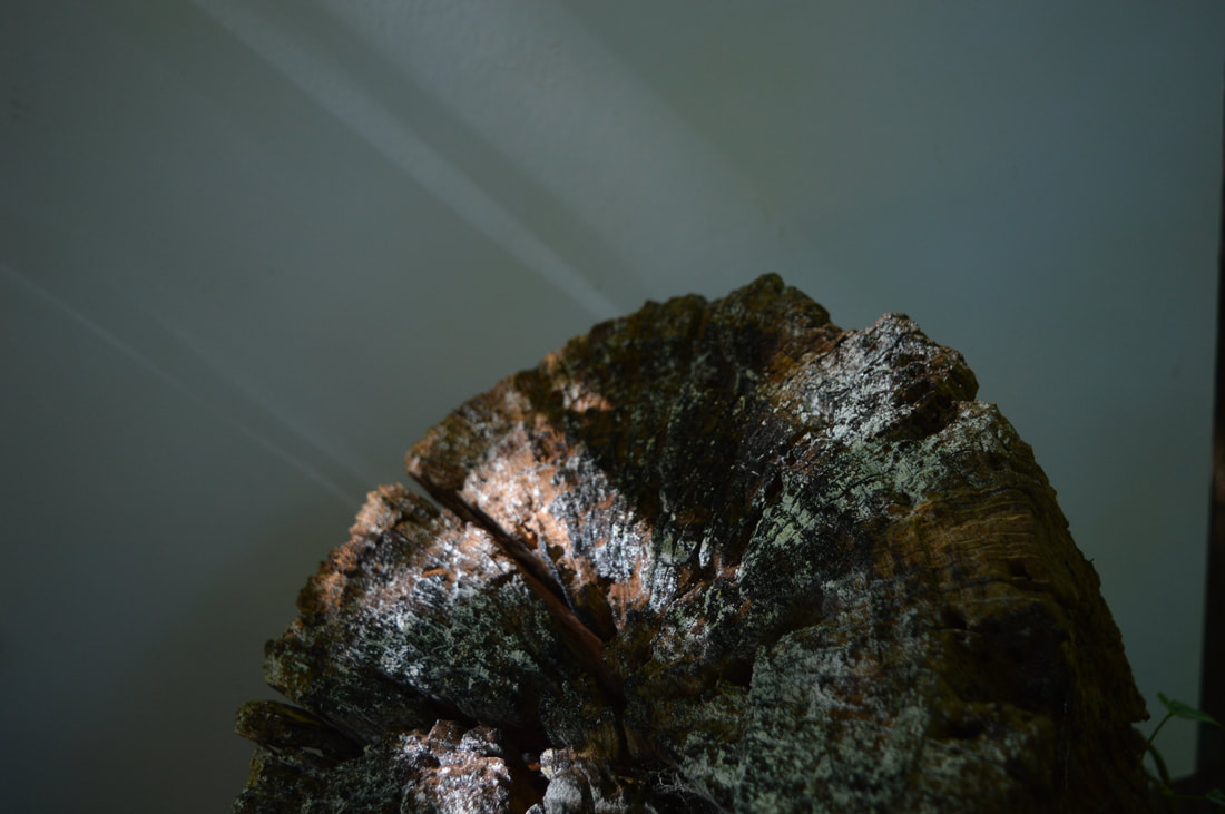
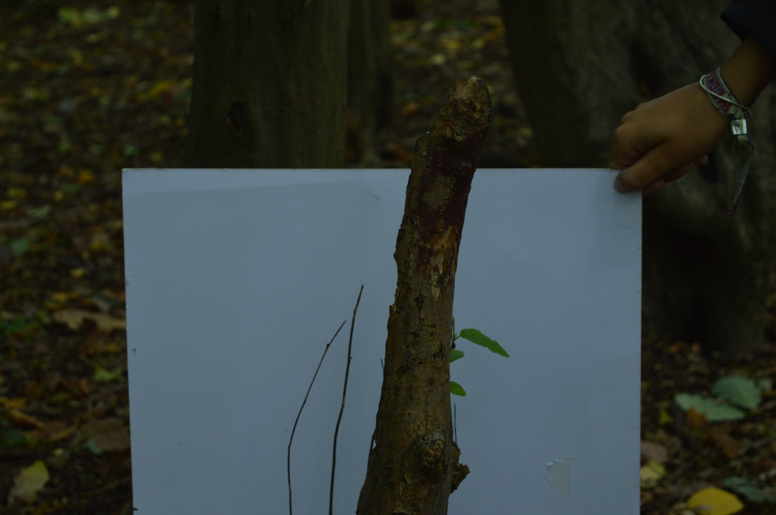
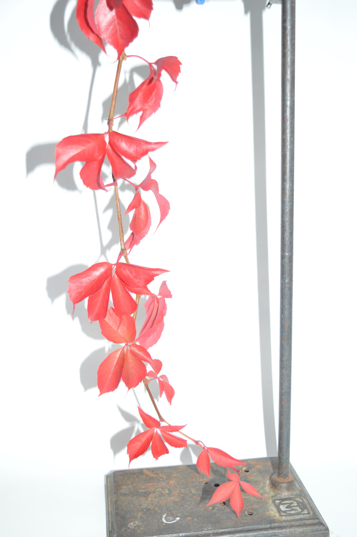
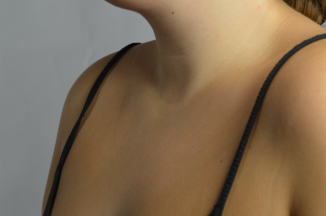
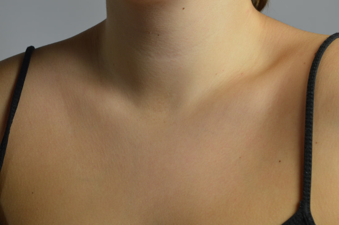
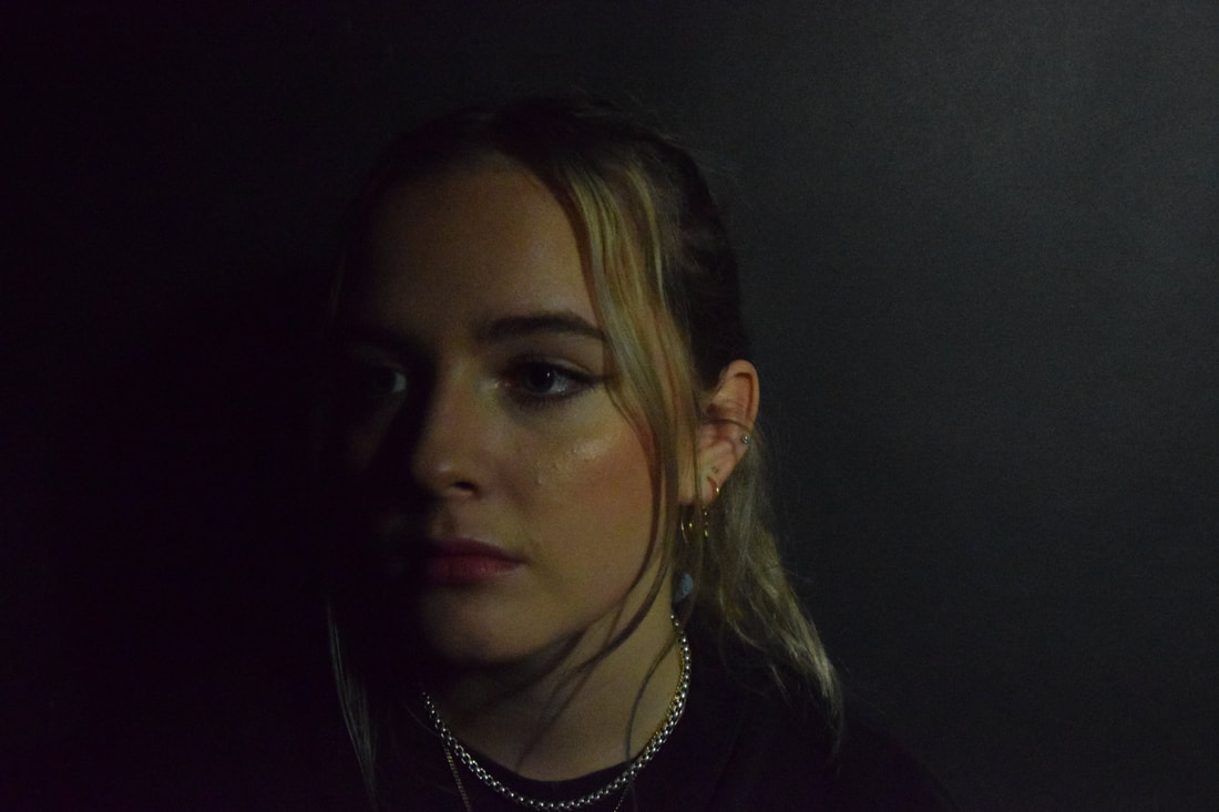
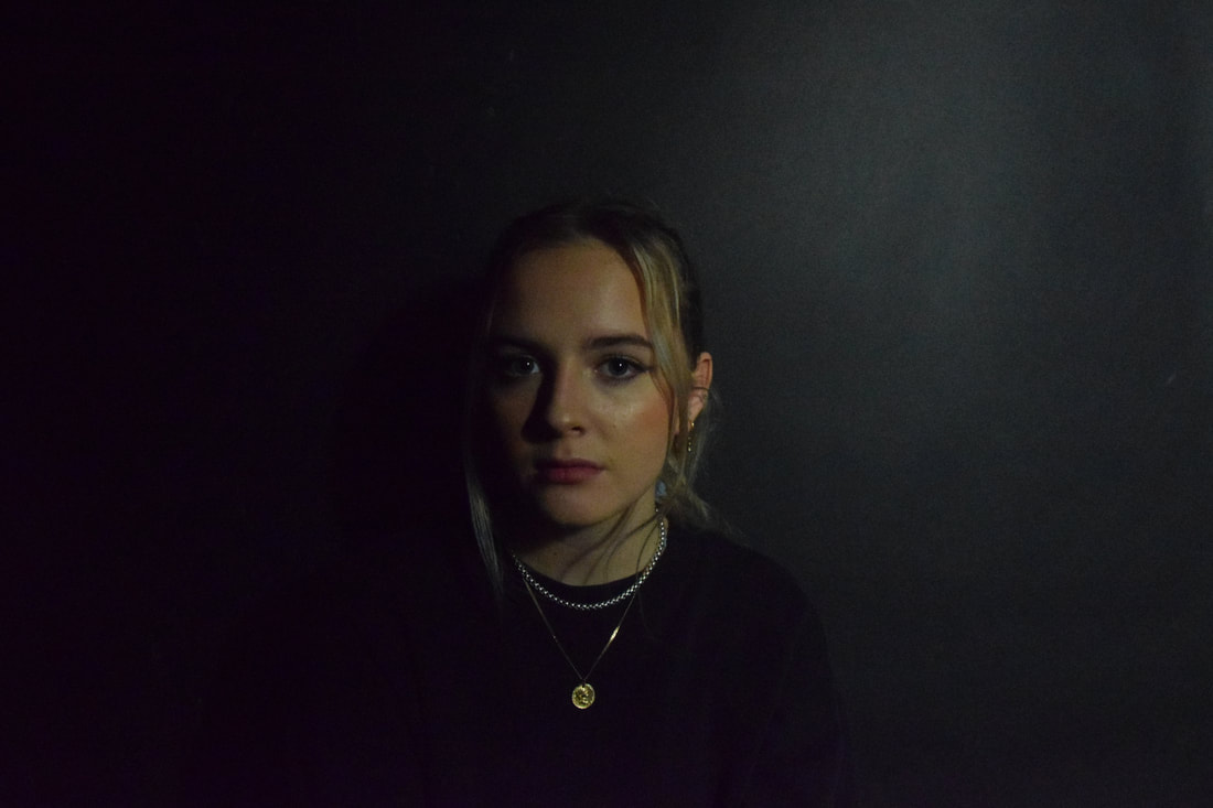
first response
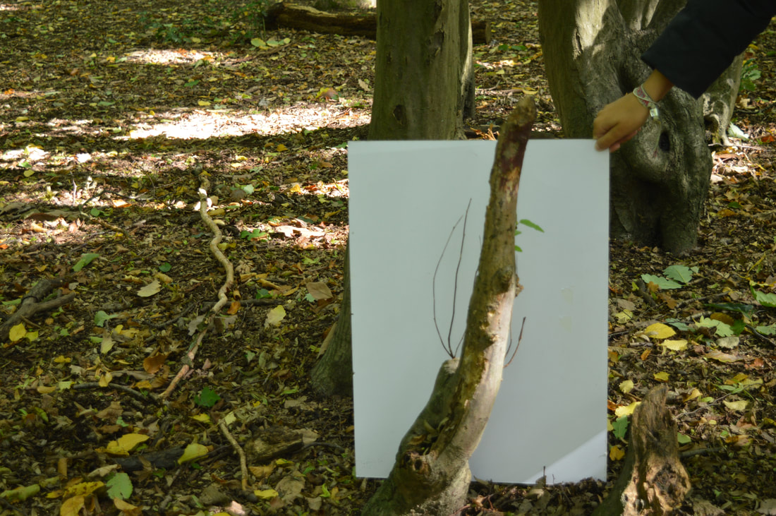
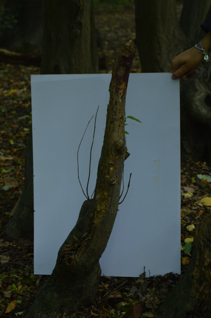
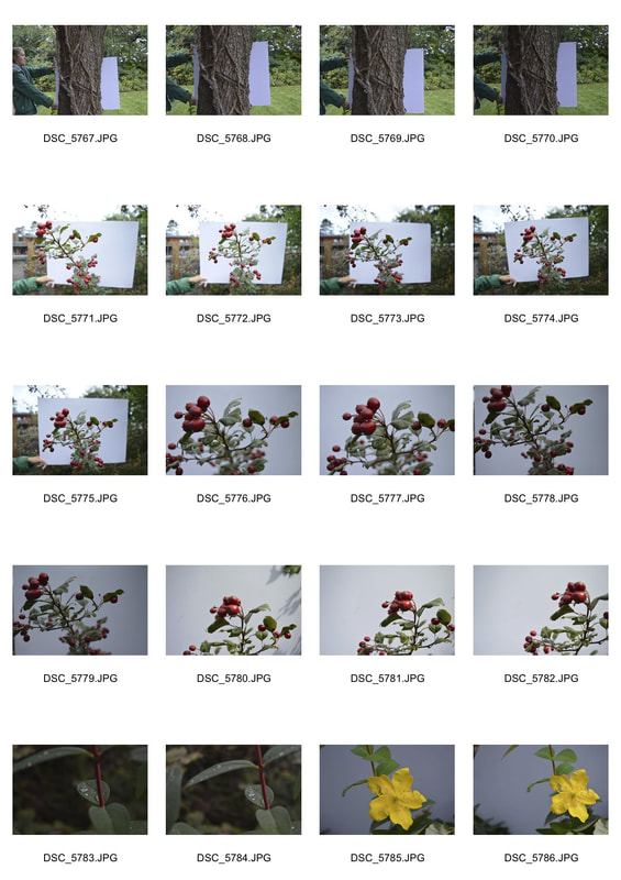
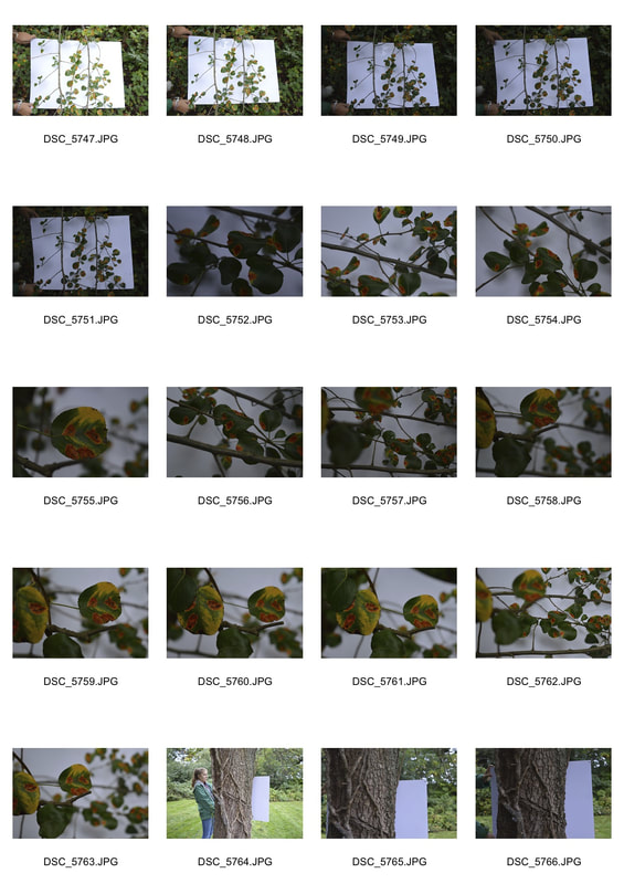
This is my first response to Myoung, we used a bit of white card board and went into a near woodland. We placed the white board behind the plant/bit of nature and changed the aperture on our cameras throughout shooting the photos to experiment with the lighting and shadows. By putting the white board behind the plant it is separating the subject of the picture from its background, like the thing i'm focusing on e.g a log or plant, is jumping out at you. It is the focus of the picture.
|
|
|
|
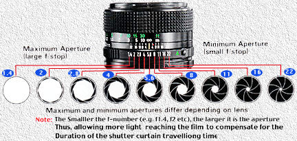
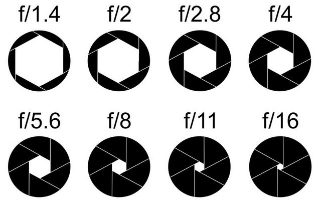
technical focus - aperture and depth of field
- In photography, aperture is expressed in f-numbers (for example f/5.6). These f-numbers that are known as “f-stops” are a way of describing the size of the aperture, or how open or closed the aperture is. A smaller f-stop means a larger aperture, while a larger f-stop means a smaller aperture. Most people find this awkward, since we are used to having larger numbers represent larger values, but not in this case. For example, f/1.4 is larger than f/2.0 and much larger than f/8.0.
- In simpler terms a smaller f number means more light is let in, because the lens is as open as it can be. The larger the f number the smaller the lens is and this is when the least amount of light is let in.
|
|
The aperture setting (f-stop) that you use will have an impact on the amount of focal range in focus in front and behind your subject. This is known as the Depth of Field (DOF). I photographed the plants using these aperture settings:
|
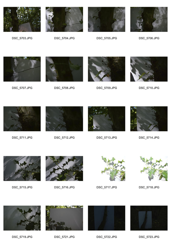
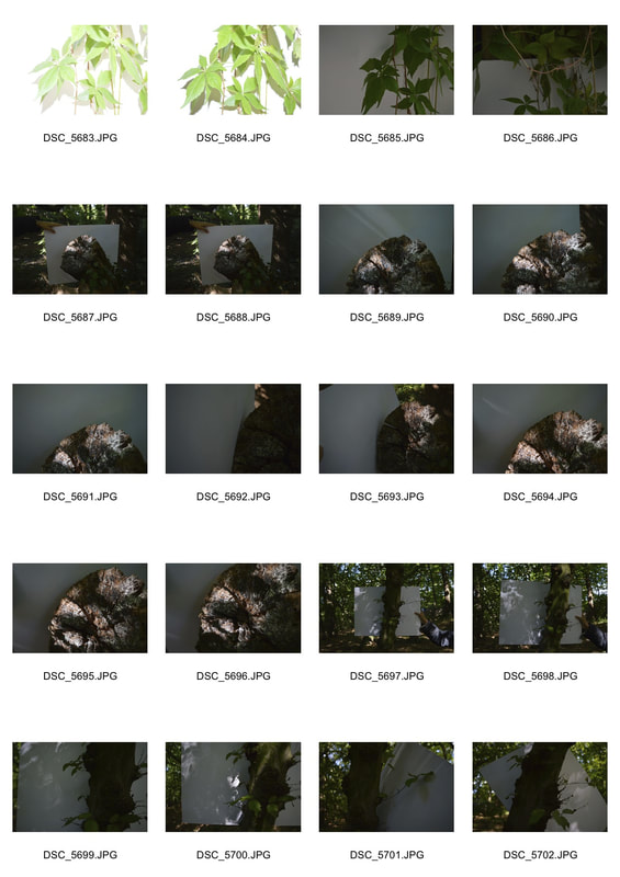
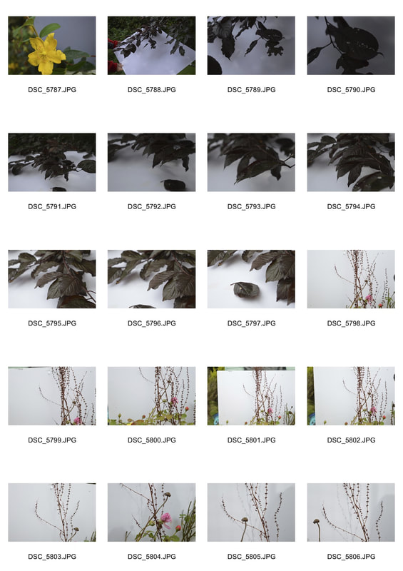
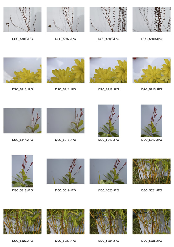
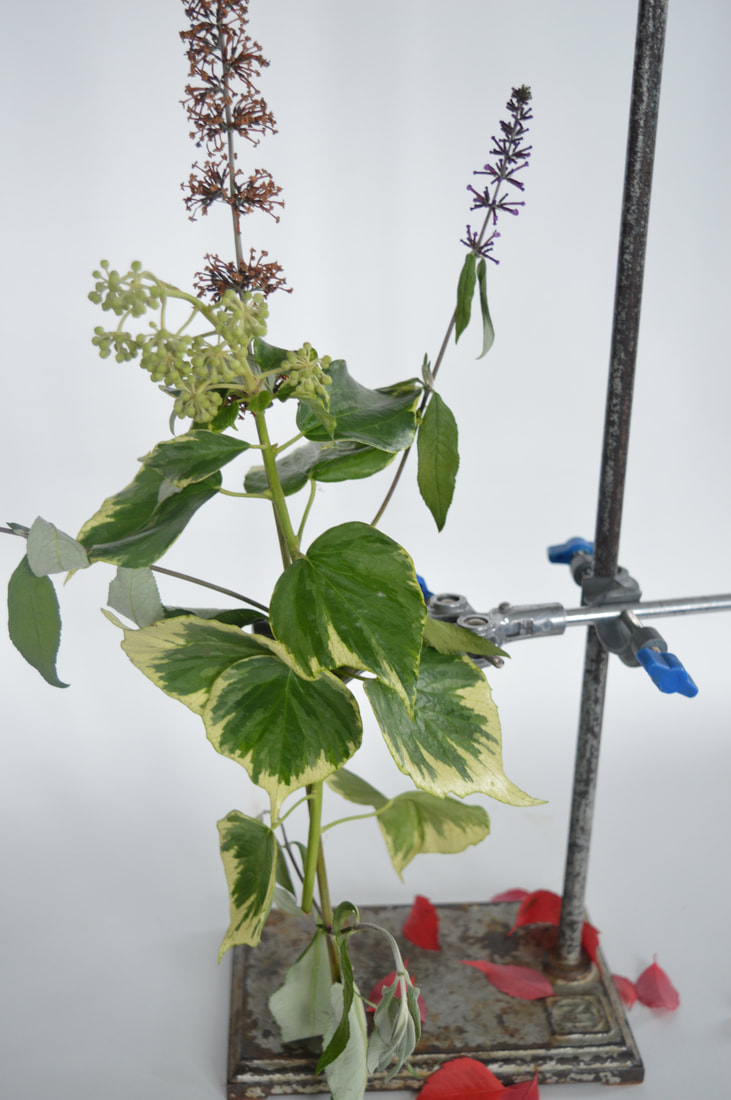
second response
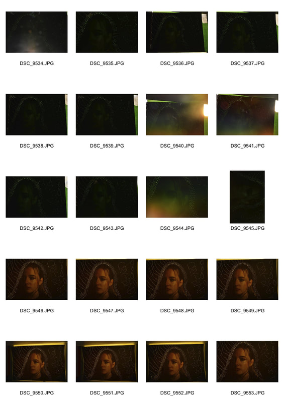
contact sheets of the shots I took and below is a slideshow of the shots I liked the most, my enlargements.
|
|
|
|
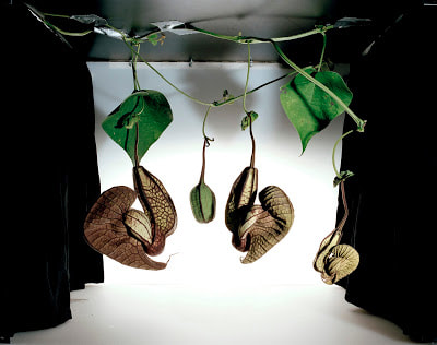
Sanna Kannisto - Field Works
The core practice of the natural sciences is to collect in order to inspect more closely. Collecting implies taming and containment, traits shared to some extent by photography. Breaking away from the conventions of scientific documentation, which typically presents specimens in isolation and devoid of context, Kannisto’s work addresses the acts of staging and image-making. Her photographs, with their biologically correct titles, show not only the breathtaking beauty of nature, but also the tools used to achieve the would-be image at center—the velvety black drapes at each side, the difficult “neutral” lighting rig, the seamless white background.
|
|
|
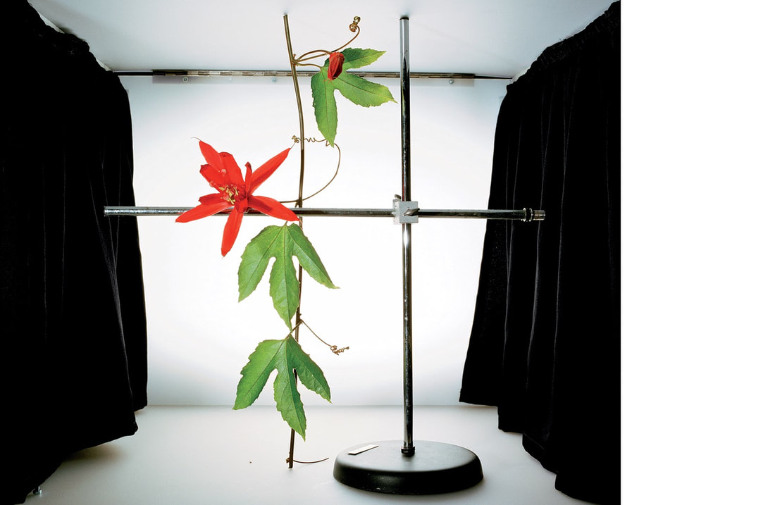
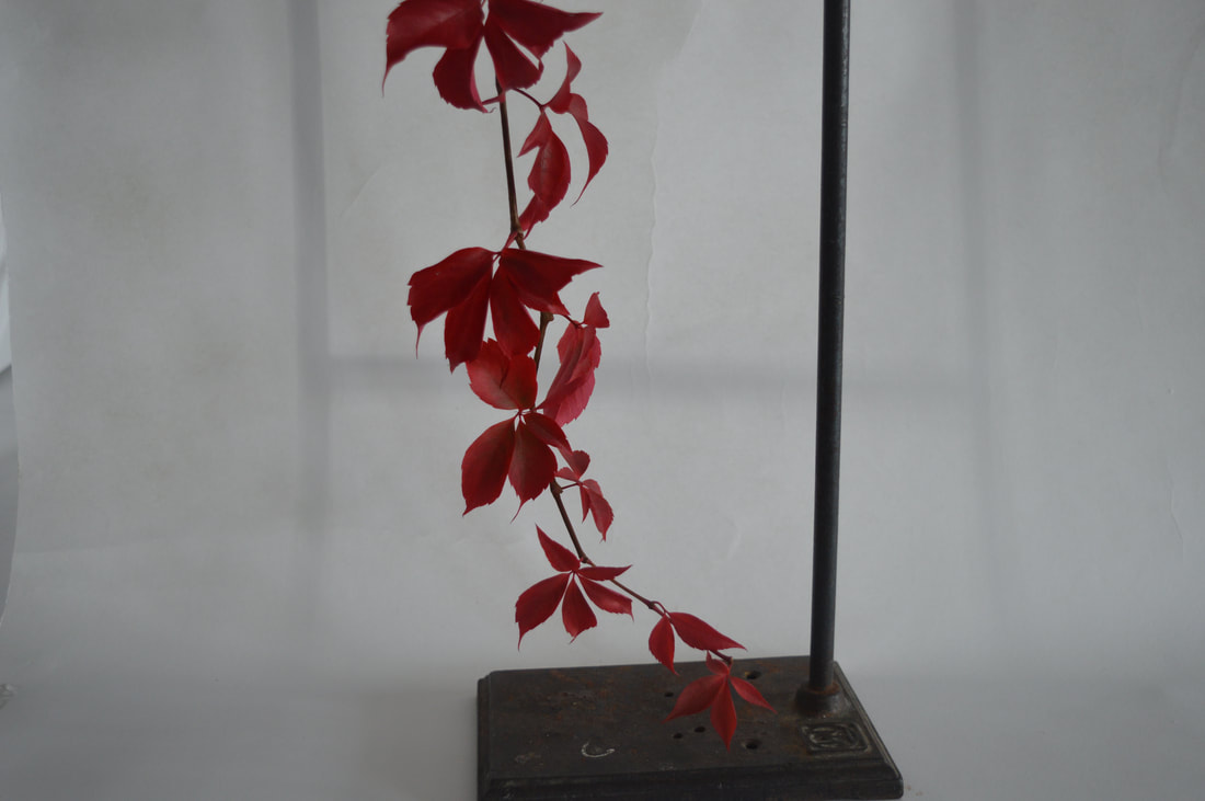
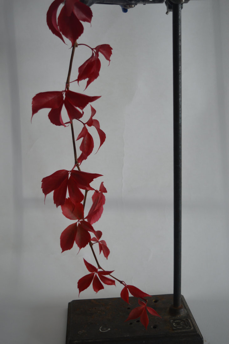
my first response
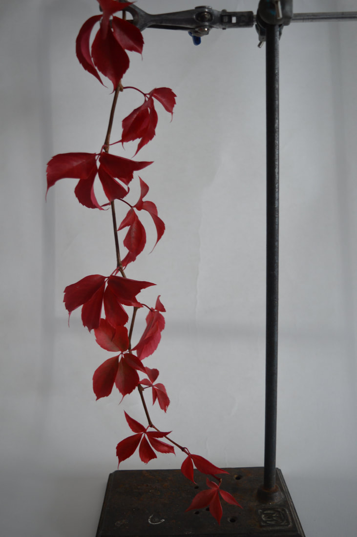
- I experimented with my aperture whilst taking these photos, as there is a white background, as I change the aperture shadows appear. For some shots I also used flash on my camera, you can tell which ones these are as they are extremely light, I couldn't quite get the right shot but I really like the shadowing that is created using flash.
- In photos 1 and 3, I used a high f stop, letting small amounts of light in, you can tell this because it is a darker photo, I think the darkness is a good mood for the photo as the red looks eye-catching.
1 2 3 4
5 6 7 8
|
|
|
|
ISO
|
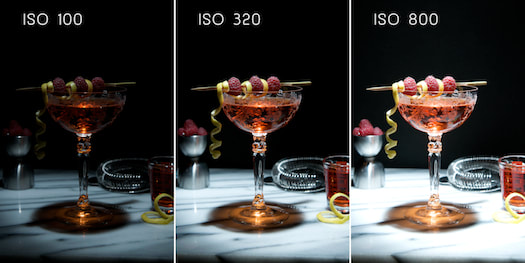
In this task, we were focusing on the ISO of the camera, In Digital Photography ISO measures the sensitivity of the image sensor. The same principles apply as in film photography – the lower the number the less sensitive your camera is to light and the finer the grain. Higher ISO settings are generally used in darker situations to get faster shutter speeds. |
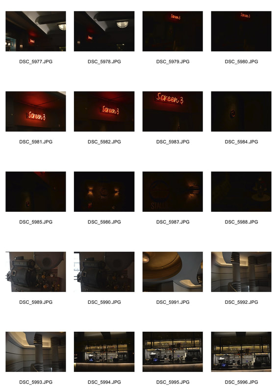
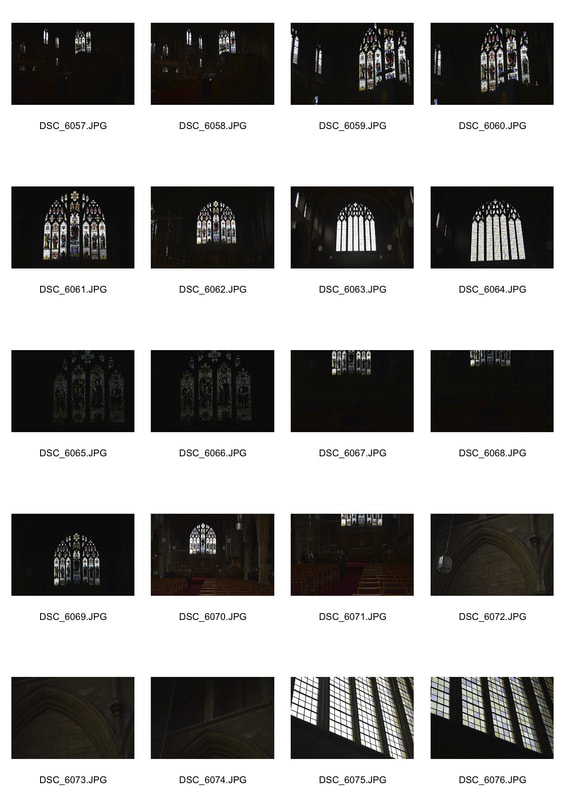
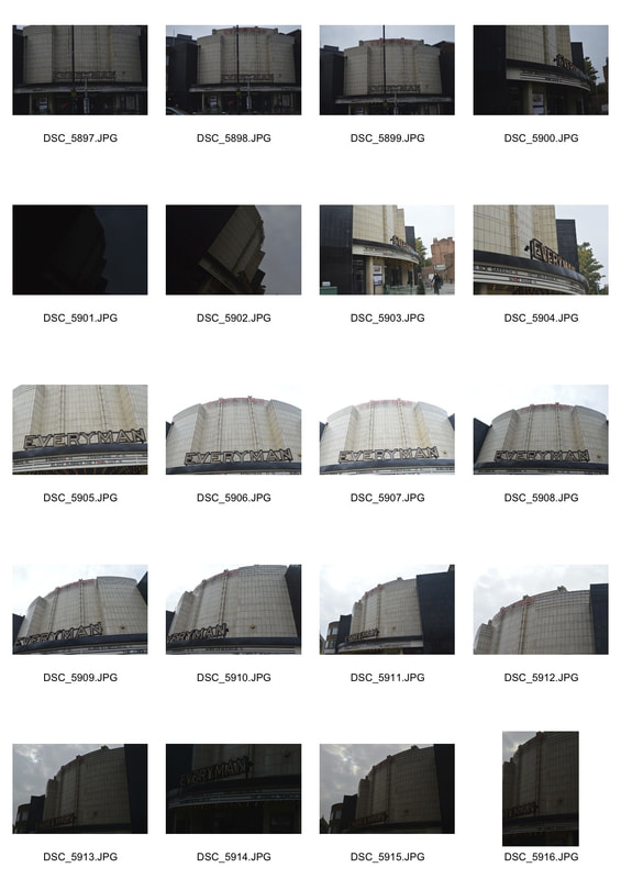
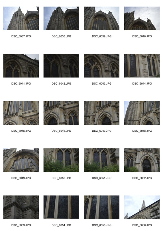
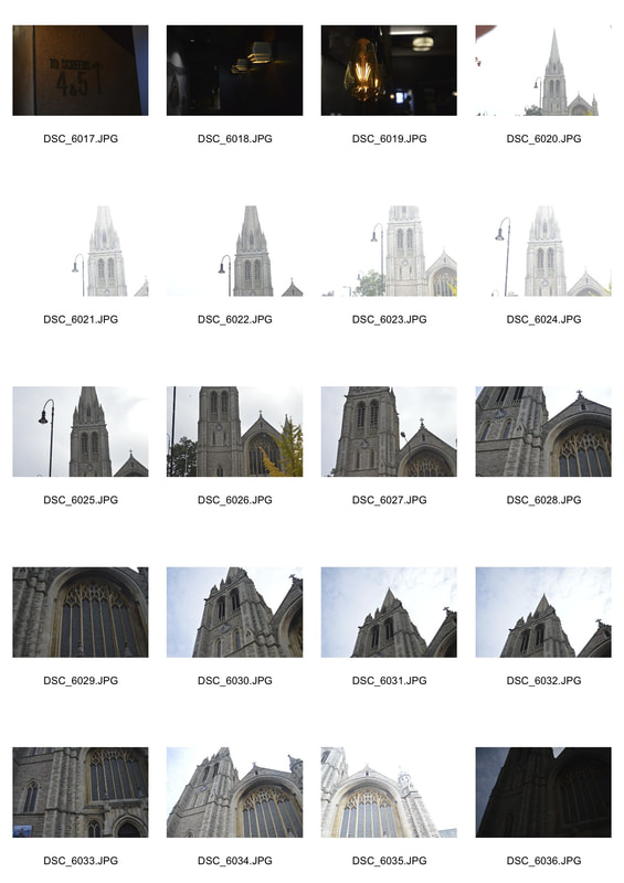
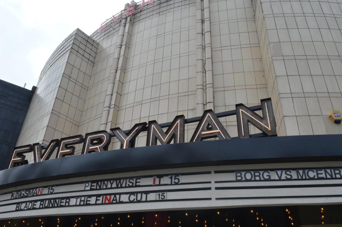
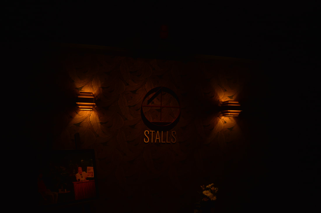
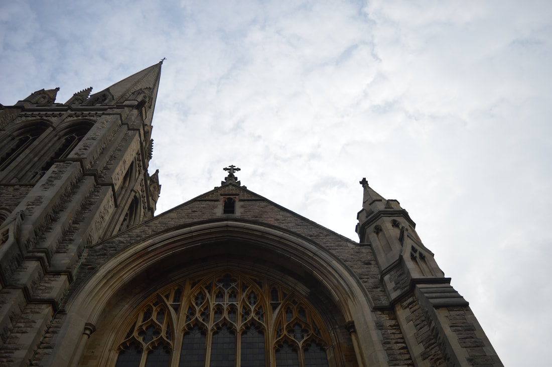
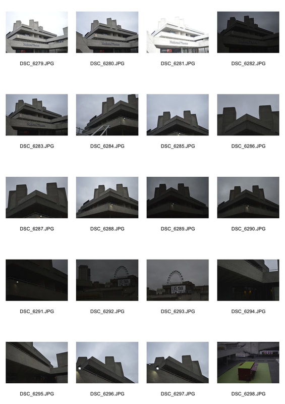
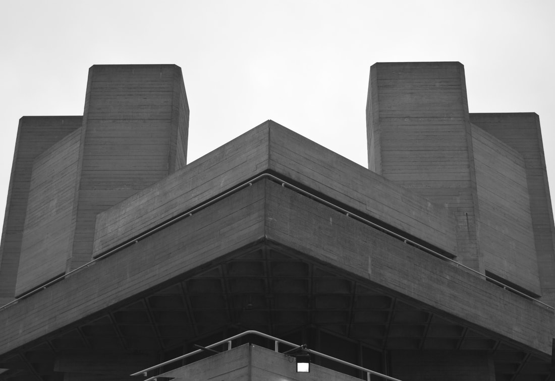
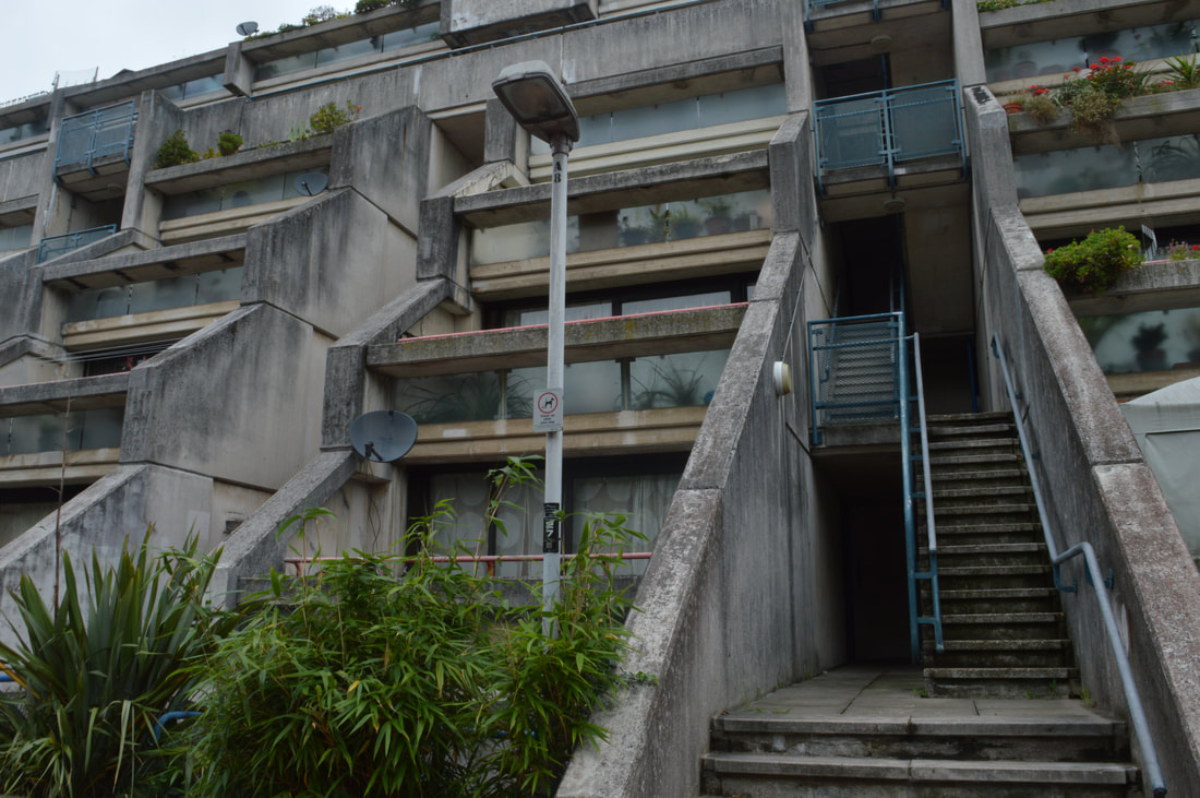
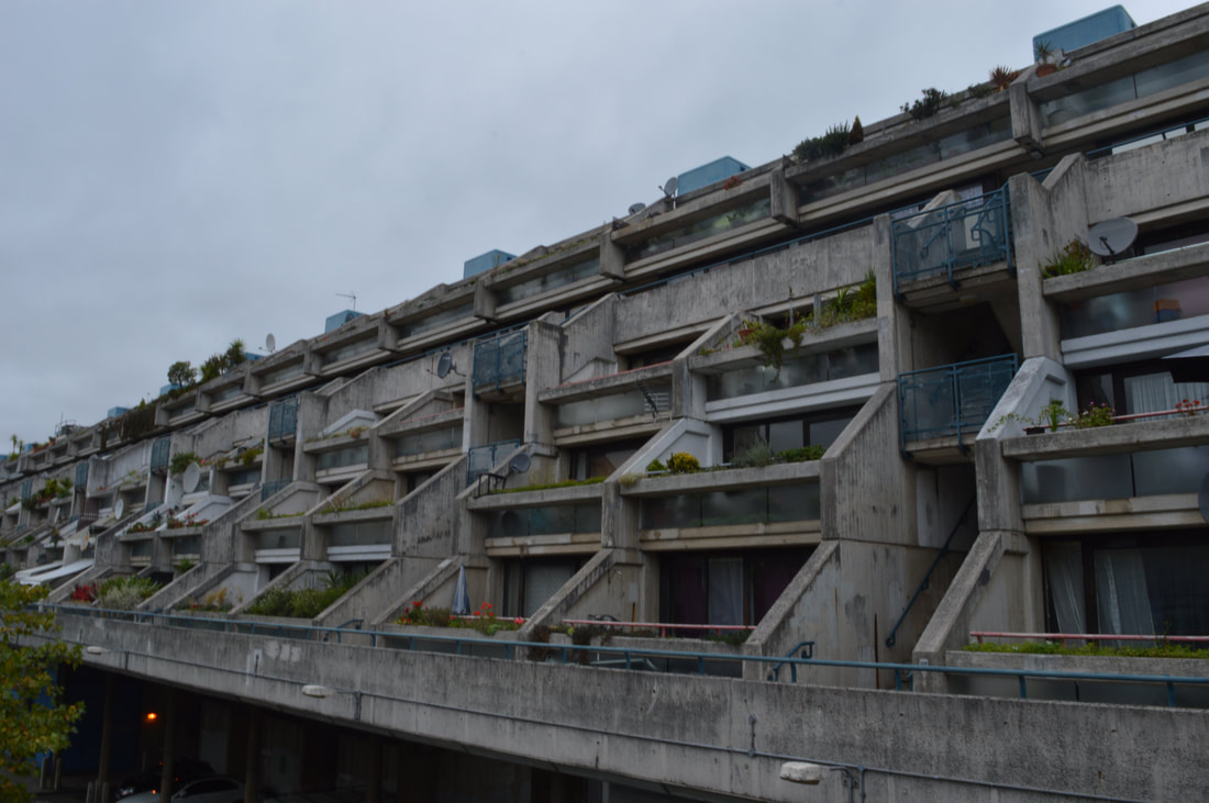
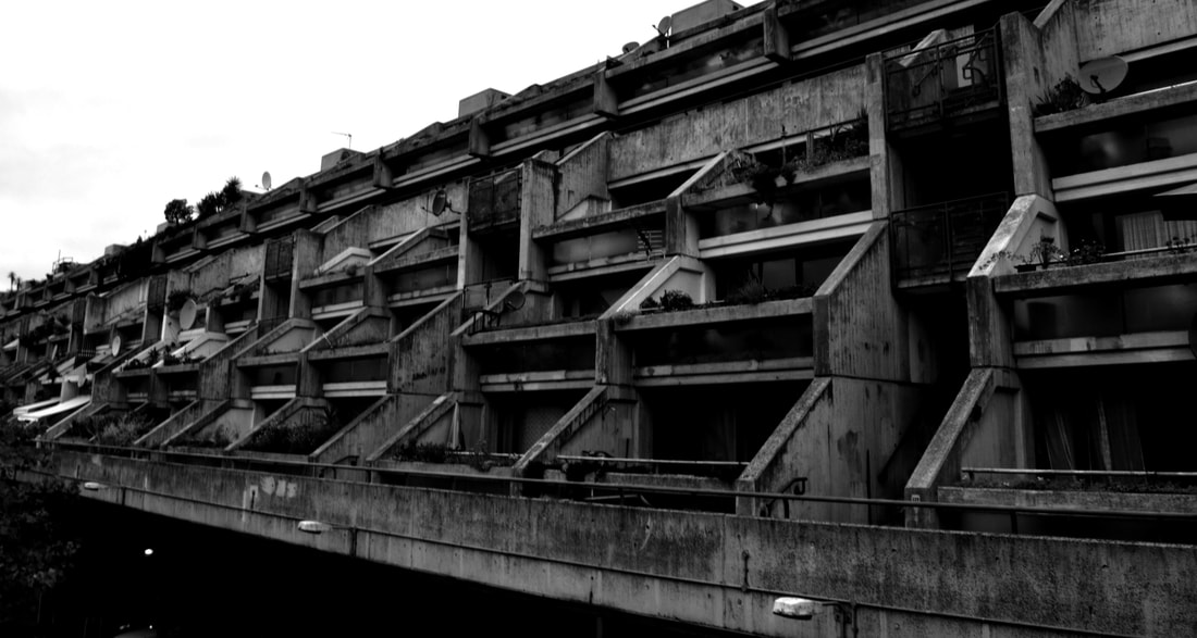
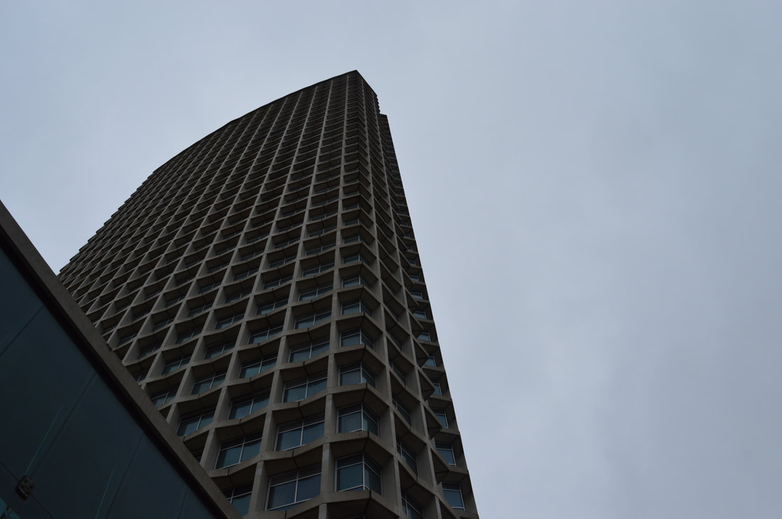
STRUCTURE AND ARCHITECTURE
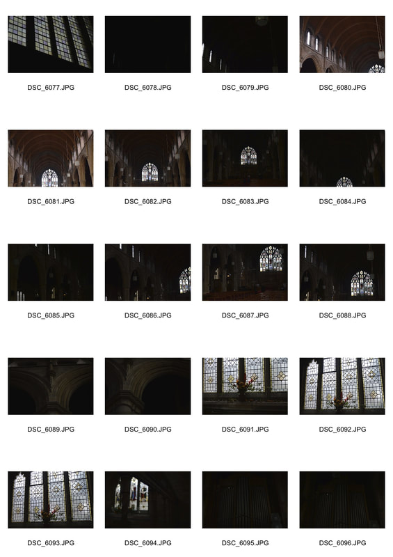
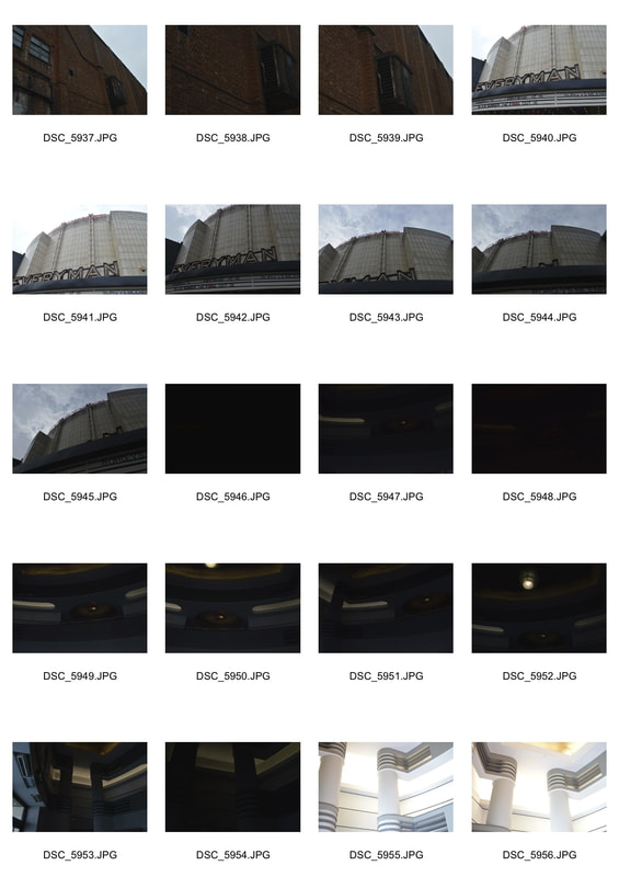
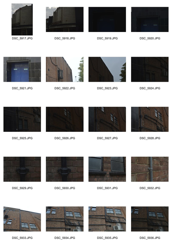
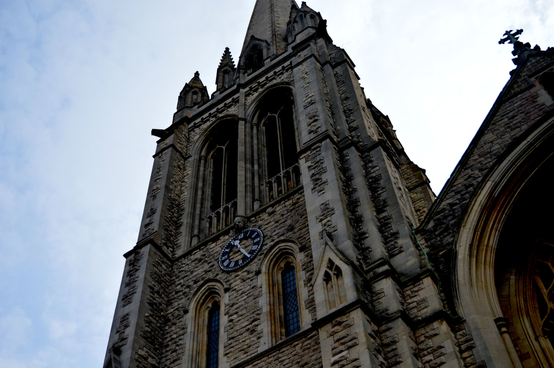
Here are my contact sheets from when we went to Everyman cinema in Muswell Hill. As part of structure, we chose to look at architecture. We went into Muswell Hill and photographed St James Church and The Everyman Cinema.
St James Church -
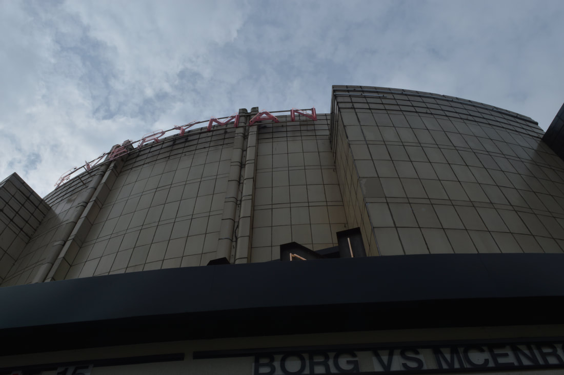
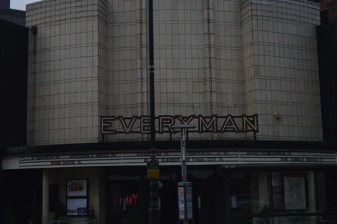
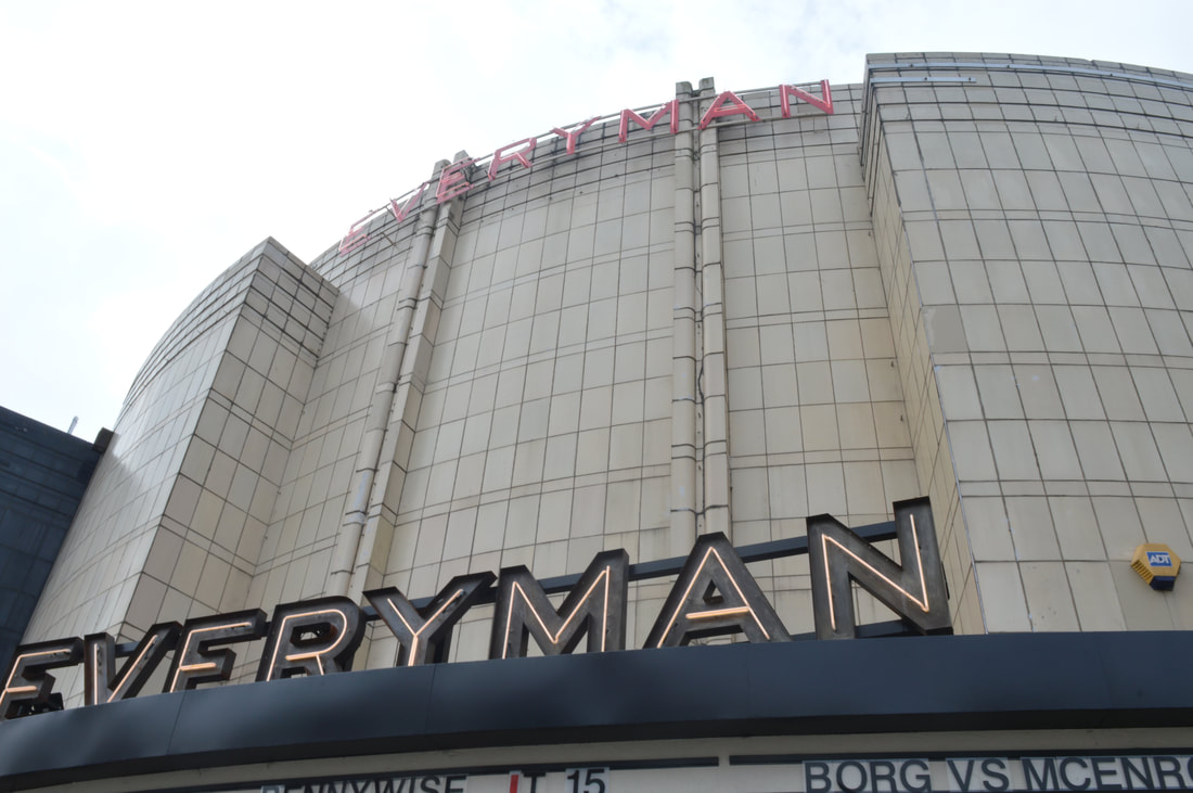
Muswell Hill Everyman -
St James Church -
- The original building was consecrated in 1842, and the church was extended in 1874. The foundation stone for the current building was laid in 1900, and the completed church was consecrated by the Bishop of London (Rev. Arthur Winnington-Ingram) on 30 June 1902.
- The building was gutted by World War II bombing, and the restored church was rededicated in 1952.
- The Church spire was completed in 1910, the spire stands 300 ft above sea level-this is how the church got the name "Church on the Hill" The tower is 21 feet square and 80 feet high. On top if this the spire rises to another 82 feet and the total height to the top is 170 feet.
Muswell Hill Everyman -
- The Odeon Theatre was one of the original cinemas in the Oscar Deutsch owned Odeon Theatres Ltd. chain. It opened on 9th September 1936 with the British comedy film “Educated Evans” starring Max Miller. Seating was originally provided for 1,827, with 1,217 in the stalls and 610 in the circle.
- Located on a corner site, the Odeon’s rather small facade is covered with white faience tiles in the central section, with two bays either side that are covered in black faience tiles. On either side are a parade of shops on the ground floor with flats above, which hide the bulk of the auditorium section of the building.
- Inside the building, the decorative Art Deco styling is considered a prime example of 1930’s cinema styling and even created a style to itself, thanks due in this case to architect George Coles, it became known as the ‘Odeon style’.
|
|
|
|
|
|
|
|
|
these 4 shots of the everyman where taken using different IOS's. The top row of 2 where taken with iOS 100 and the second row of two where taken with IOS 800. I much prefer the top two, making it darker adds more emphasis to the brutalism perspective.
|
|
|
|
|
|
|
|
|
|
|
|
|
simon phipps
One of my link artists for brutalism is Simon Phipps. Simon Phipps is a fine art photographer operating in the UK and has captured a wide variety of subjects. However, when we came across his Brutalist Prints series, we immediately saw something special. While photographing Brutalist architecture is nothing new, Mr. Phipps' approach and execution is something very unique. We were able to speak to the photographer about the series and understand his ethos and vision.
Phipps says 'The departure point for my photographic documentation of brutalist architecture is Reyner Banham's essay ‘The New Brutalism’ published in the Architectural Review, December 1955: Brutalism’s properties were characterized by Banham as being: ‘1, Formal legibility of plan; 2, clear exhibition of structure, and 3, valuation of materials for their inherent qualities “as found”.’ Banham further argued that great architecture derives from the correct interaction of structure, function and form whilst also requiring a necessary conceptual content in order to have ‘memorability of image’. Brutalist architecture communicates functionality, dynamism and the dictum ‘truth to materials’. Within the enhanced materiality of the built brutalist form my intention is to develop a narrative that explores the dynamic sculptural and conceptual characteristics of brutalist architecture within the context of a socially engaged and progressive movement. Ultimately the attraction is always ‘memorability of image’.
Phipps says 'The departure point for my photographic documentation of brutalist architecture is Reyner Banham's essay ‘The New Brutalism’ published in the Architectural Review, December 1955: Brutalism’s properties were characterized by Banham as being: ‘1, Formal legibility of plan; 2, clear exhibition of structure, and 3, valuation of materials for their inherent qualities “as found”.’ Banham further argued that great architecture derives from the correct interaction of structure, function and form whilst also requiring a necessary conceptual content in order to have ‘memorability of image’. Brutalist architecture communicates functionality, dynamism and the dictum ‘truth to materials’. Within the enhanced materiality of the built brutalist form my intention is to develop a narrative that explores the dynamic sculptural and conceptual characteristics of brutalist architecture within the context of a socially engaged and progressive movement. Ultimately the attraction is always ‘memorability of image’.
|
|
|
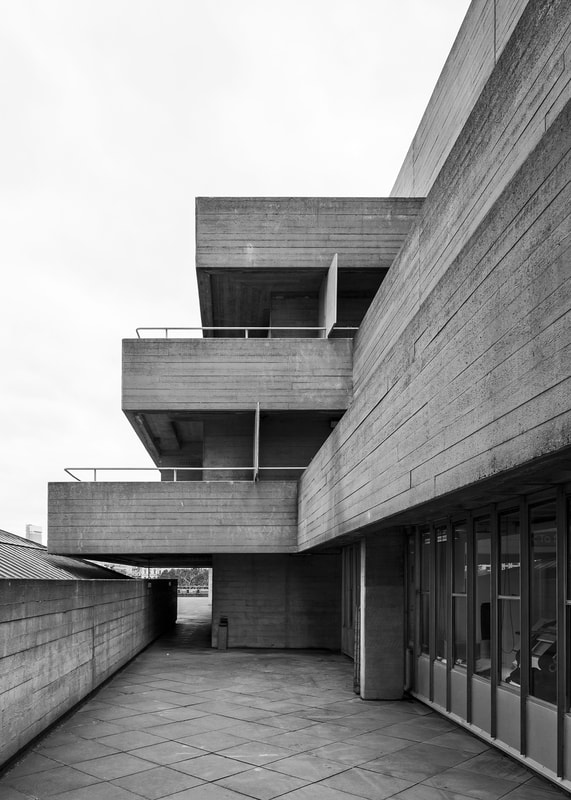
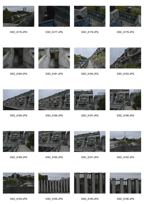
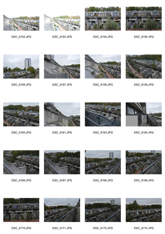
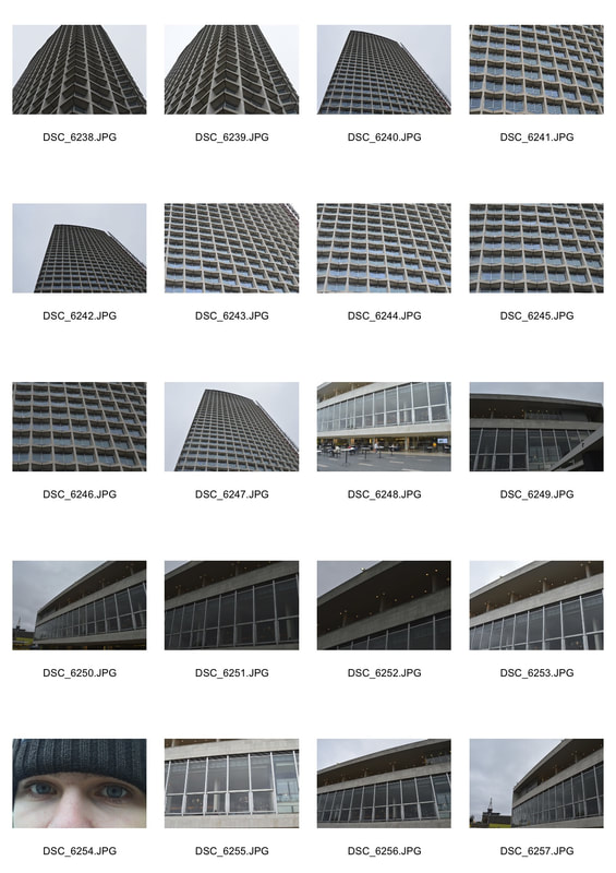
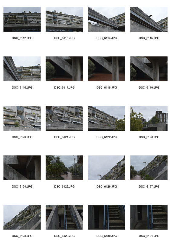
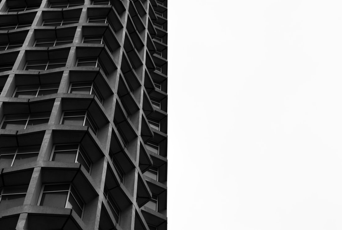
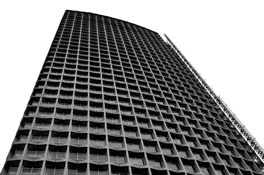
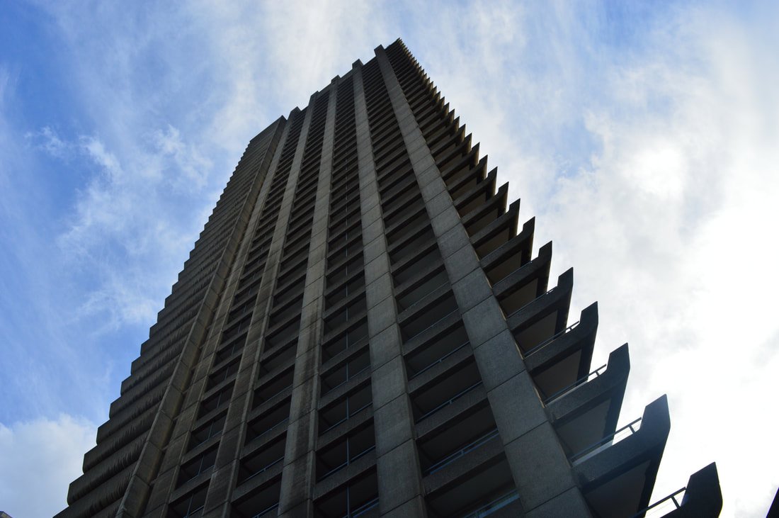
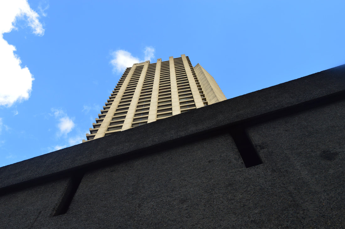
BRUTALISM
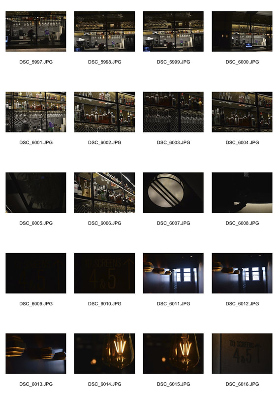
contact sheets -
|
|

|
|
|
|
|

|
|
|
|
|
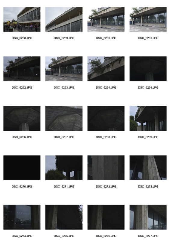
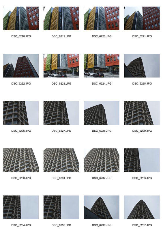
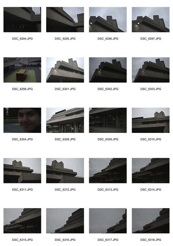
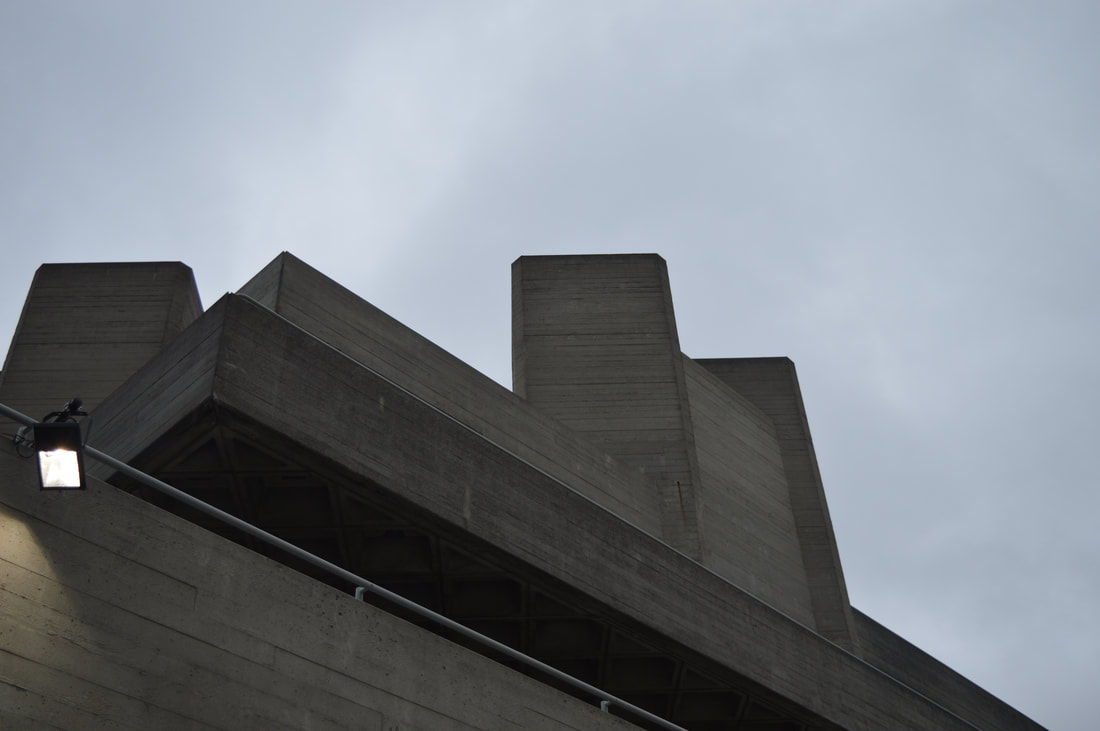
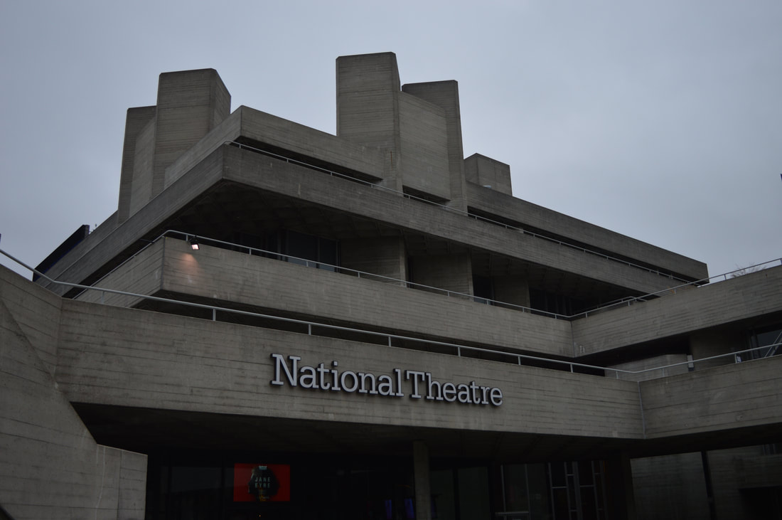
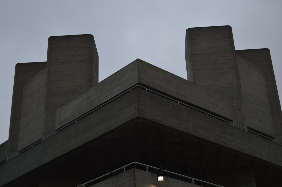
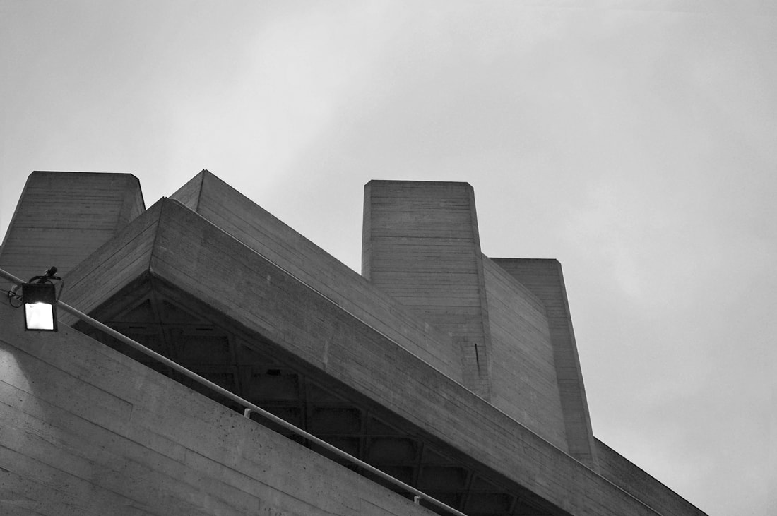
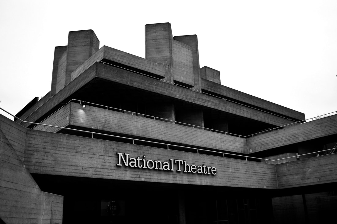
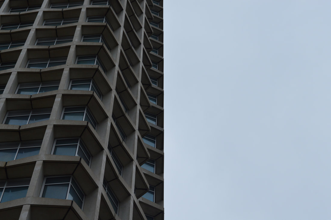
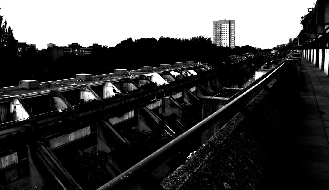
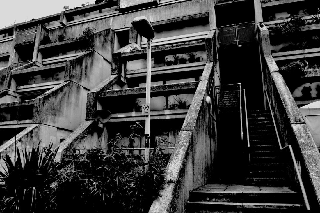
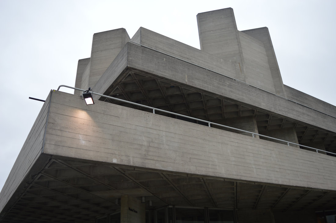
brutalism in architecture - extension part 1
These are the images I liked the most and though represented the idea of brutalism in architecture the best. The pictures below are taken at the national theatre/southbank centre, as many of the buildings around have buildings which really represent the idea of brutalism well. They are big, dark and un-aesthetically pleasing. I have uploaded the original photo and then the black and white and also edited version of the photo, i have made adjustments to fit the photo more to the theme of brutalism. I have changed the exposure, levels of brightness and contrast, and played around with the different colour levels.
|
|
|
|
|
|
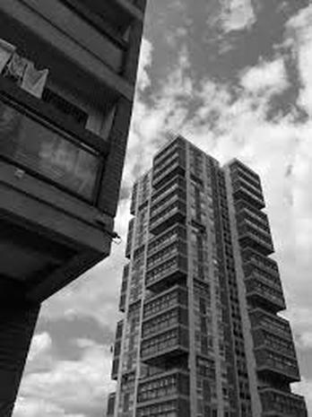
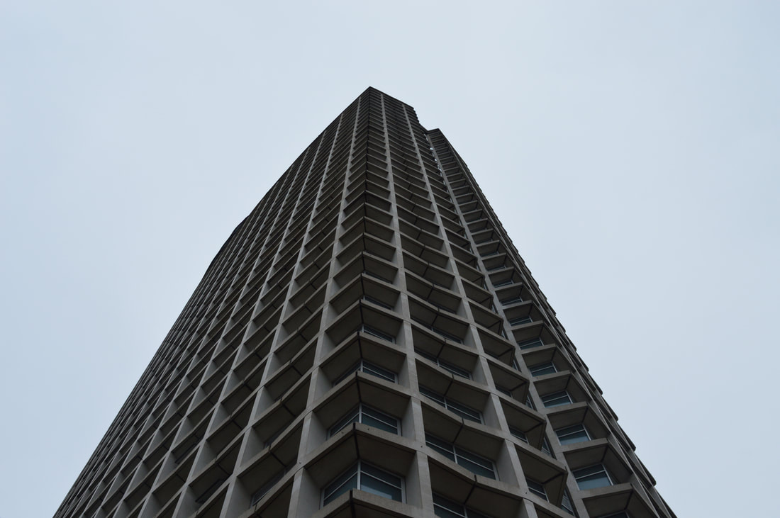
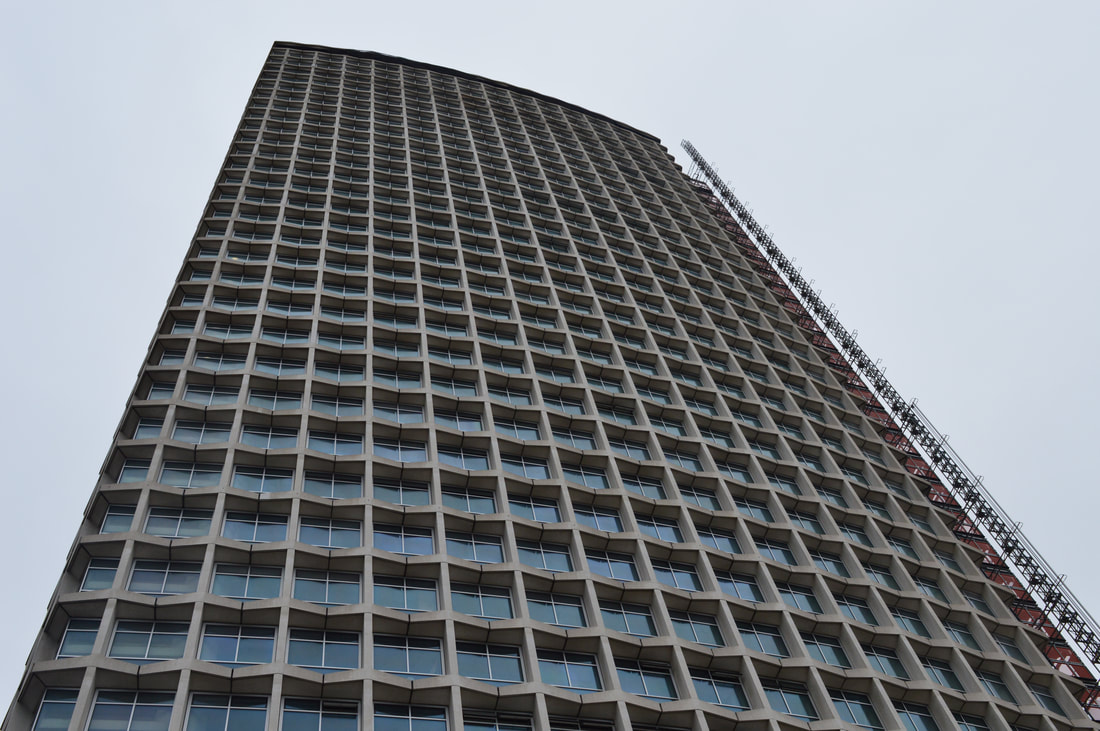
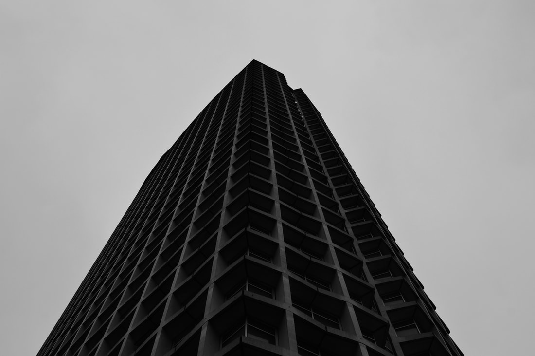
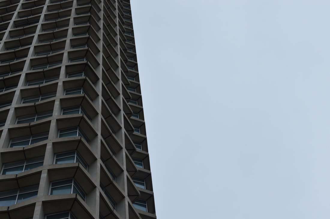
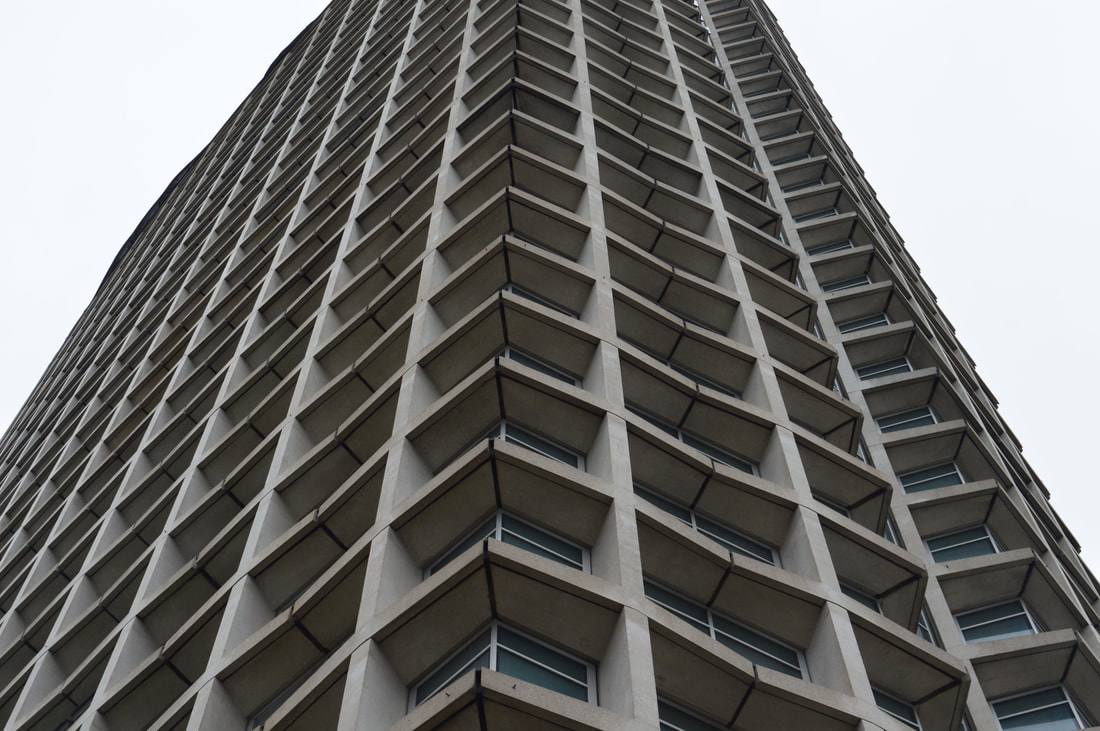
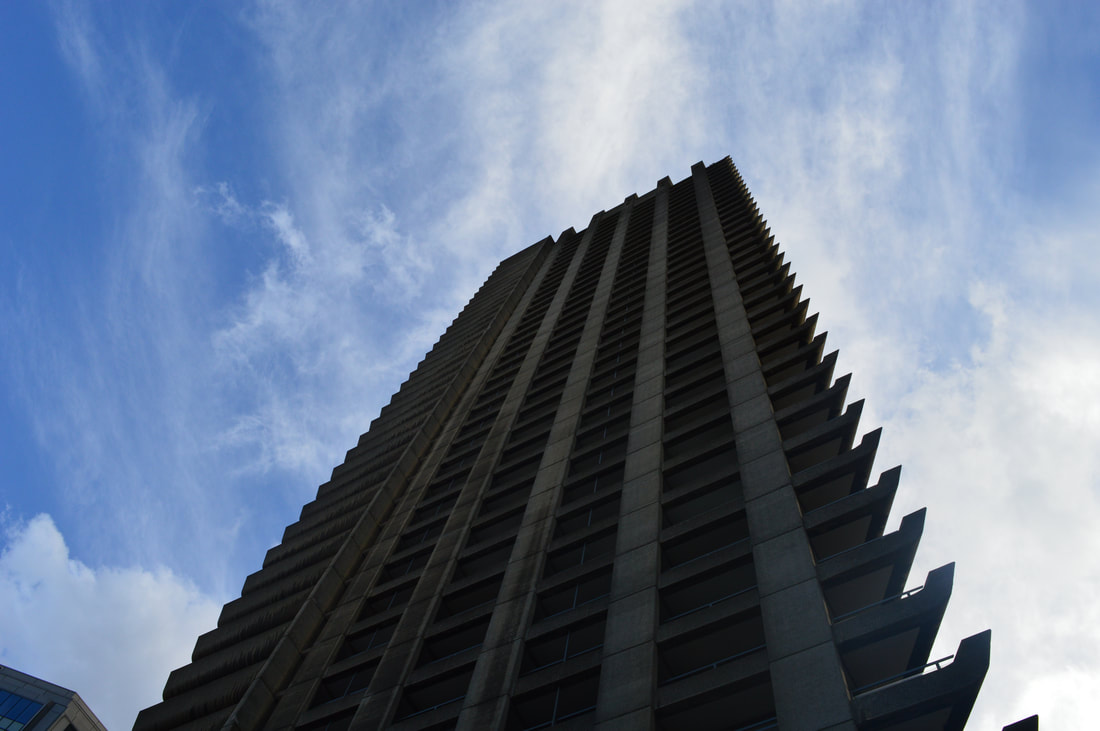
centre point
Centre point was really great to photograph, as its such a simplistic building but it is symmetrical and all one colour which when you edit the photo, for example what I did darkened the tone and changed the contrast, it makes lots of shadows and makes the building look really eerie. Another thing is that its extremely tall and you can access right below the building, when you're photographing like that, the building is sky scraping over you, it looks like its towering above you.
|
|
|
|
|
|
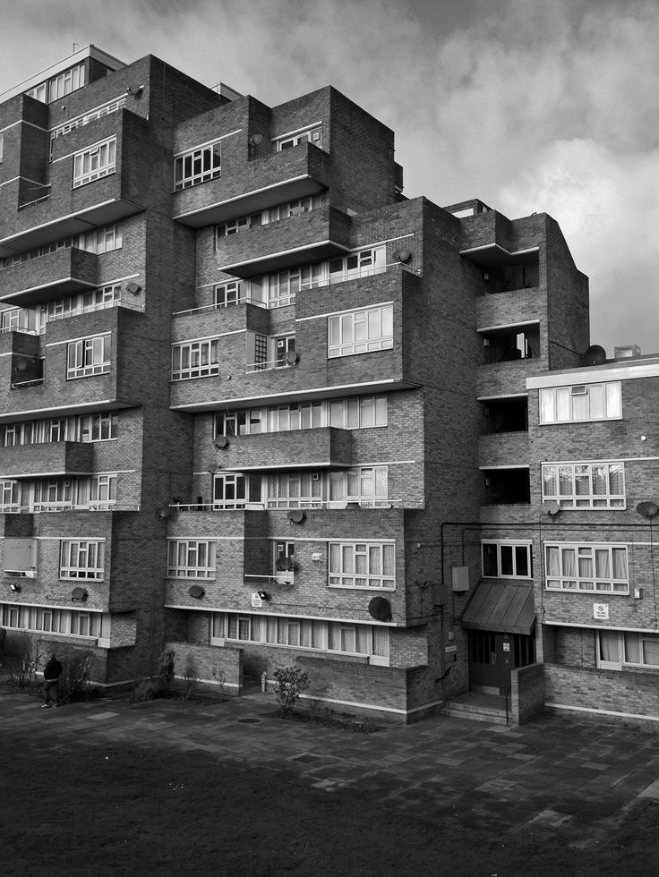
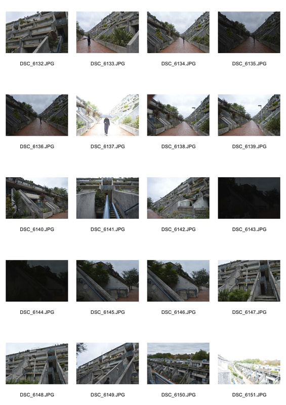
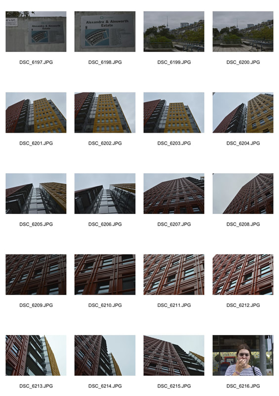
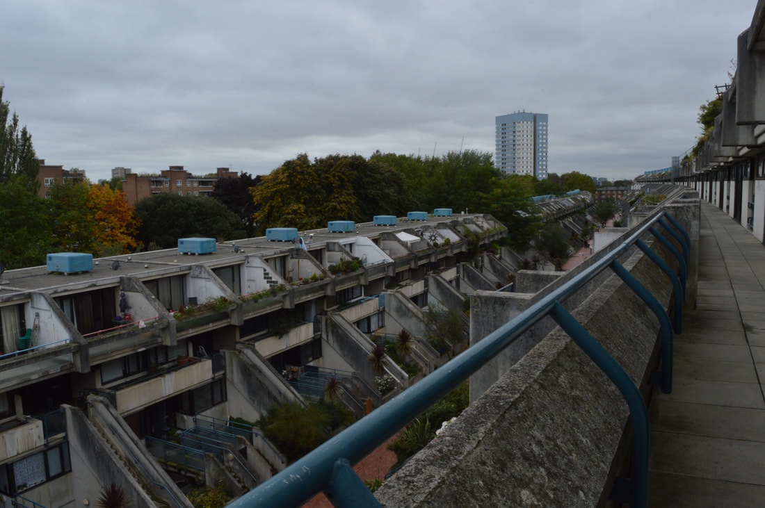
ainsworth estate
|
|
|
|
|
|
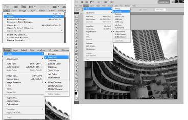
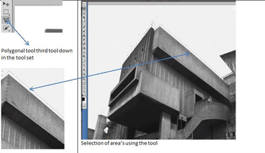
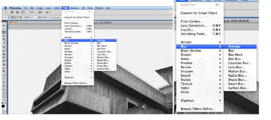
brutalism extension
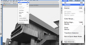
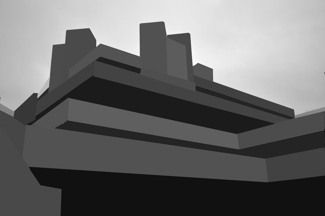
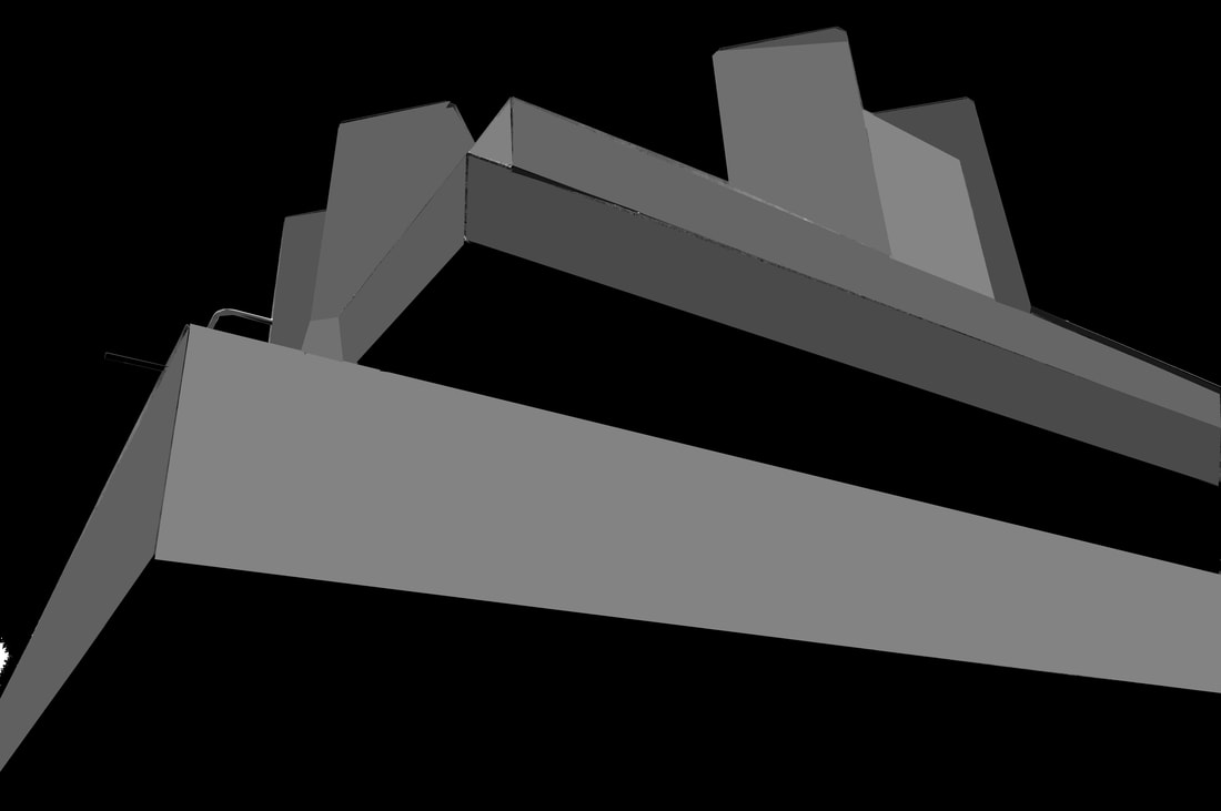
These below images were my favourite photos I took in my brutalist architecture section, to make them even more unique we used photoshop and made the image into almost a cartoon, shown below. Here are the instructions to make an image like this in photoshop. this is how i made them in photoshop step by step:
|
|
|
|

|
|
|
|
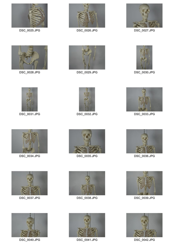
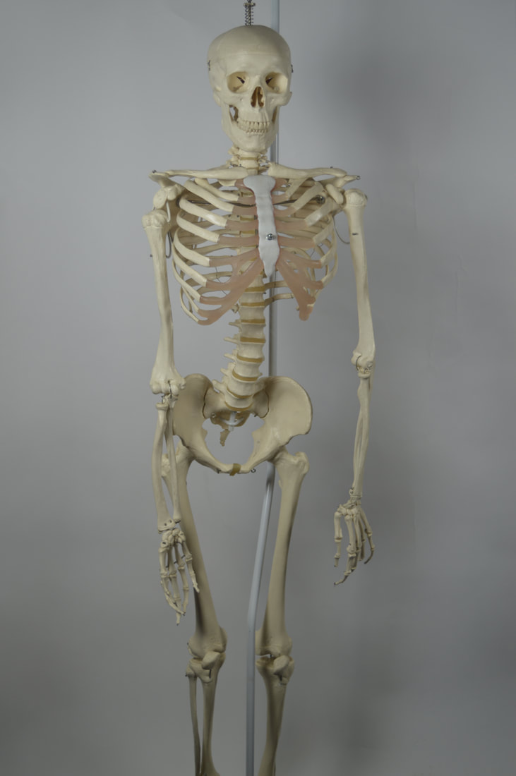
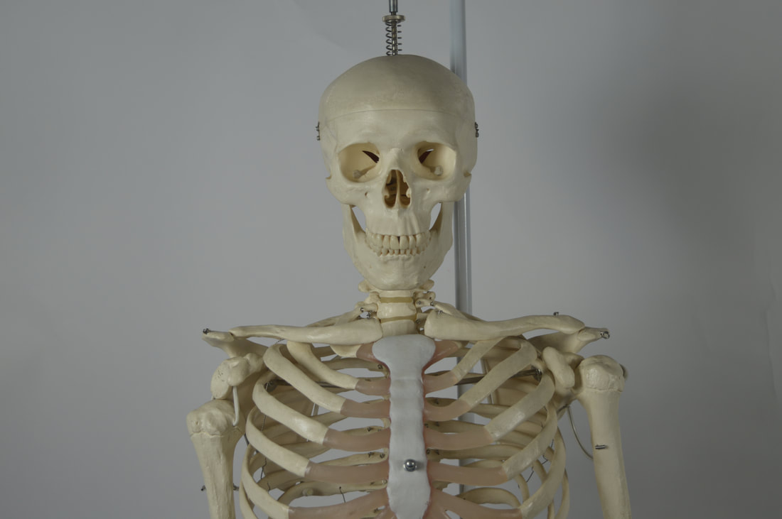
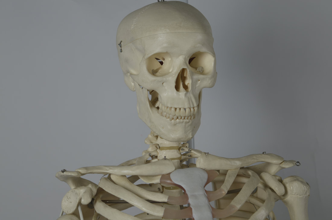
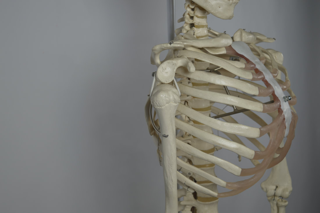
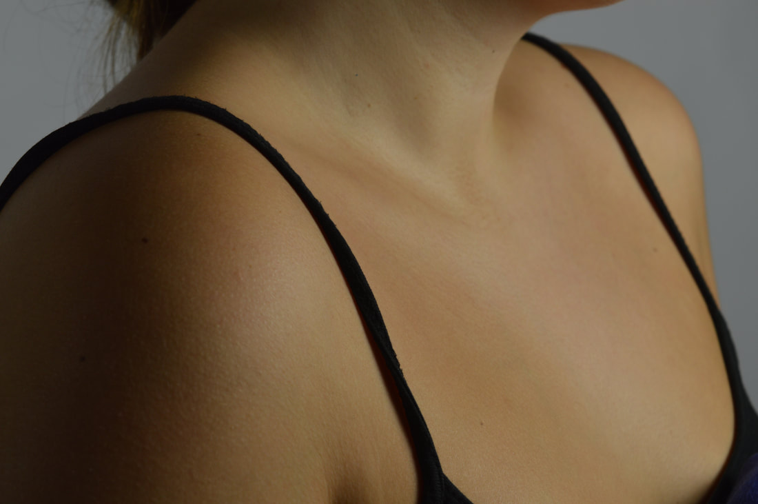
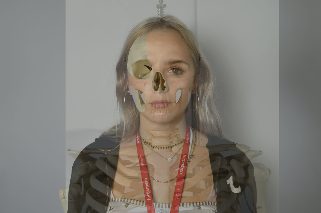
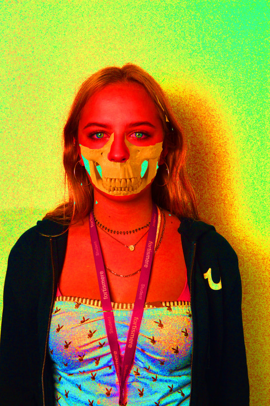
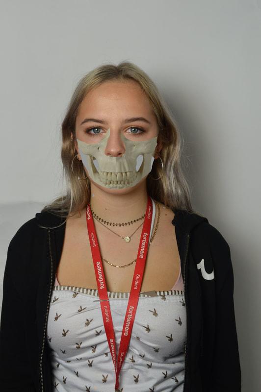
Structure of the body
The topic of structure of the body involved me taking photos of the skeleton we had in the studio, which is just bones. We Then took photos of the human body with flesh. I then merged the two in Photoshop. The idea of this task being whats underneath the body. By merging the two photos, making them two layers, its revealing something. We know the basic structure of the human body and what it looks like on the outside but this gives an insight on the structure inside.
|
|
|
|
|
|
|
|
|
|
|
Half Term work - THREE STRANDS
FIRST STRAND - HIGH RISE ARCHITECTURE
Link Artists:
|
Simon Kennedy
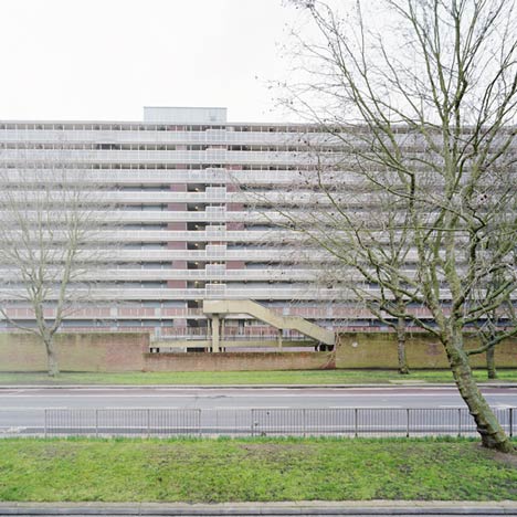
HEYGATE ESTATE - since knocked down
|
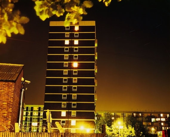
I incorporated ideas from both these artists in my strand work. Both of the photographers have captured photos of blocks of flats. Although Rut Blees photo taken at night looks really eye-catching, I wanted to capture the flats with more of a realistic look, like Kennedy's work. The block of flats I took photos of were yellow and I wanted to contrast it with a grey darkish background of the sky. I continued just photographing tall buildings. i love Rut Blees work and I think for my second response I am going to photograph blocks of flats at night. |
Rut Blees Luxembourg
|
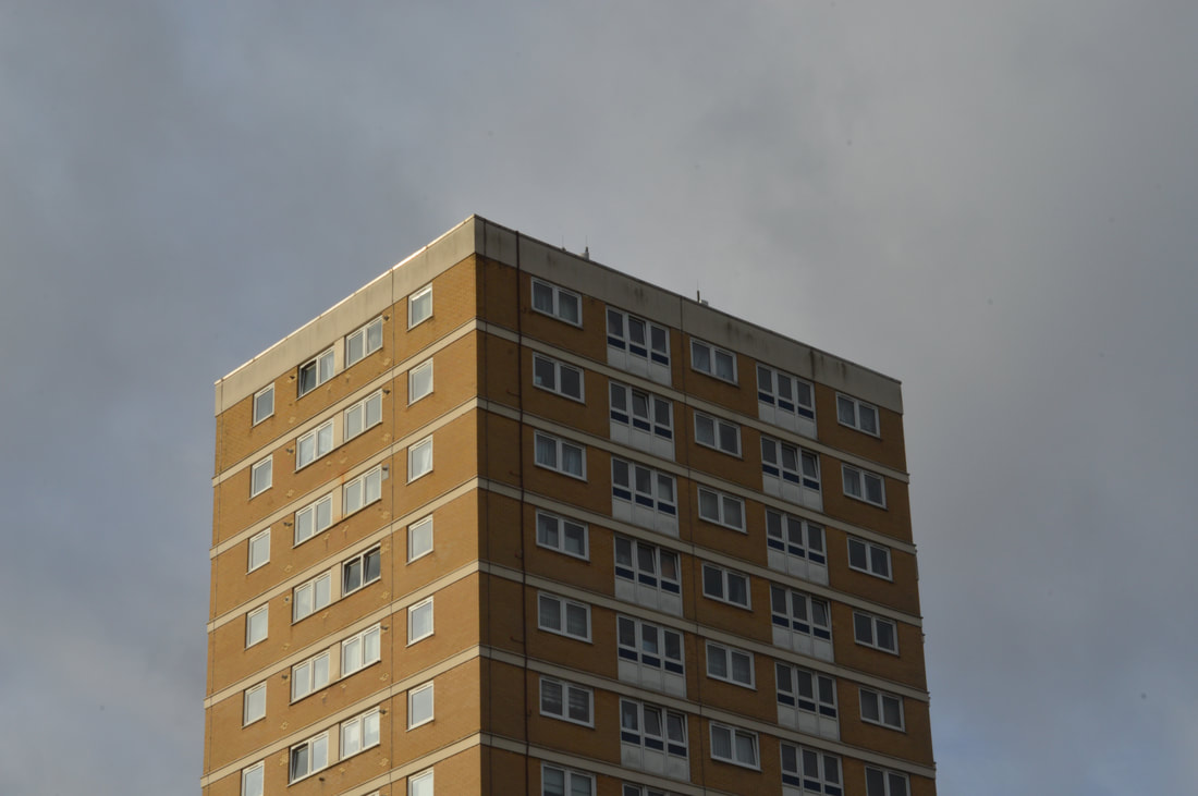
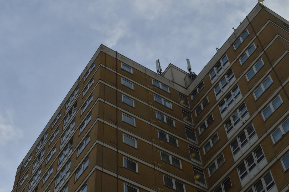
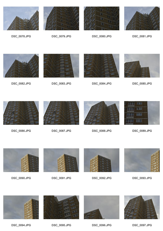
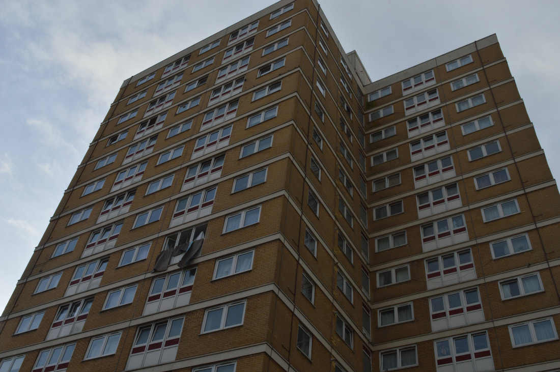
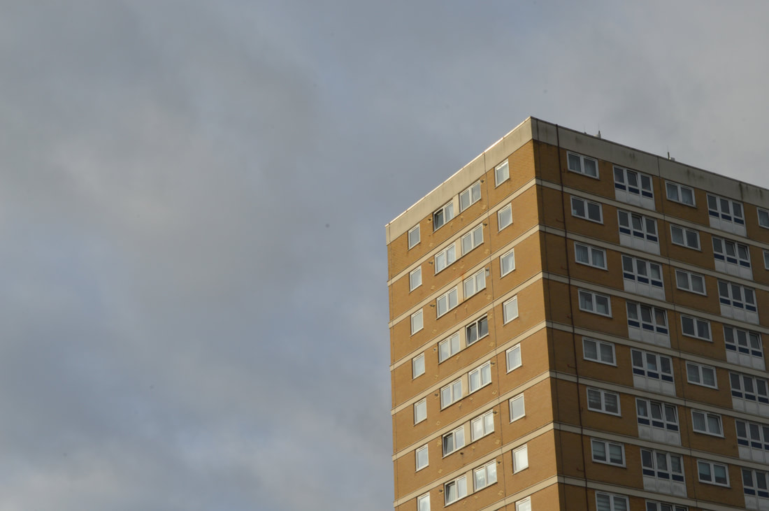
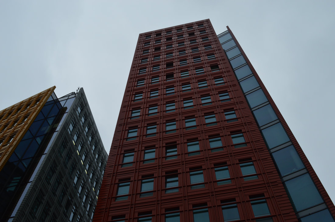
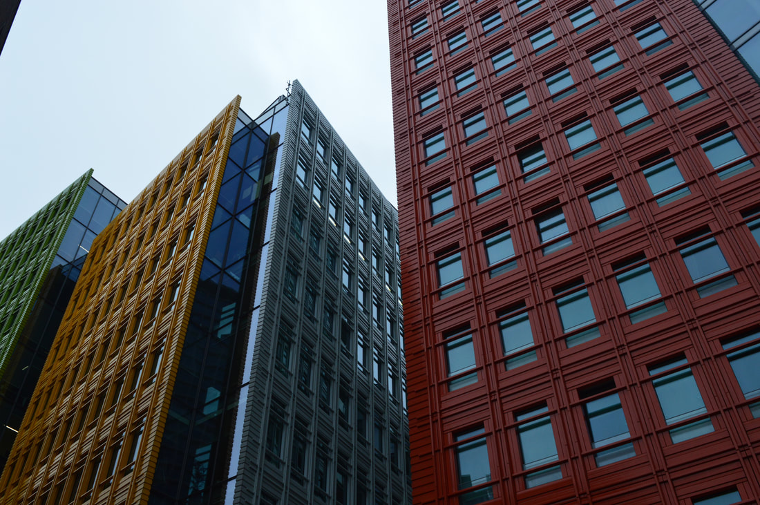
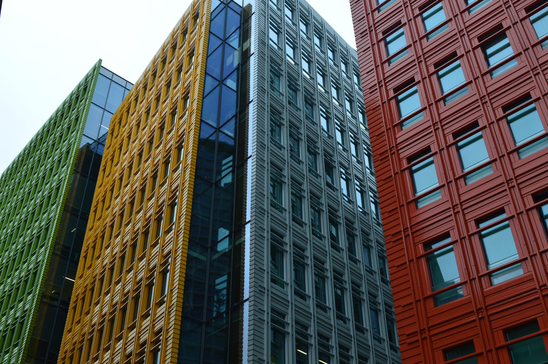
I chose high rise structure as one of my strands as London has so many buildings that are tall and very often symmetrical. I especially like photographing council blocks and estate buildings, as they are usually symmetrical, with many floors and windows. It always easy and interesting when taking the photos because there are so many angles and points to take from so you get a complete variety of shots and viewpoints, not all one boring image. I like taking the photos from below the building so the building is imposing and it makes the image look darker, which is the effect I'm trying to create. I always try and include the sky in my shots, because when on Photoshop editing, for instance changing the contrast and brightness, it will make the sky look much more detailed. The clouds will be more prominent for example. It always compliments the building in the image or whatever the focus of the image is on.
|
|
|
|
|
|

|
|
|
|
|
|
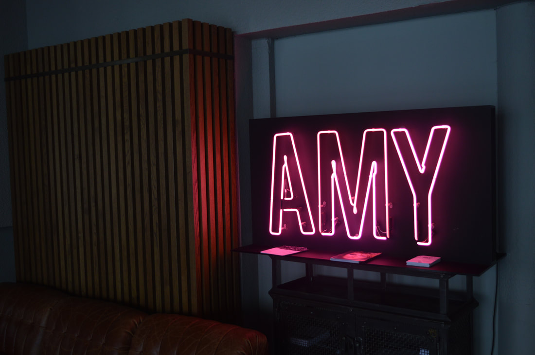
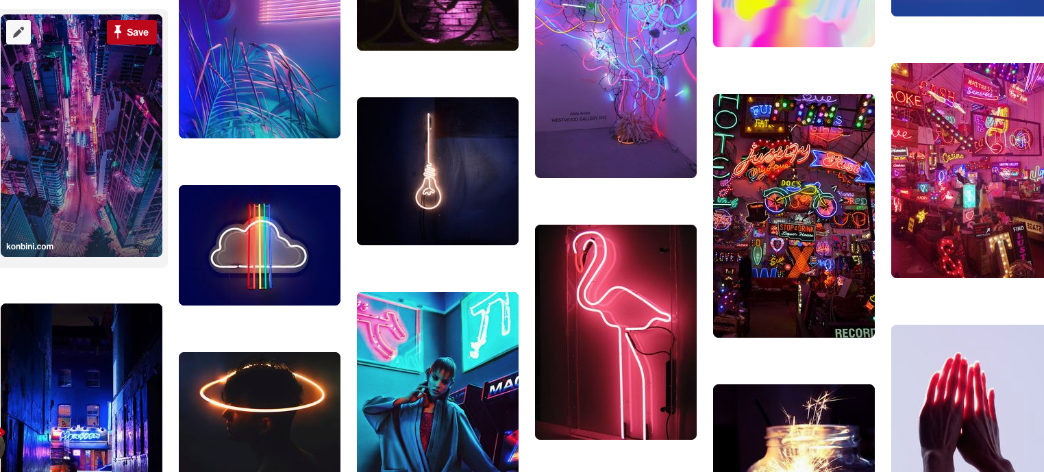
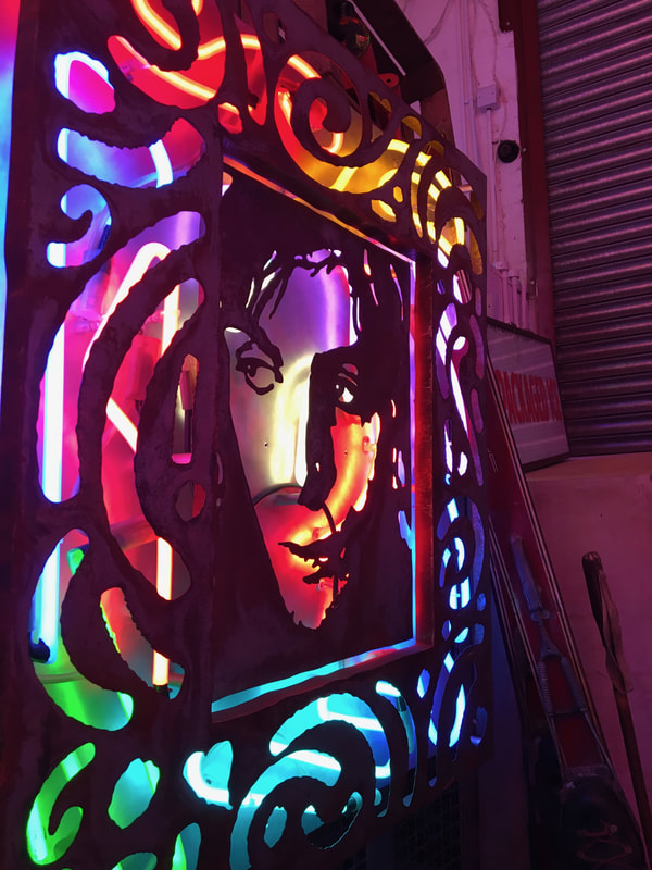
Second Response - Strand 2- Lights
-pinterest board inspiration below-
|
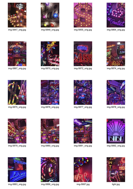
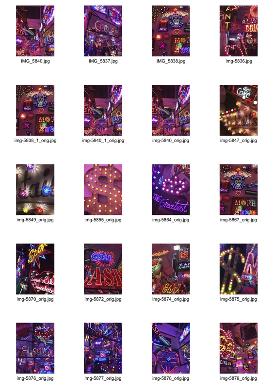
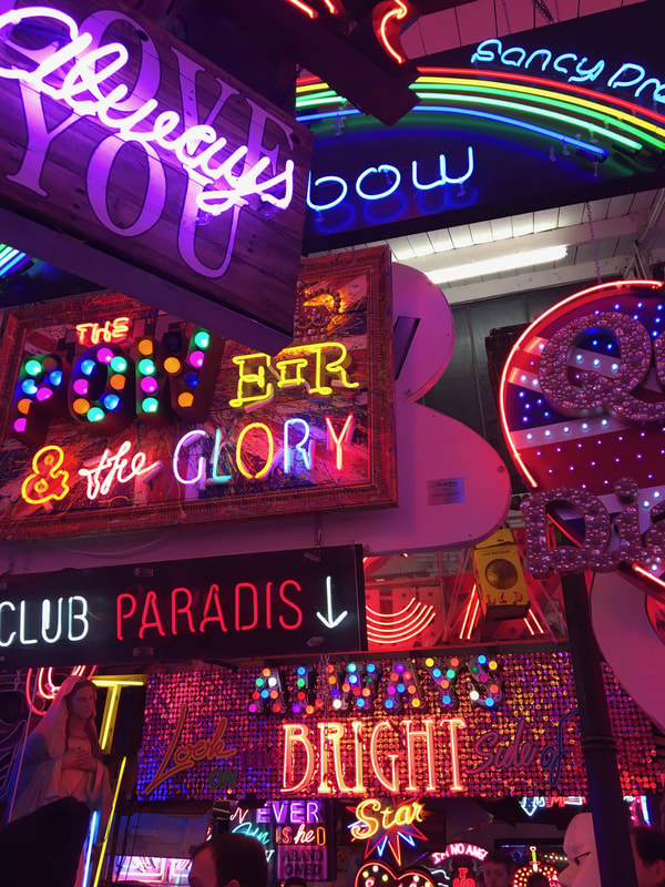
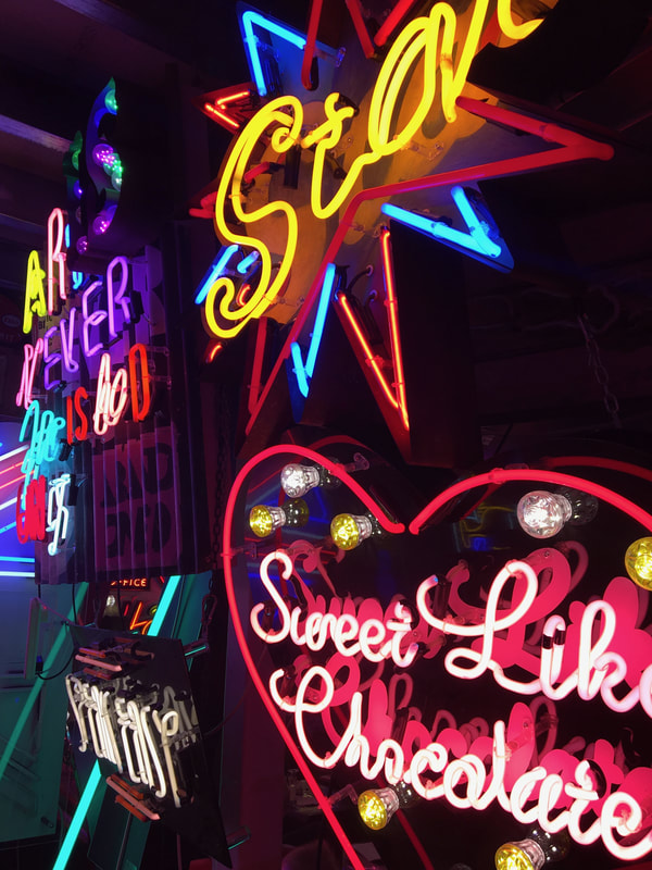
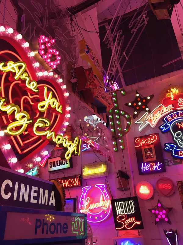
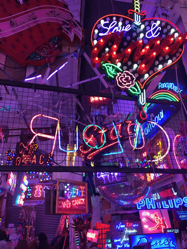
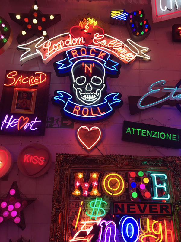
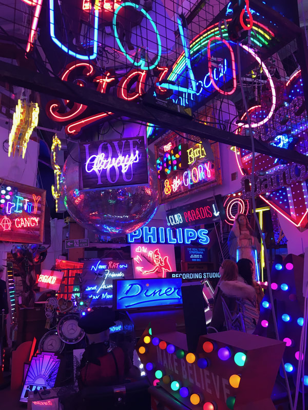
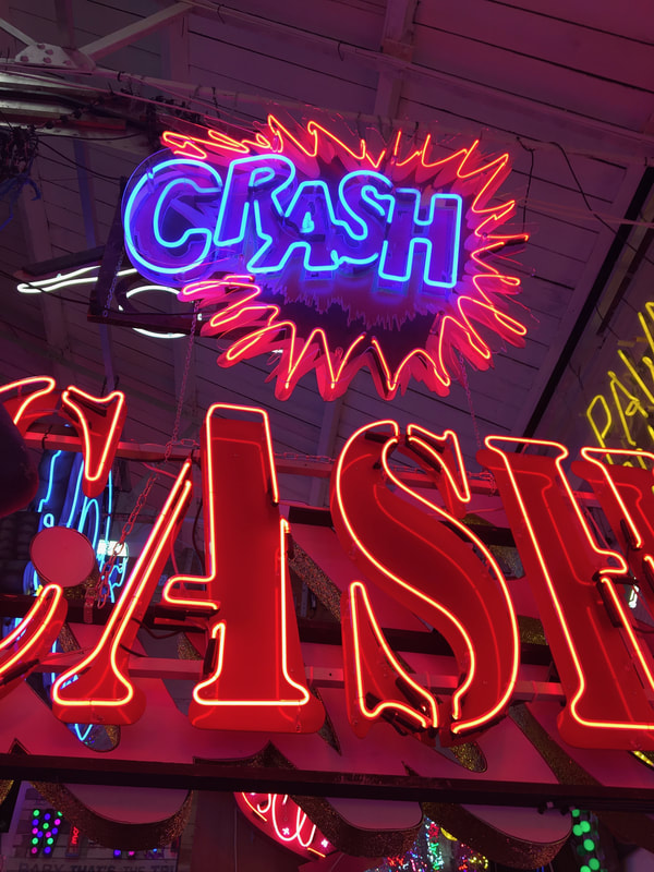
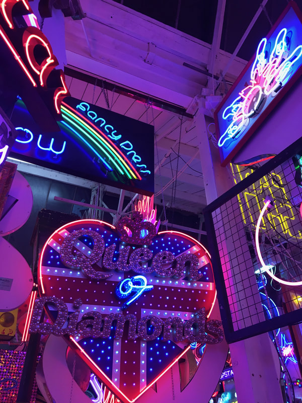
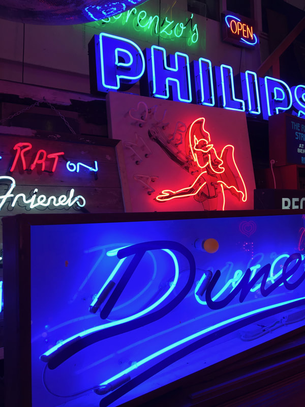
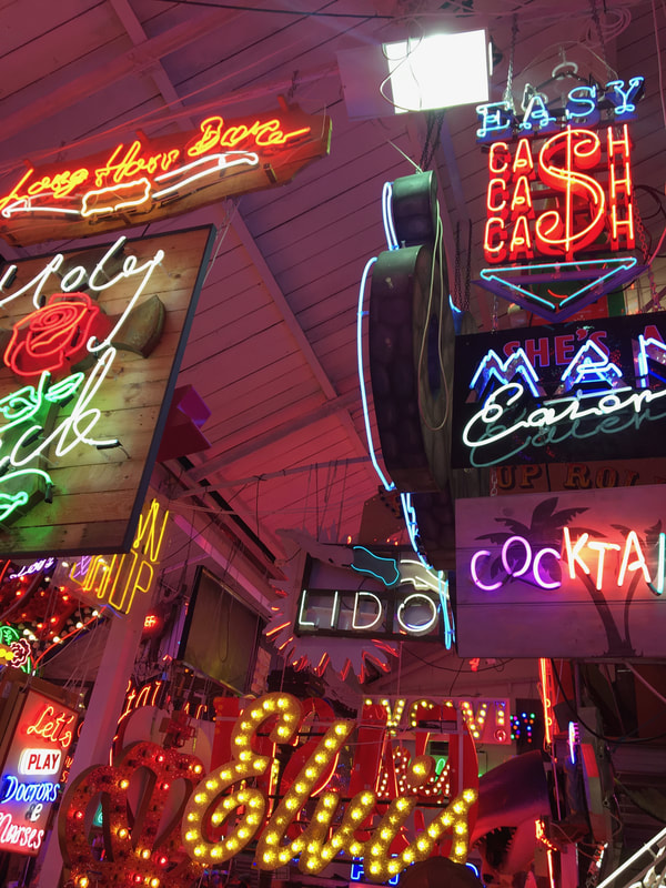
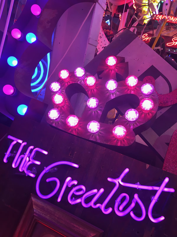
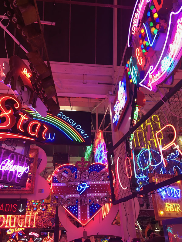
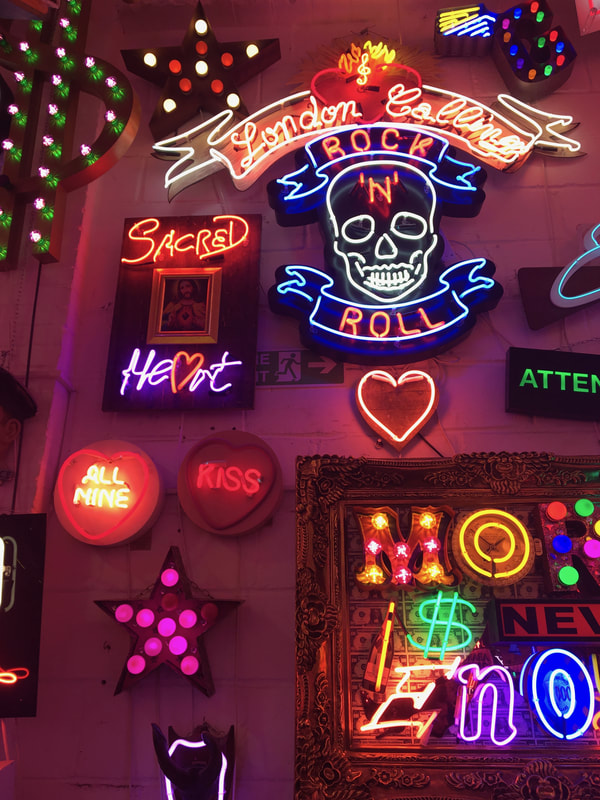
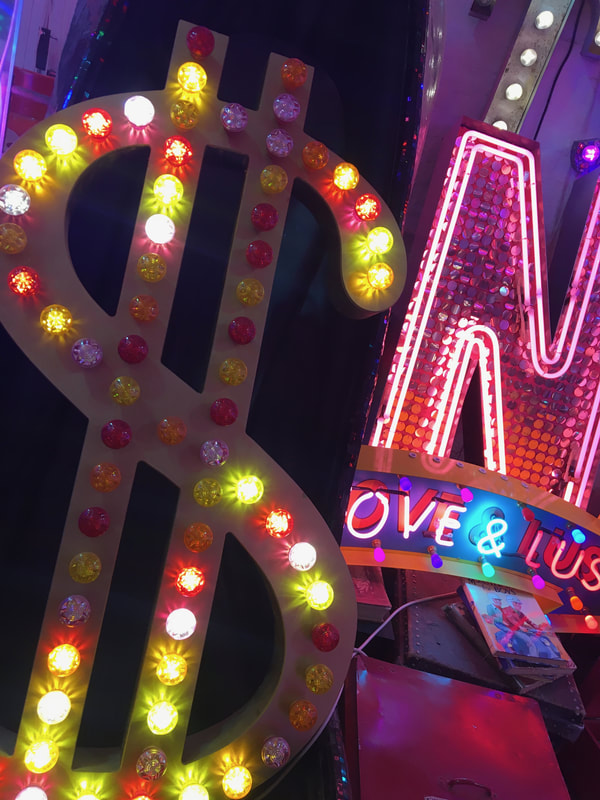
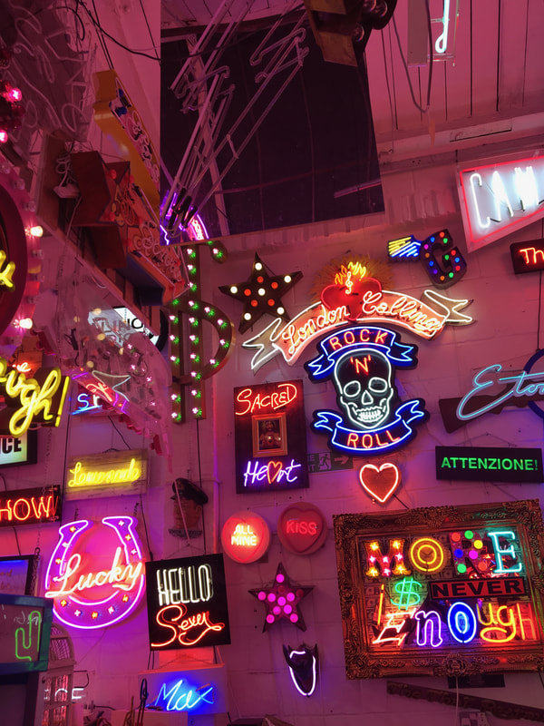
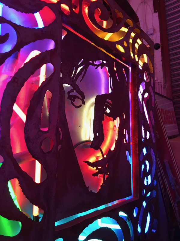
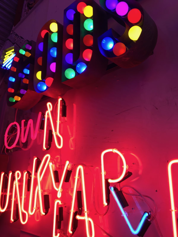
My second strand is about lights and placement/structure of them. To take these photos I went to GODS OWN JUNKYARD. It is a space full of neon and glowing lights. God's Own Junkyard showcases neon artist Chris Bracey's personal collection of work in a salvage yard in Walthamstow. It contains everything from his signage for Soho clubs in the '60s to his work for the movie industry, including pieces that were used in 'Captain America', 'Eyes Wide Shut', 'Byzantium' and more. Its a really cool and vibrant place, its a great experience and visually its amazing and eye-catching everywhere you look.
|
|
For this strand I wanted to focus on the brightness and contrast of lights. I captured with quite a vague idea of what I was actually trying to capture, I just started photographing neon lights without a straight idea of what I wanted but the idea of structure was still there as I captured the photos on a slight angle, playing with the idea of structure and placement. The lights where surrounding me in the junkyard and are placed overlapping and in certain positions so lights are coming at you from everywhere and you can always see what the lights/ signs say.
Light can really structure a room, and in this case light surroundings shapes the room.
Light can really structure a room, and in this case light surroundings shapes the room.
|
|
|
|
|
|
|
|
|
|
|
|
|
|

|
|
|
|

|

|

|

My second strand is structure at night
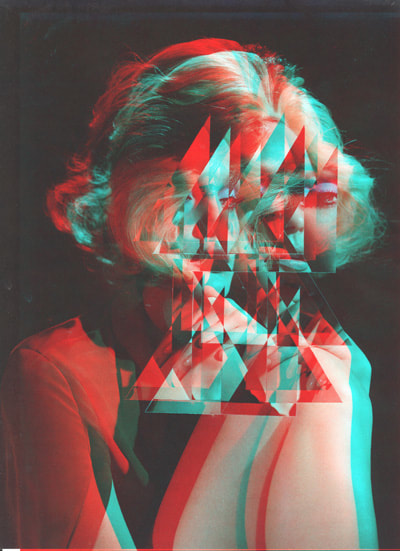
Strand 3 - people
Gordin Magnin
|
Gordon Magnin was born in Reno, Nevada, USA and lives and works in Southern California. He has exhibited in Southern California, Reno, and New York City. In 2009, he attended a Canada Council for the Arts-sponsored artist residency at L’Écart, Lieu d’Art Actuel in Rouyn-Noranda, Quebec, Canada. Magnin is an LA based artist who uses fashion images and turns them into a unique collage of "altered found images" with his use of geometric patterns. Collages using appropriated photographic images, Gordon challenges the intended “intended objective, interpretation, and significance". I think Magnins work is really interesting, it catches your eye straight away,involving peoples beauty and shapes and patterns, and every time you look at his pictures I feel you could look at it from a different angle each time and still be mesmerised. His work is quirky and eyecatching, a great idea is making gifs (moving images) out of the pictures, below I've made one using photoshop and the circles rotate, his pictures are intricate and unique, those are two words I would use to describe Gordons work. |
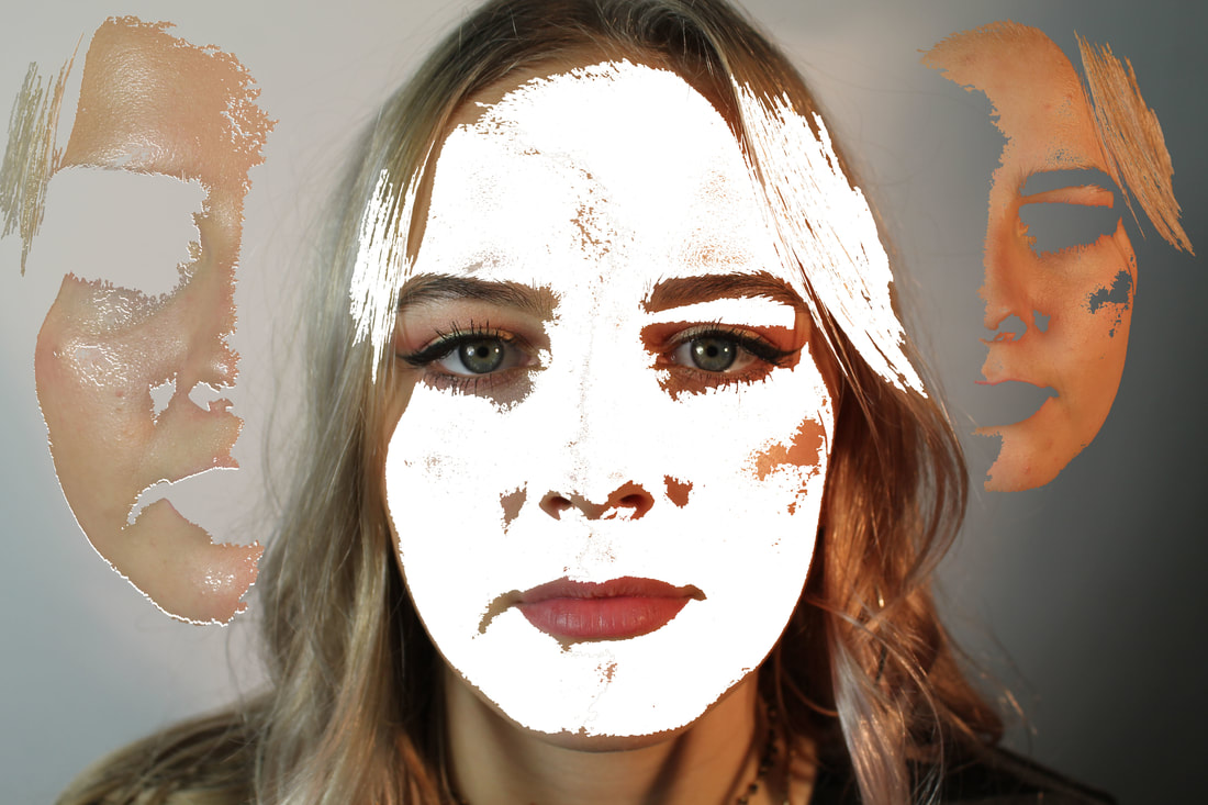
Strand - P E O P L EFor my third strand I decided to experiment with portrait photos of people and edit them in different ways, chopping up making the face look different to the original. My aim is changing the structure of the face, mixing up the 'normal' facial structure. The four photos on the right show my attempts to do this. The top 2 is where I selected different parts of my face and the magic wand tool created a line that looked like my face had been sewn up. Below I made a gif using lots of different screenshots that id captured everytime using a different selections so it looks like my face is being sewn or changed and there is movement in the gif, my idea being that its cutting up my face, messing around the structure. The second set, I removed structure from the face, I selected parts of the face and moved the outline and colour of the face and put them in the background like a shadow. the face is blank and there is no structure. This is what I was aiming for. |

|

|
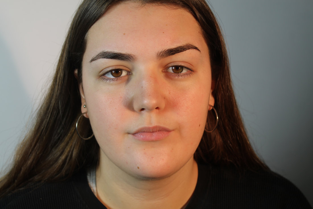
development
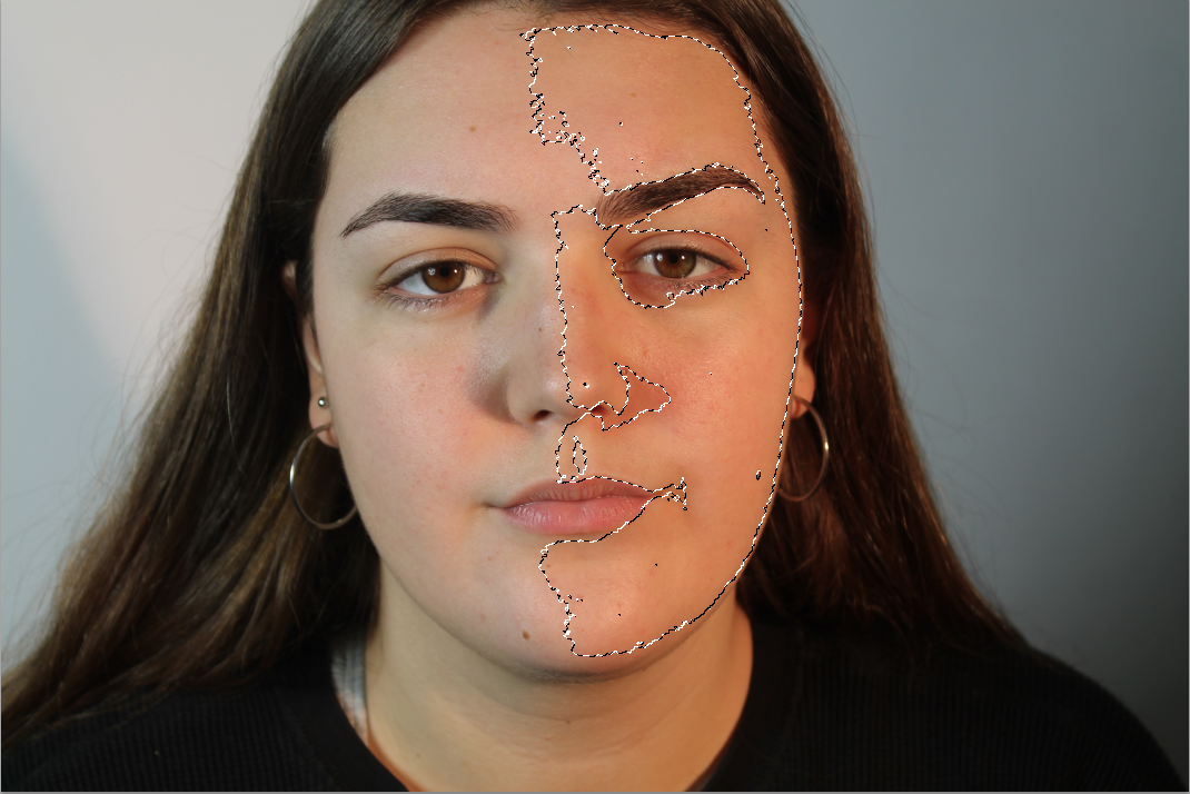
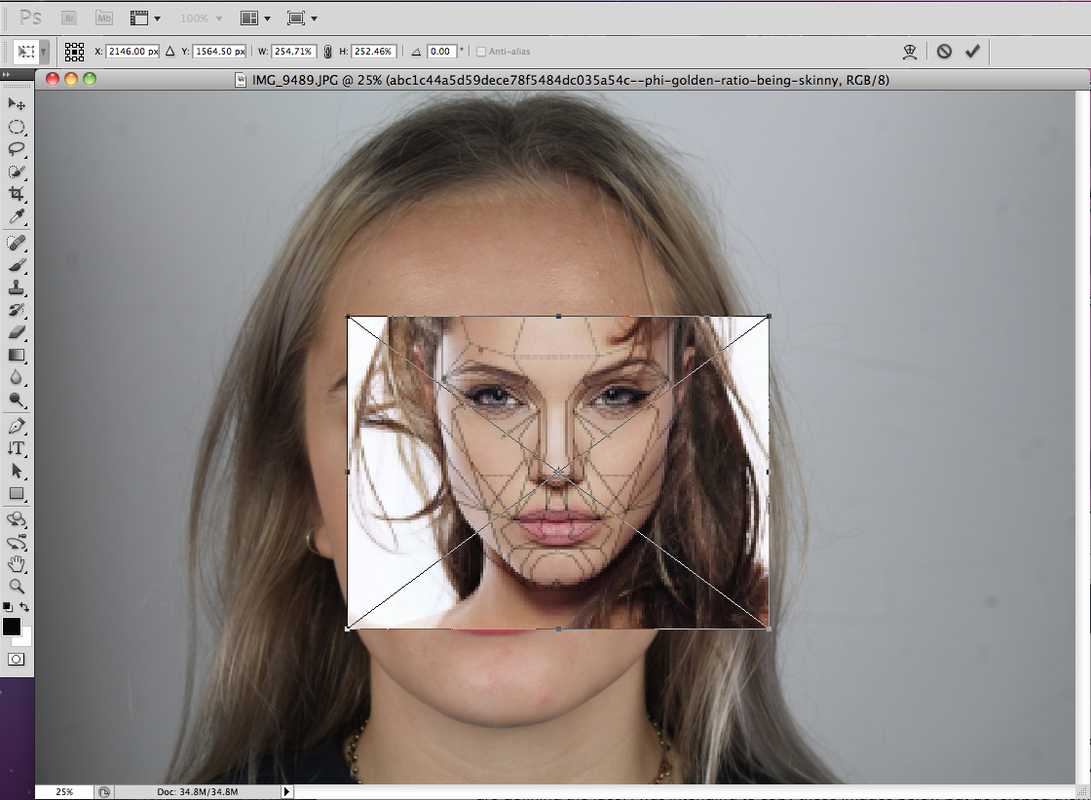
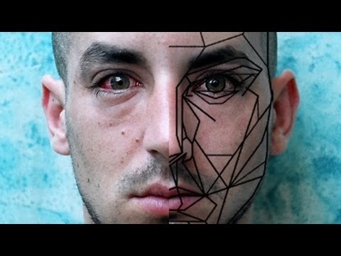
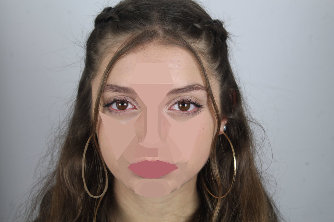
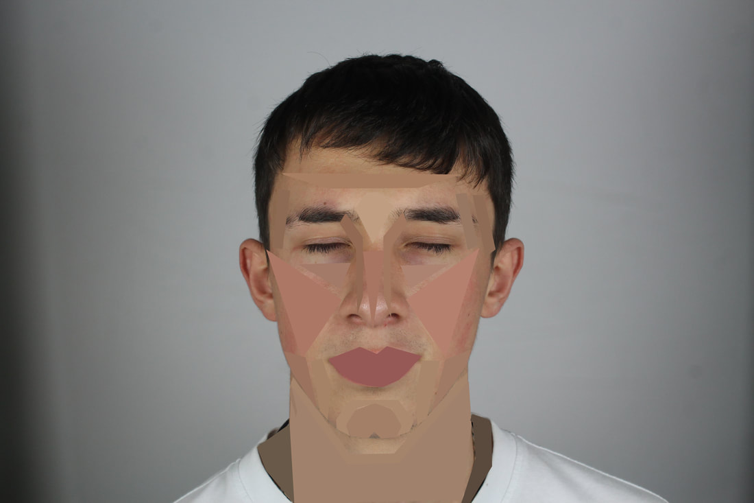
For my development I chose to get portrait shots of people, quite close up so that you can see most details and the basic structure of the face.
This development links to my strands of structure and especially structure of the face. As the lines are defining that are shown below and in my responses are defining the face. I was intending to copy these images below but developed them in my own way. I first worked in Photoshop.
This development links to my strands of structure and especially structure of the face. As the lines are defining that are shown below and in my responses are defining the face. I was intending to copy these images below but developed them in my own way. I first worked in Photoshop.
|
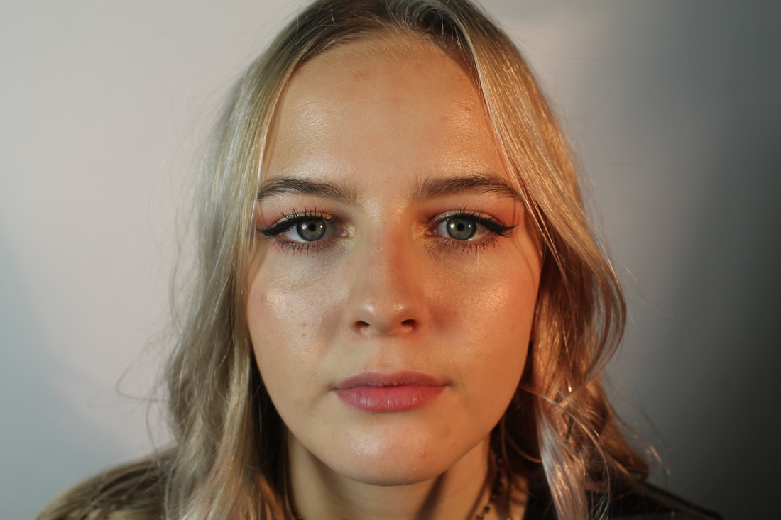
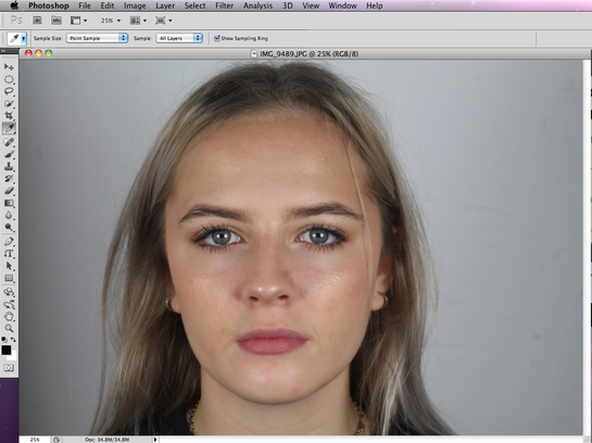
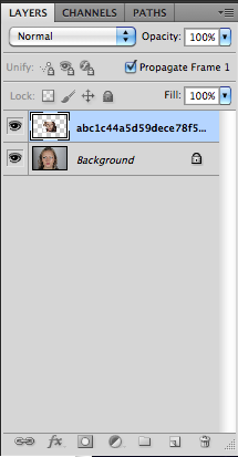
STEP 1. Open photoshop and drag your desired image into it.
|
STEP 2. I used another image found online which had lines already put onto a face, so I used this as a stencil to get more accurate lines. I also dragged this into photoshop, which then creates two layers to work on, so when you get your final image only one photo is showing with the lines perfectly drawn onto the face, outlining.
|
|
|
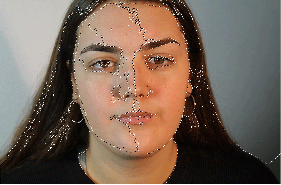
STEP 3.
In this step I placed the image with the lines on top of the photo of my model I'm using. I tried to match up the two face shapes so it would be easier to draw lines as Id be following a template and make them really symmetrical on the face I wanted to cut up. To do this you make one of the layers on photoshop opaque, there is an opacity button where you can change how transparent it is. Once you've fitted the faces together press the enter button and they will be fitted. You have to make sure you are working on a the certain layer, not the background as it wont show up on the finished thing.
|

|
|
|
|
|
Development
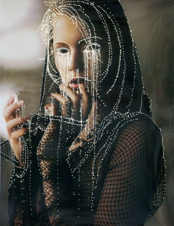
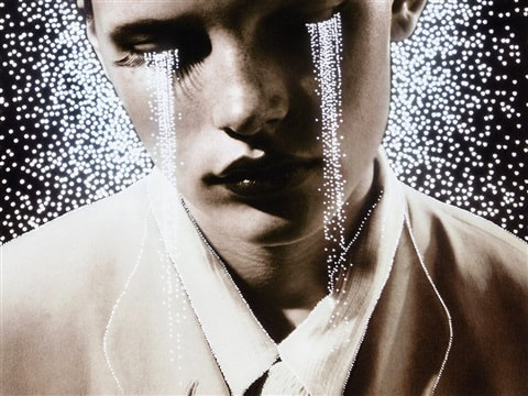
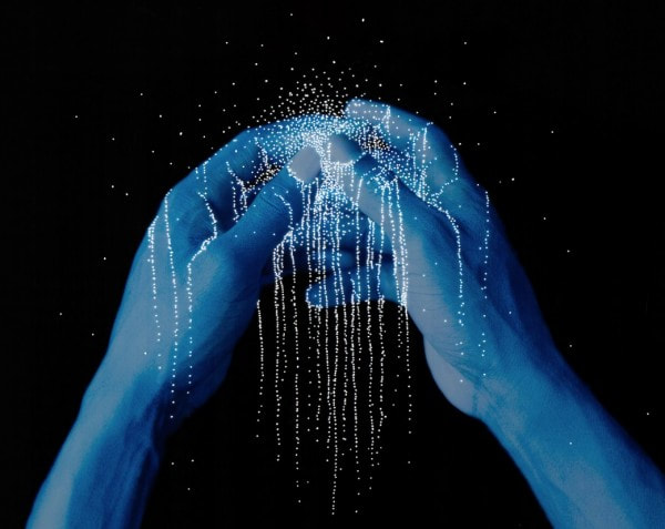
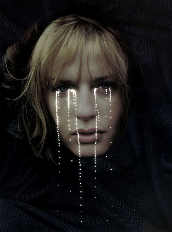
Daniele Buetti
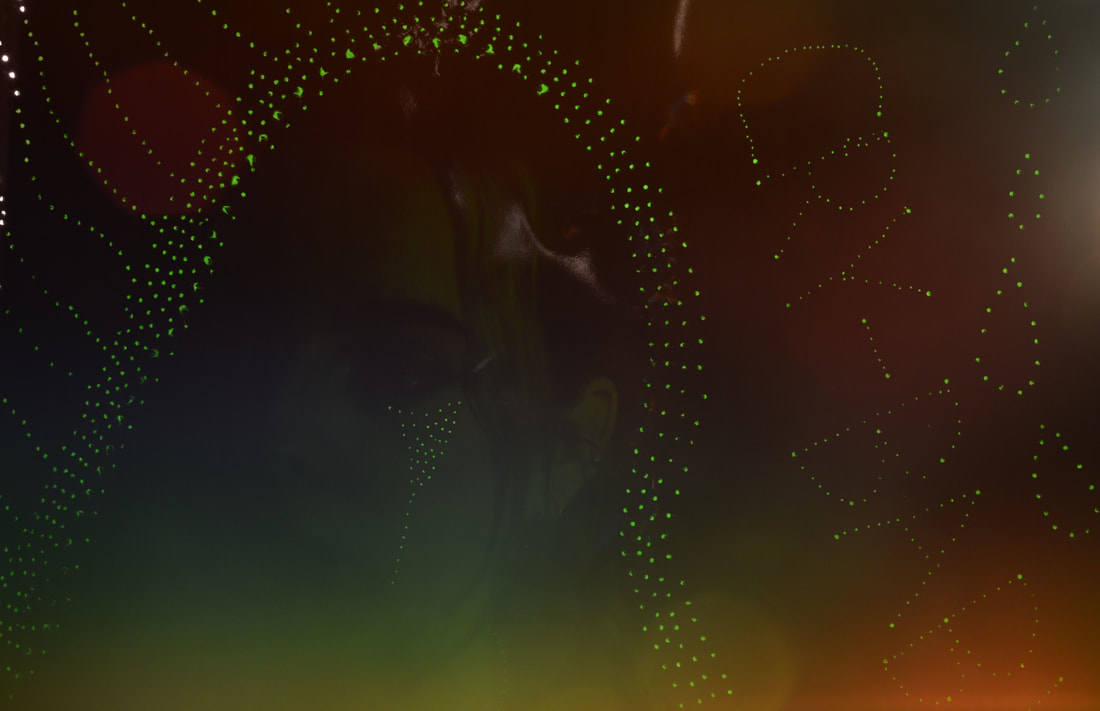
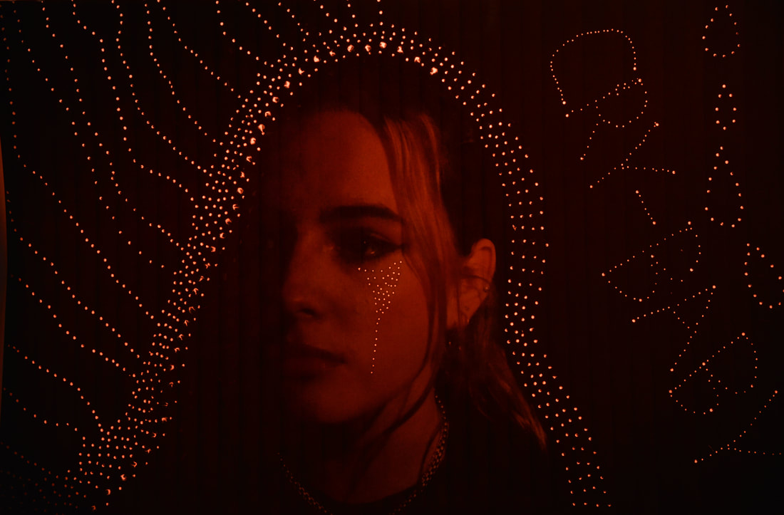
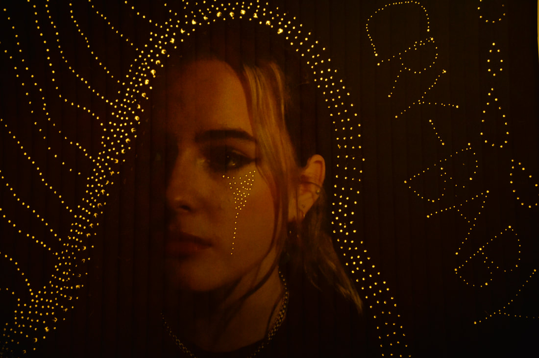
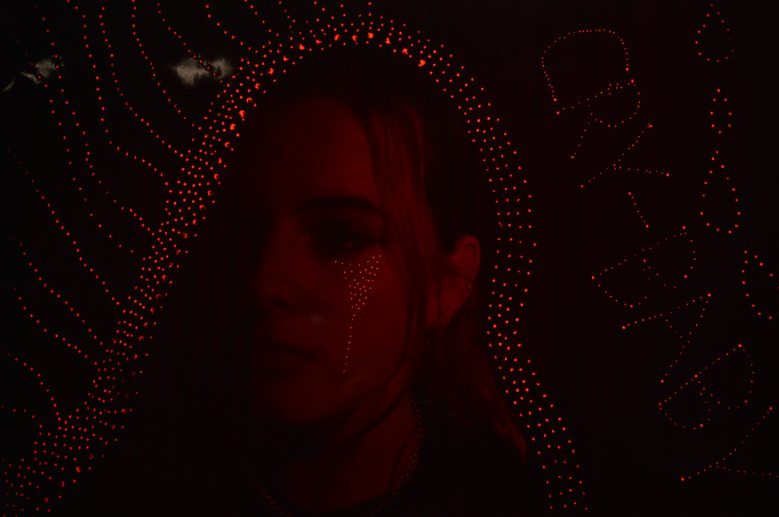
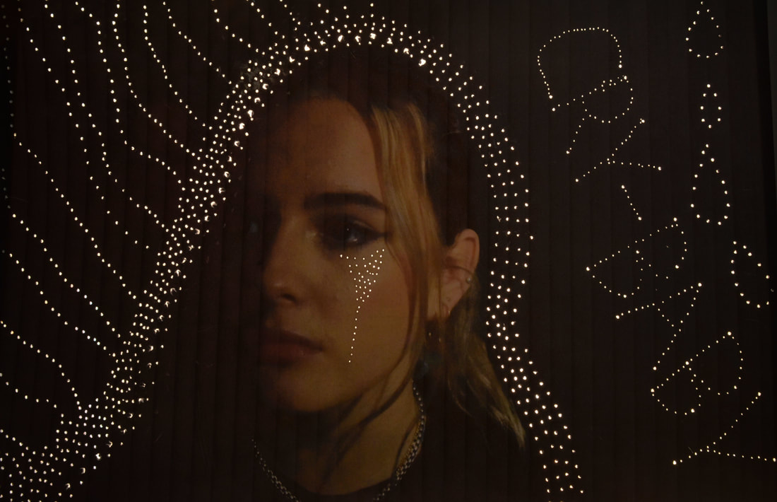
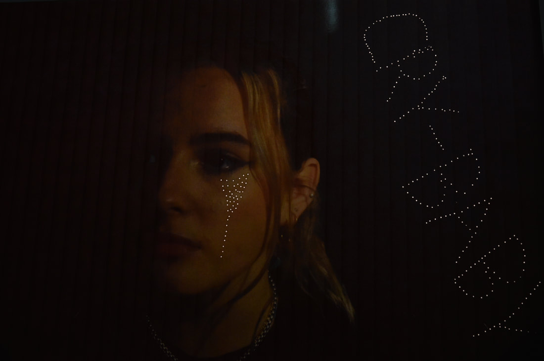
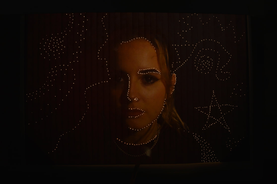
This work by Buetti is called 'Light Installation' The Swiss Artist Daniele Buetti adds a remarkable sense of his interpretation of photography in his light photos. Using a type of light box construction, Buetti punctured holes in the photographs allowing the light to seep through. The light emitted from beneath the surface of the image creates an enchanting glow to the images. Giving them an almost surrealistic touch. Buetti’s choice of photos include posed models and a few of them seem to be distressed/upset. We can tell this as in the photos the lights are placed in a way it looks like tears rolling down the models face (see all the photos below).
|
|
1
|
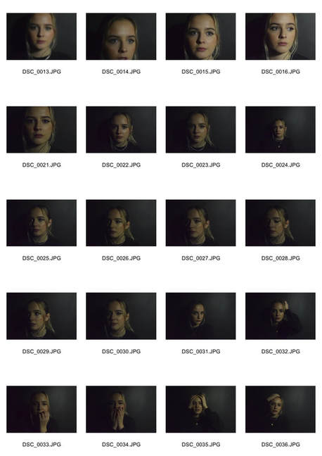
my response |
enlargements |
|
WWW: I like how my photos came out I used a tripod to avoid any camera shakiness.I also thought this would help to focus my camera better. I wanted the face to be the thing that was in focus. I also changed my depth of field around when taking the photos. I experimented with different poses and moved my lens, I found the best photos where the ones taken with the lens extended. It captured the face in just the way I wanted. One thing was that my photos came out slightly blurry. EBI: Change my exposure and play around with the lighting, e.g. more light and less light. Also change camera, use a different lens. I would also make the photos sharper and much clearer. I would also change the angles I photograph from, I wouldn't use a tripod however.
|
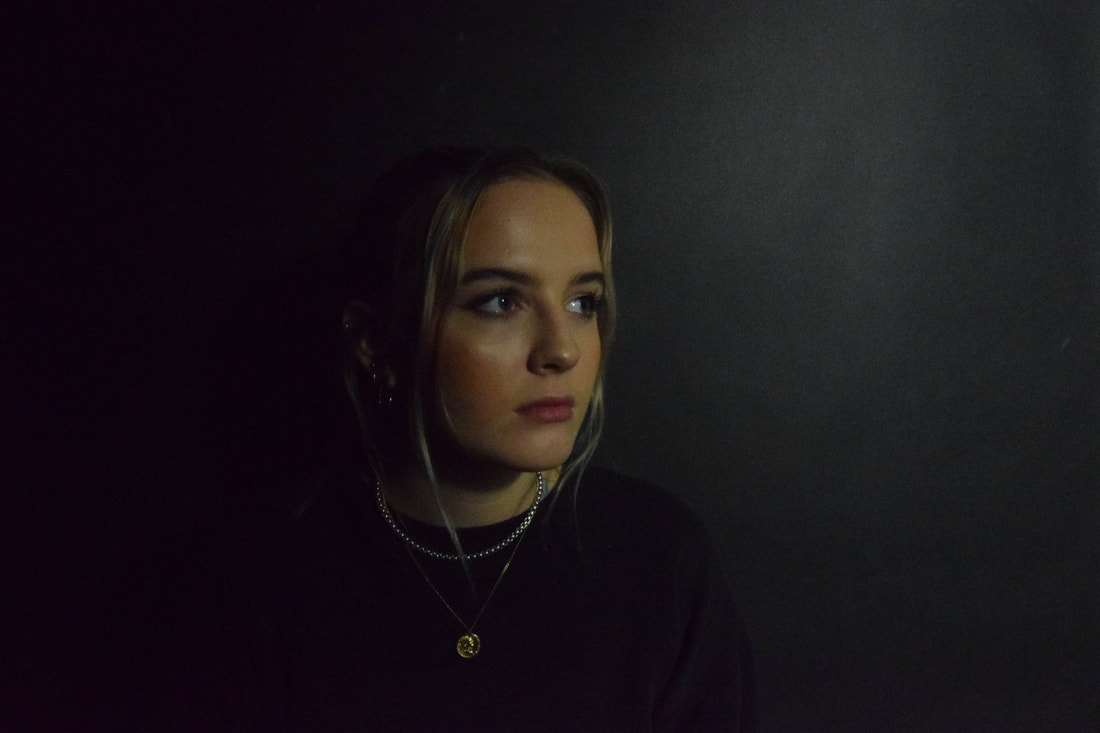
In my response I have started with taking the photo which I am later going to put holes through and shine a light through to follow in Buettis footsteps. I chose to try and recreate the photo above (I have labelled it number 1). To take the photo I turned the room lights off and used a black backdrop and then a bright studio light, I wanted the background to be as dark as possible just like Buettis face and then have the models face to be the only thing lit up. I wanted to do this to create shadowing and to make sure when I poked holes through the photo for it to look as real as possible, what I mean by this is like the light is natural, as if there was a lighted background it wouldn't work the way I want to present the photo. My next step is to shine the light through the holes and take the photos. When I print I am going to print a few so I have different photos to experiment with and make different light patterns.
|
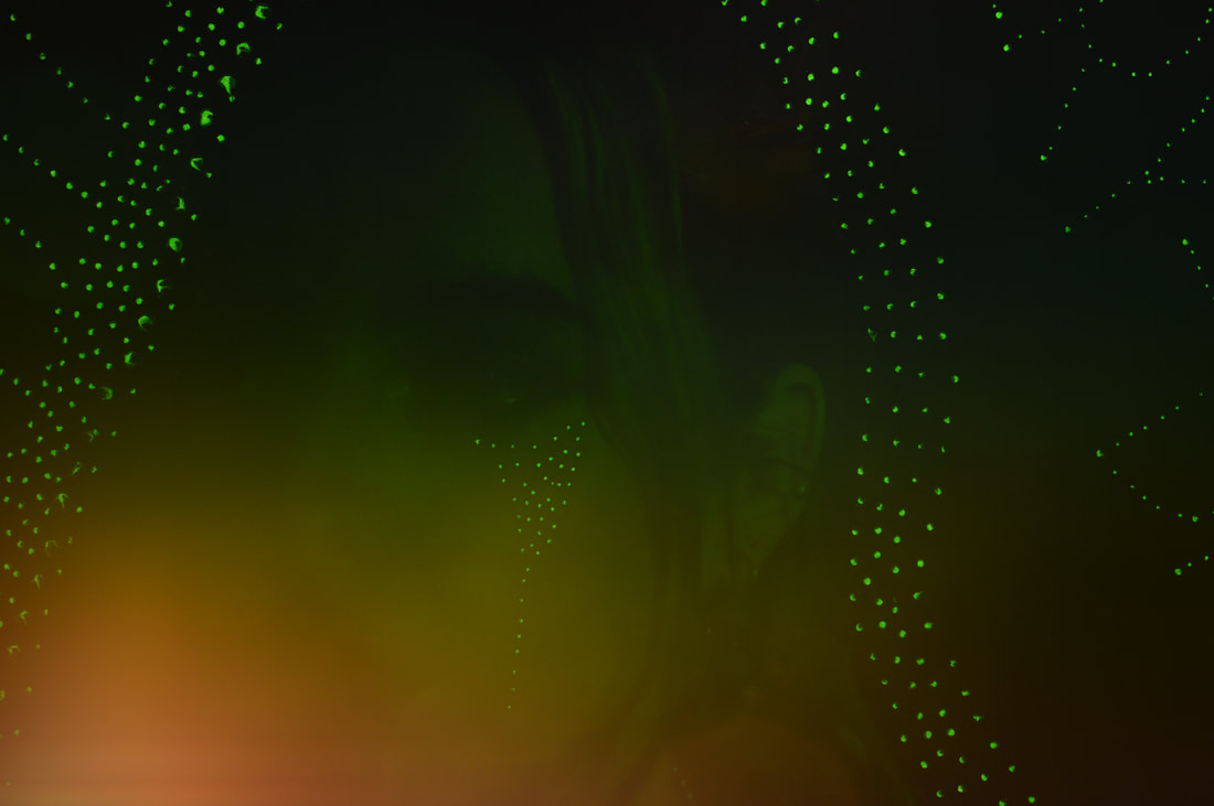
Miharu Matsunaga
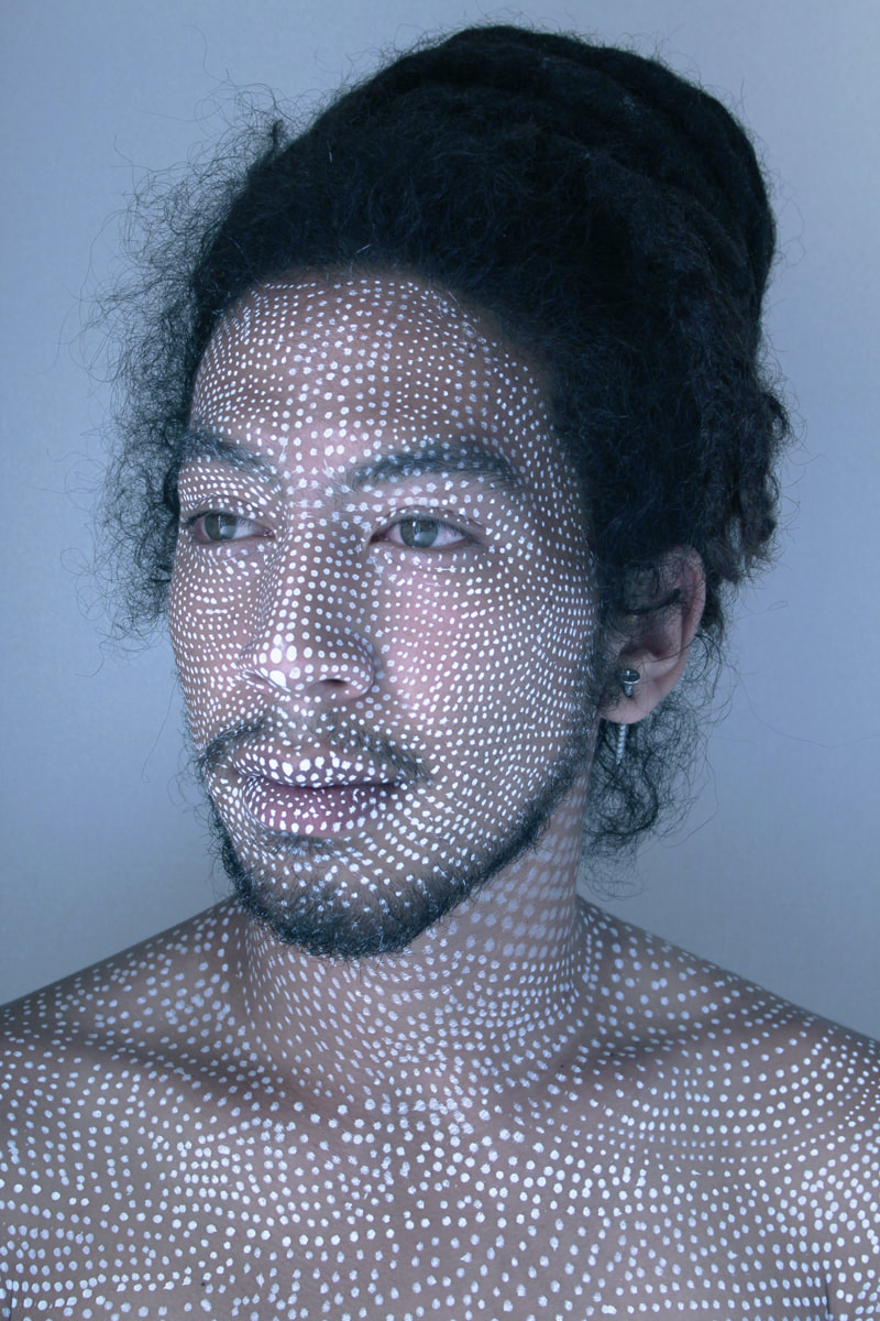
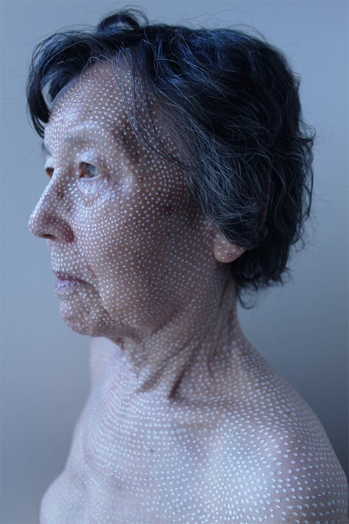
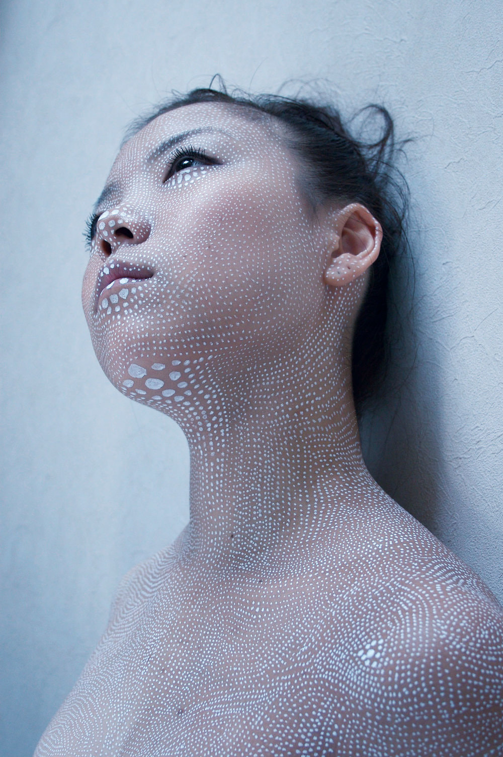
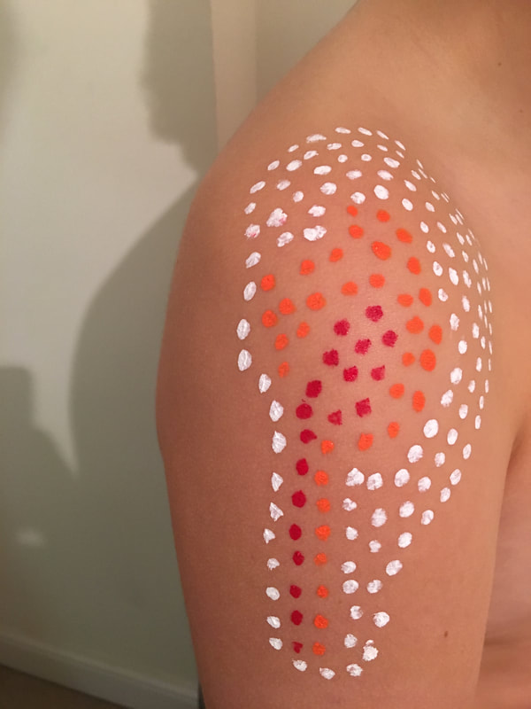
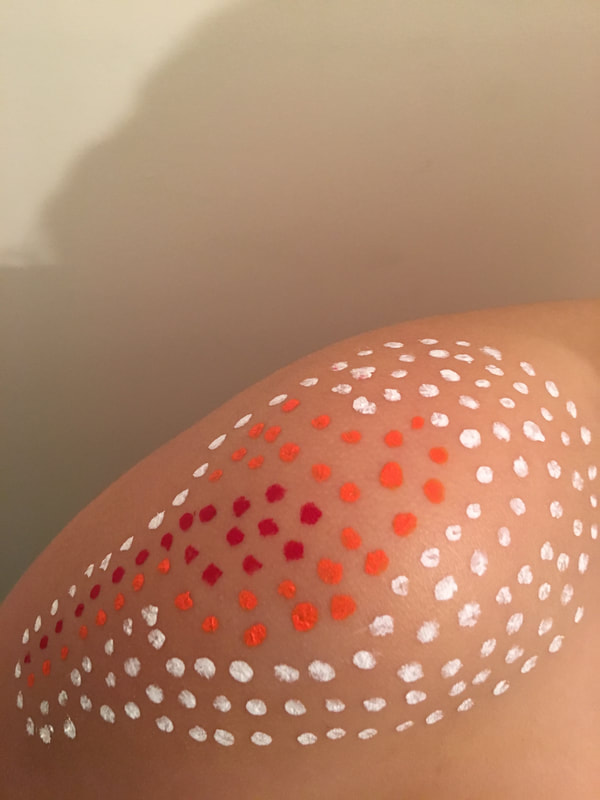
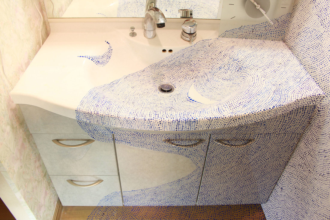
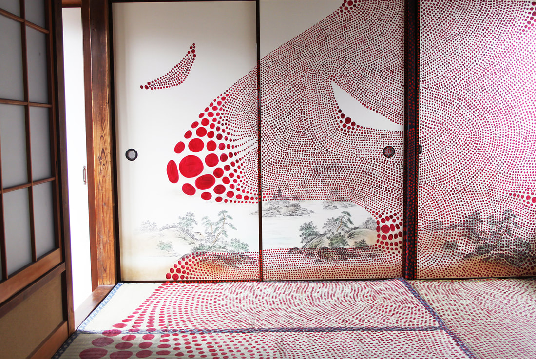
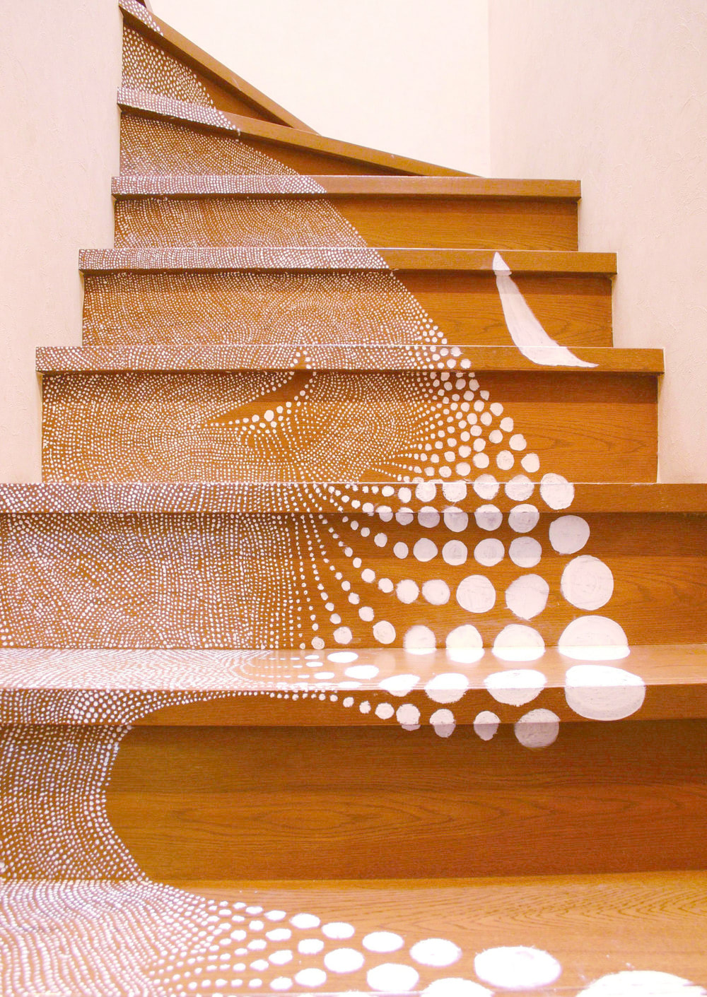
Matsunagas images below are from a series called Ten Ten. Artist Matsunaga paints thousands of painted dots, ranging in sizes all over the body.Matsunaga has been exploring the interconnectedness of people and places in two recent projects, this being one of them. The delicate white dots are meant as a visual display of the often neglected and forgotten interconnectedness between “family, parents, sister, friend, man, woman, adult, baby, race,” and people of different languages. ' Matsunaga decided to painstakingly hand-draw hundreds of dots across the human body. The result is dazzling as it is obfuscating. The different races, ages and genders blur together on the canvas as if to say, we are one massive painting.'
Matsunaga creates mysterious images, she does this by incorporating the lighting and colour together to make cold darker images. I think Matsunagas work is really eye-catching. The thousands of dots are really mesmerising. They almost don't look real at first glance as they are quite symmetrical and as there are so many dots. The photos look like they have been edited and like its a been through a computer programme. The dots bring out the features and details on the models faces. I think there are themes of identity and society in the artists work. The dots are built up on the skin, just like our body is built up by hundreds of cells. Different people have different patterns/ sizes of dots, because they are diverse from each other, nobody is the same. I think its about identity. The dots are showing identity but also hiding out.
Matsunaga creates mysterious images, she does this by incorporating the lighting and colour together to make cold darker images. I think Matsunagas work is really eye-catching. The thousands of dots are really mesmerising. They almost don't look real at first glance as they are quite symmetrical and as there are so many dots. The photos look like they have been edited and like its a been through a computer programme. The dots bring out the features and details on the models faces. I think there are themes of identity and society in the artists work. The dots are built up on the skin, just like our body is built up by hundreds of cells. Different people have different patterns/ sizes of dots, because they are diverse from each other, nobody is the same. I think its about identity. The dots are showing identity but also hiding out.
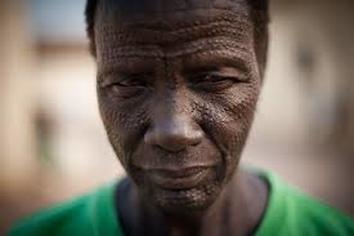
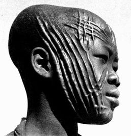
tribal scarification
Scarifying (also scarification modification) involves scratching, etching, burning / branding, or superficially cutting designs, pictures, or words into the skin as a permanent body modification. In the process of body scarification, scars are formed by cutting or branding the skin by varying methods (sometimes using further sequential aggravating wound healing methods at timed intervals, like irritation), to purposely influence wound healing to scar more and not scar less.
Body marking has been used for centuries in parts of Africa to indicate a person's tribal heritage. It's becoming less common but some people still want to carry the marks of their ancestors.
|
|
|
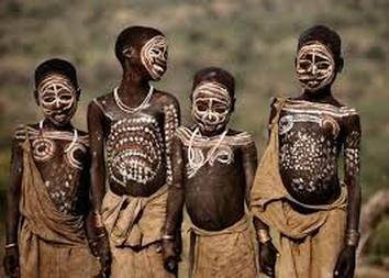
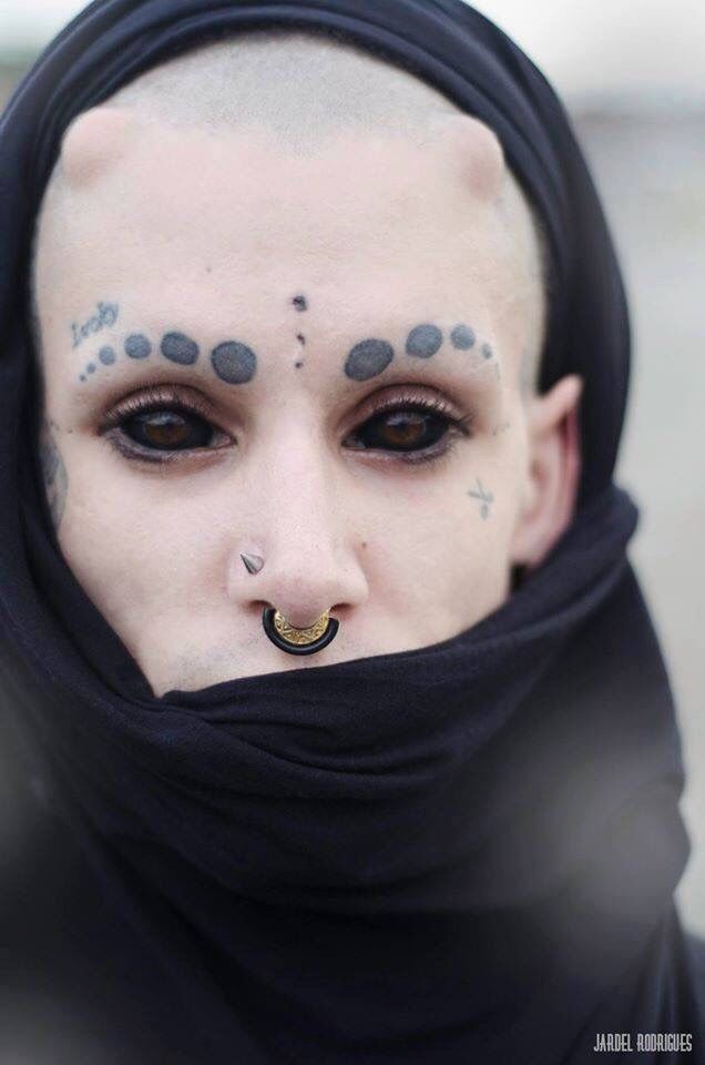
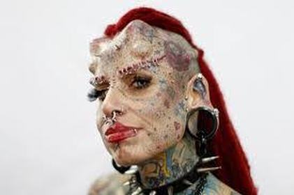
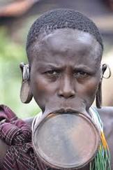
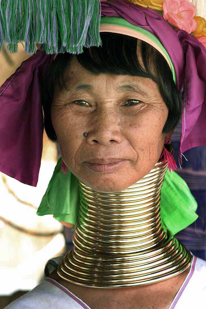
body adornment/enhancement
|
An adornment is generally an accessory or ornament worn to enhance the beauty or status of the wearer. They are often worn to embellish, enhance, or distinguish the wearer, and to define cultural, social, or religious status within a specific community. Enhancing your body is changing in, adding to it for example dyeing the whites of your eyes or removing bones of even adding things -------> e.g the horns on this persons head (which aren't natural they have been added).
|
|
|
|
|
|
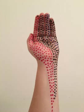
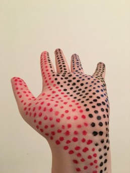
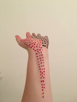
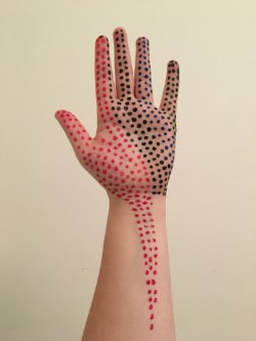
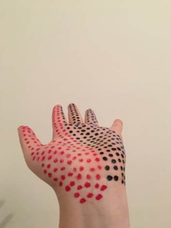
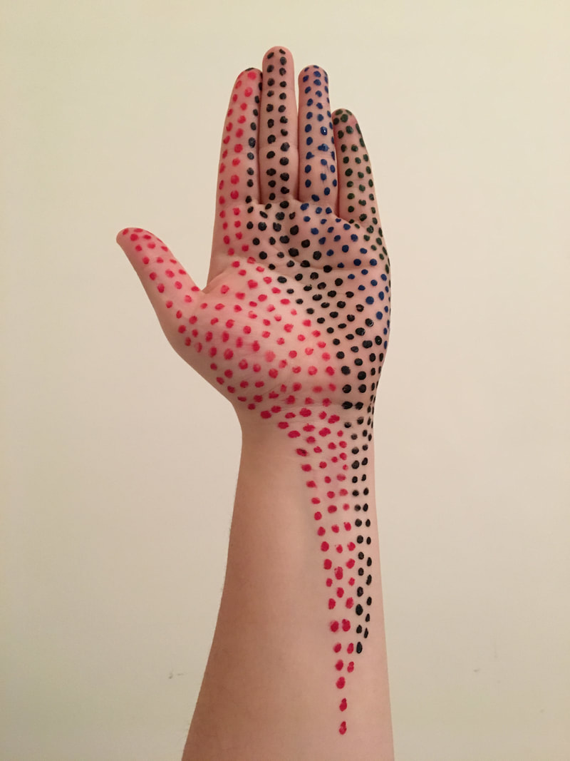
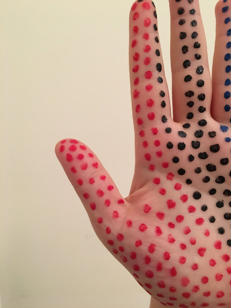
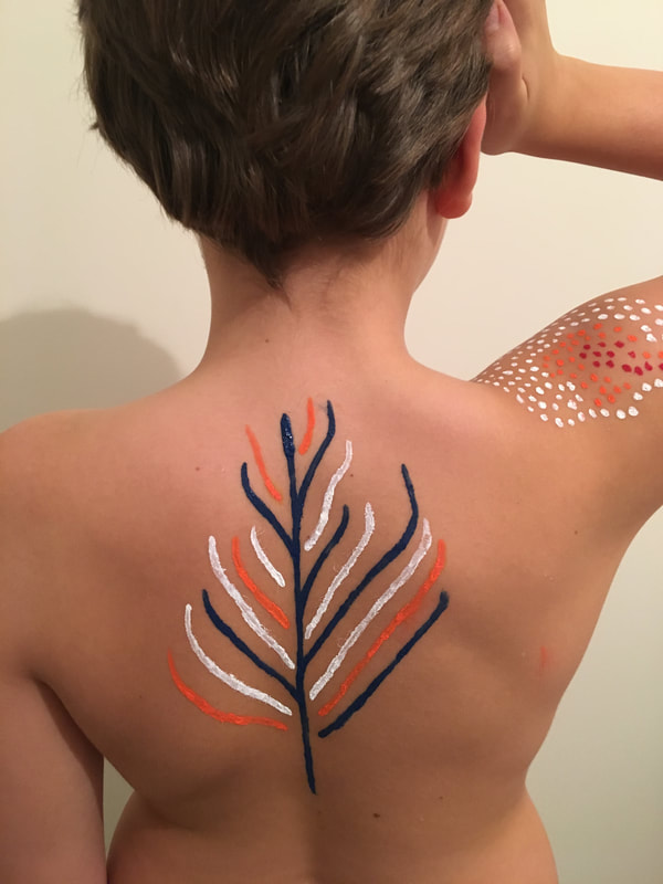
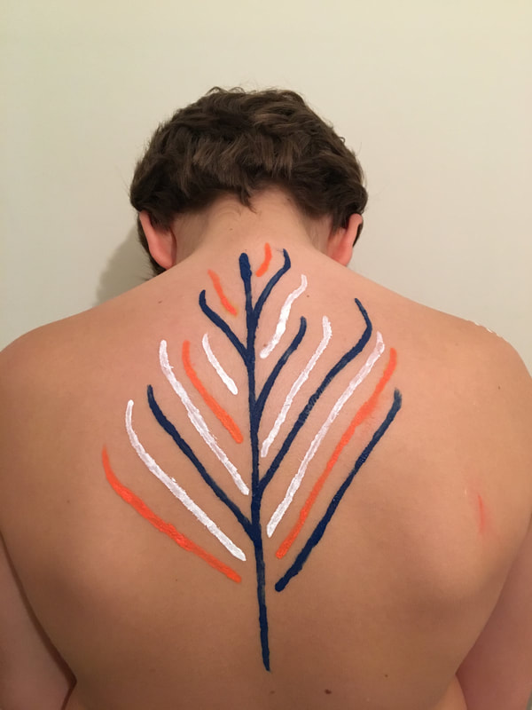
my response
My intention was to recreate Matsunagas work but using more specific parts of the body rather than a larger area, in my first response anyway. My EBI: Is to create a second response with primarily one colour and use a larger space and cover more of the body. I first used my hand and painted colourful dots instead of the plain white, in the artists photos the white painted dots really looks good with tone and colour in the picture, it looks icy and cold and the skin is pale so the white looks like its imprinted into the body, sort of looking like a robot. In my response I worked around the veins on my arm and the lines on my hand to show structure through this development. I used the red to represent blood and the black and blue generally look good and bold on my skin. I made sure the background was plain so my hand was the main focus, although EBI when I re- do this I am going to make sure there are no shadows. Also I'm going to experiment with my brightness/darkness. Also use different backgrounds.
|
|
|
|
|
|
|
|
|
|
|
|
another project: TEN TEN OHTERS
Another piece of work by
|
|
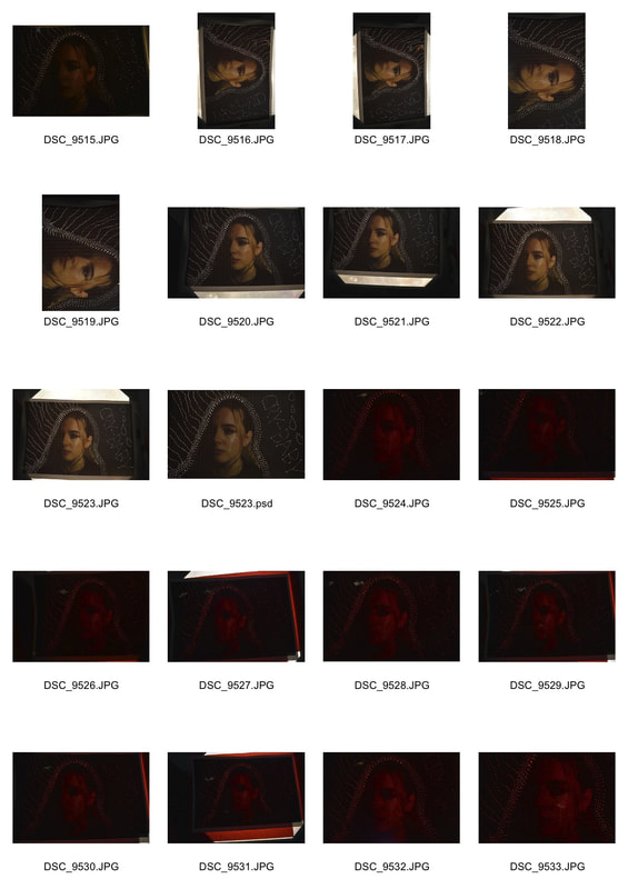
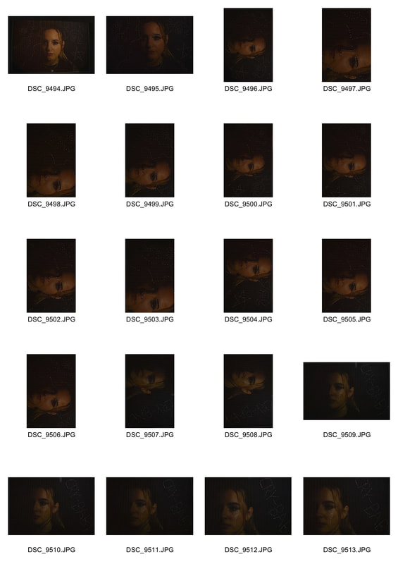
MOCK EXAM WORK
I decided to develop my photos and incorporate Daniele Buettis work. I wanted dark photos so the dots of light would look really effective. I used a light box and placed the photos over the top of the machine so the light streamed through the holes. To experiment I used coloured sheets of paper and put them under the photo so when the light came through there were different colours. To further develop I would take a wider range of photos and do different pin designs rather than using the same photo, Id like to make the colours link to the design of dots.
|
|
|
|
|
|
|
|
|
|
|
