pinterest board titled Secrets,Codes and Conventions.
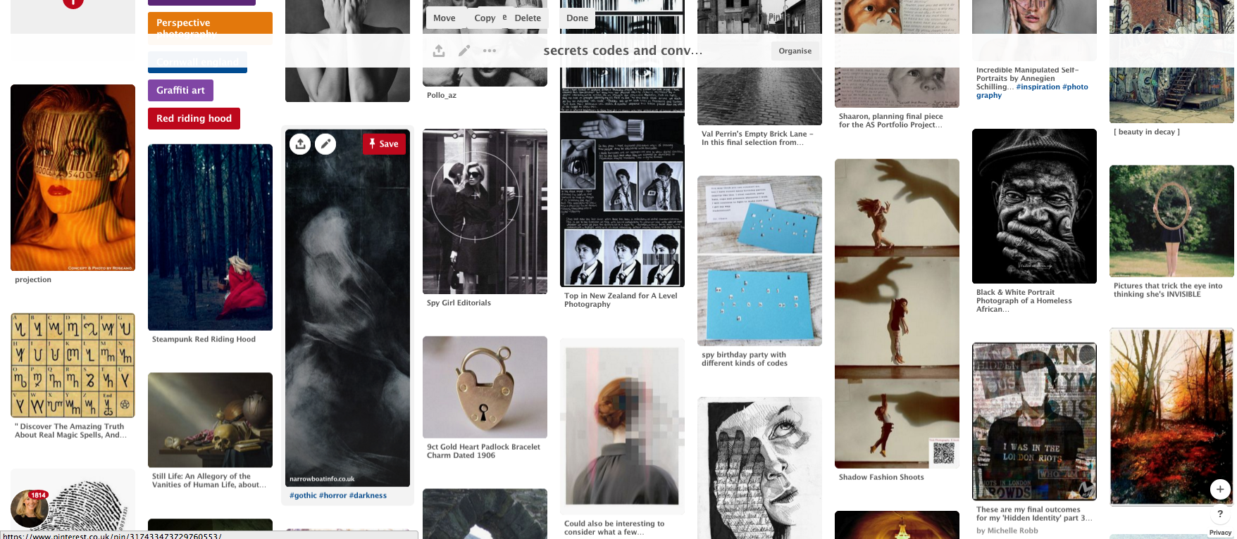
• rules, rituals, etiquette, procedures, conformity, oppression, masks, disguises, camouflage, costumes , oceans, forests, caves, smog, night
• hieroglyphs, codes, Braille, runes, fonts, single-celled organisms, parasites, cocoons, shells, dens, the Underground, tunnels, cracks, catacombs
• magic, theatre, espionage, Bletchley Park, lies, deceit, tragedy, romance, exploration, discovery, archaeology, metal detecting
• science, knowledge, astronomy, space, diving, caving, orienteering, cellars , hide and seek, pass the parcel, gambling dice
definitions -
|
|
|
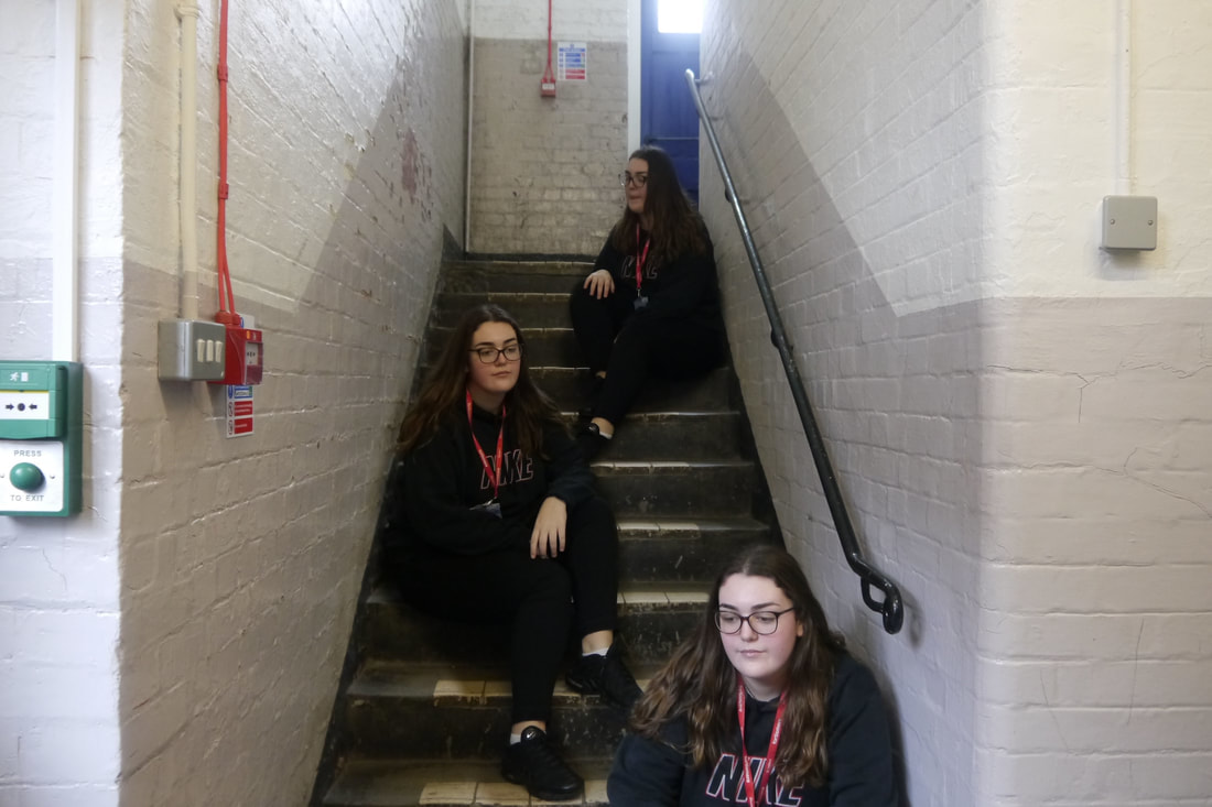
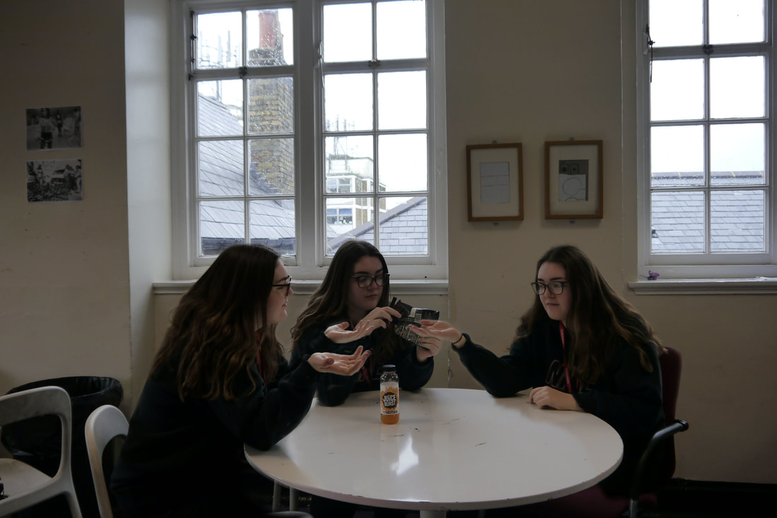
the conversation
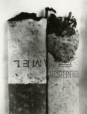
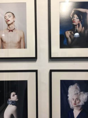
link artist - Paul M Smith
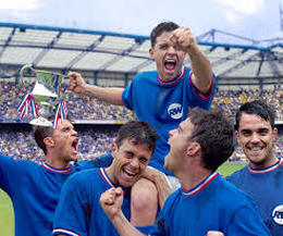
- The publicity surrounding Artists Rifles and Make My Night had by now extended beyond the denizens of the fine art world and had bought Paul's work to the attentions of Tom Hingston, the graphic designer responsible for many of Robbie Williams' record covers including Sing When You're Winning.
- The chosen theme for the project was Robbie's love of football, a hitherto closed book for Paul and Tom. For research purposes they attended an Arsenal v Chelsea game. The ideas with which they came away were about the whole experience of going to (and playing) football. The vast hoard of football photography and paraphernalia gave Paul additional inspiration for the pictures and he used the nostalgic charm of past records to complement the glamour of the modern game.
- In a light-hearted take on Paul's previous work, Robbie was to be his own fantasy football team; plus opposition, management, fans, touts and policemen. Unlike his other projects, Paul had to complete the shoot in three days and the whole project, from initial research to the finished body of work, in three months. A task that would ordinarily take a whole year.
|
|
|
|
|
our response
For my first response to 'The Conversation' I created this image on Photoshop using photos already taken by somebody else. I cut out and copied each layer and then pasted it on the image with just the background.
WWW- I created a first response to 'The Conversation' and learnt new Photoshop techniques.
EBI- I had zoomed in on each layer so i could use the brush tool to erase closer up details. I create my own response using photos that i have taken.
WWW- I created a first response to 'The Conversation' and learnt new Photoshop techniques.
EBI- I had zoomed in on each layer so i could use the brush tool to erase closer up details. I create my own response using photos that i have taken.
|
|
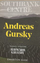
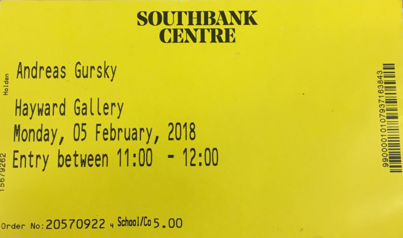
Exhibition Visit: Andreas Gursky @ The Hayward Gallery, Southbank.
|
|
|
|
|
|
Review of Gursky
The exhibition is exploring Gurksys work that hes produced over 4 decades, ranging in all of his projects. Gurskys art has been driven by his insight into forms of collective existence. In order to capture these amazing scenes he has developed ways of creating monumental photographs whose pronounced physical presence is matched by their unprecedented clarity. Along with his frequent use of distant viewpoint, this approach has produced pictures that feature a dizzying quantity of detail and highlight formal patterns. His exhibition was full of colour and eye-catching images. There were tons of different themes and controversial topics that had been photographed in the exhibiton, I enjoyed it mostly because there was a good variety of styles and themes of photographs.
Background:
Andreas Gurksy was born in 1955 in Leipzig, East Germany. He moved to the west and grew up in Dusseldorf. Gursky studied photography at the Folkwang University of the Arts and Dusseldorf Art Academy. He is known for his large format architecture and landscape colour photographs, often employing a high point of view.
|
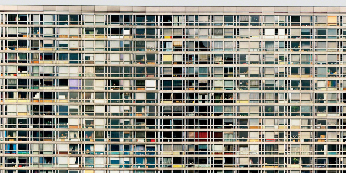
The place in the photo is Paris, Montparnasse. 1993. The photo is actually two photos spliced together and was taken from a hotel lobby across the road. The photo shouts out 'modernism' it is taken in an urban, developed scene and it looks distant but it is what we live in. I really love the photo as all the windows are the same size but every single one looks different and every one has a different story and a different persons life behind it. It is 75 flats all together. Your eyes are drawn into each individual window and wondering how the spaces are occupied. There are also lots of different, but slightly dull colours dotted around. I think the photograph is all about perspective, I really love this one, I think it was my favourite from the whole exhibition.
|
|
|
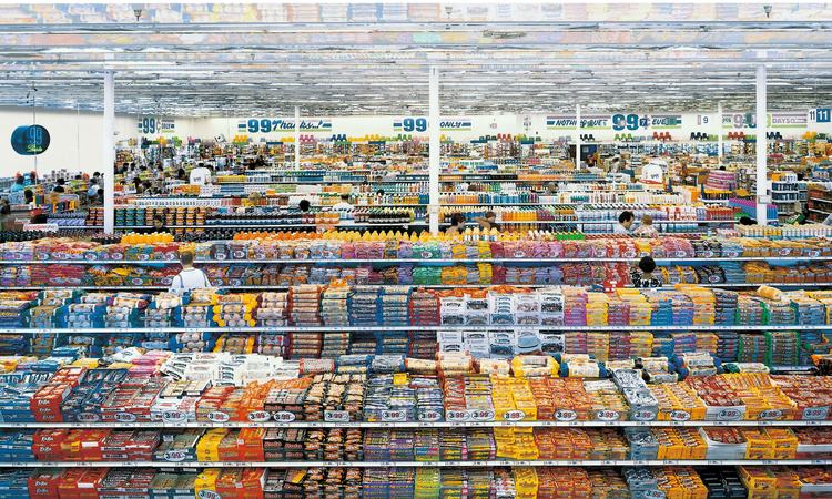
This photograph is called '99 cent' and was taken in 2009. This is a famous image by Gursky. It once went for 1.7 million pounds in an auction. This photo is all about 'consumerism'. Its a confusing image as its actually lots of images stitched together. It has lots of viewpoints and no viewpoints in a certain way. All of the objects have been reflected into the ceiling, it seems very full. The colours are stand out alot, I think they have been edited and brightened up. The photo has a sort of negative idea about us as humans, consuming all this sugar for very little amounts, and how much of it there actually is in the world. In the photo it is all piled up. The image is very full, sort of claustrophobic, there are lots of things you could say.
|
|
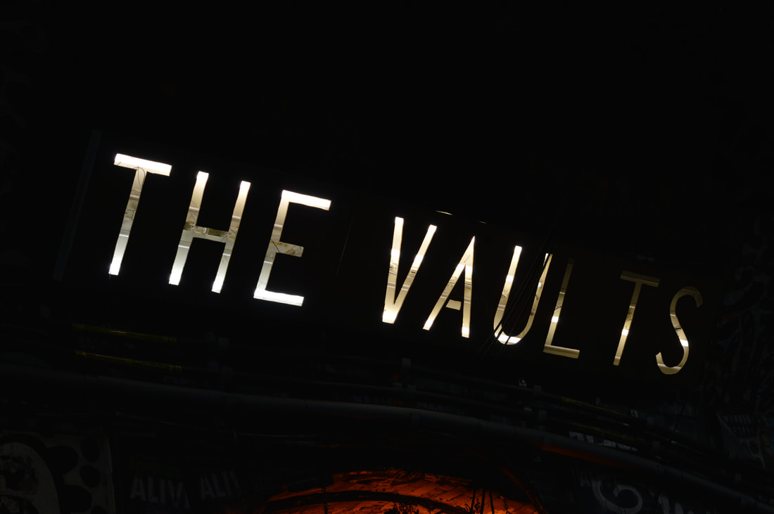
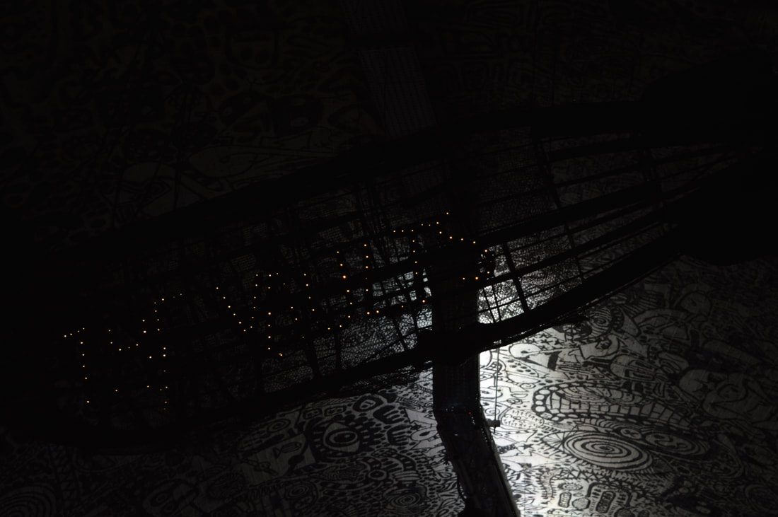
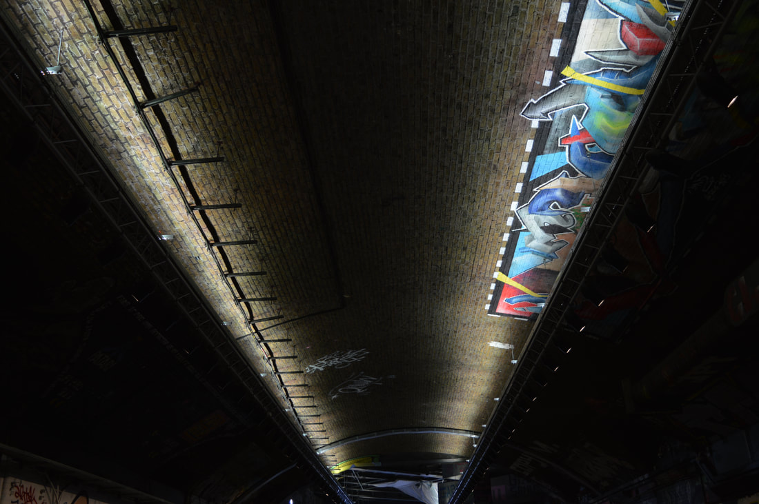
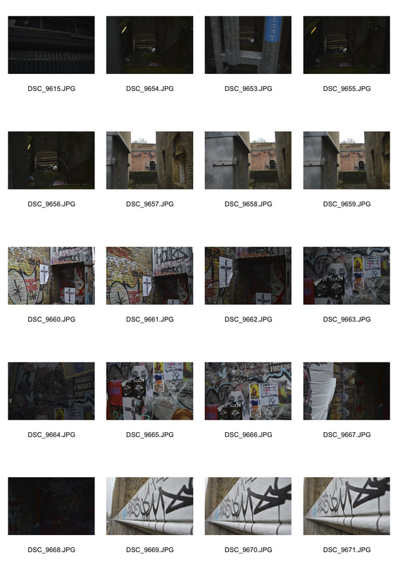
Southbank walk -
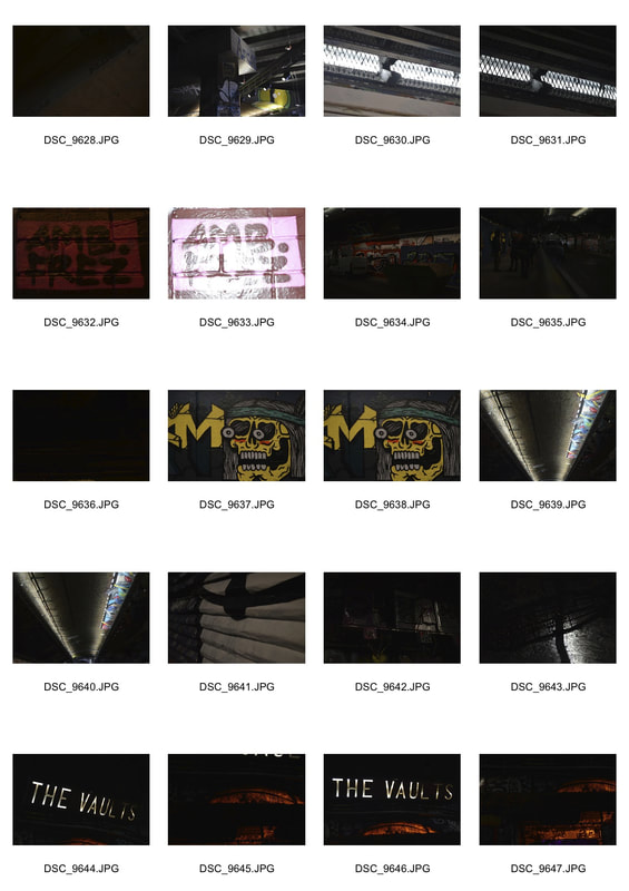
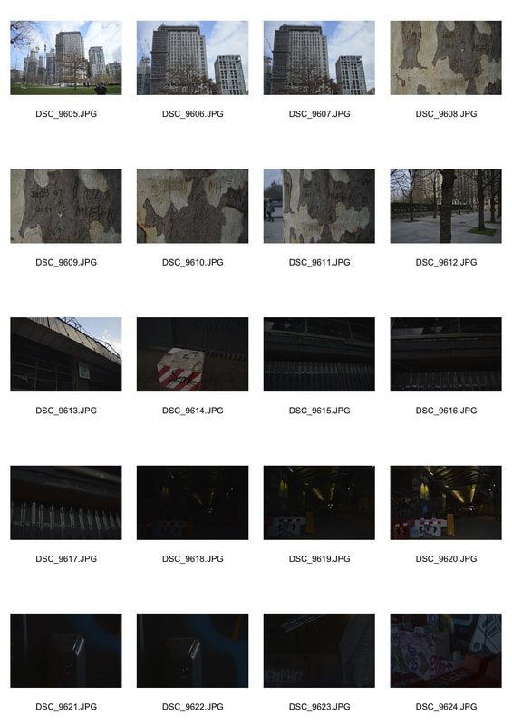
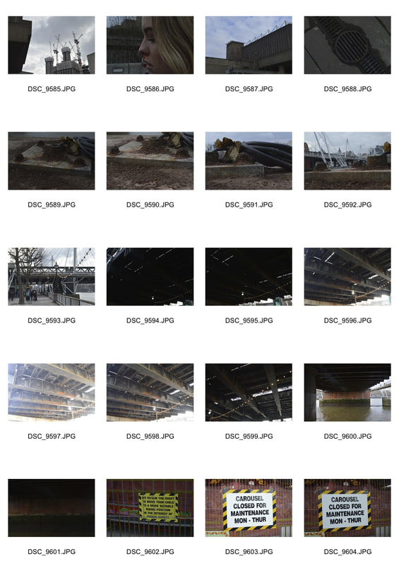
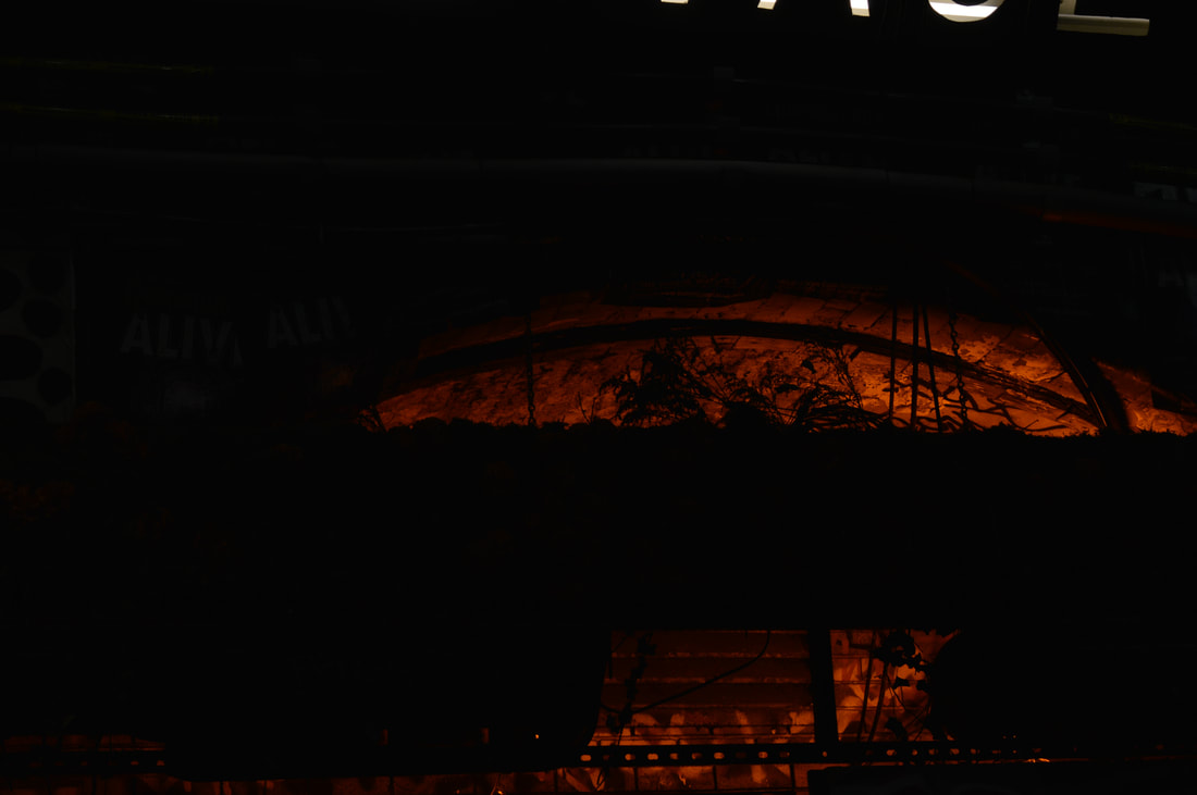
After visiting Gurskys exhibition, I went on a walk along South Bank, mainly photographing buildings and streets. There was also lots of opportunities to take photos of graffiti and different logos and stickers, which caught my eye. Whilst photographing I was thinking about the key words of our theme: Secrets, Codes and Conventions. On the South Bank I captured lots of graffiti and we also walked through a very tall tunnel which was covered in graffiti and messages, there were also lights incorporated which added a really nice touch.
WWW - I think I stuck to the theme well and also captured some really clear images.
EBI - Visit other parts of London, and using he same theme capture a wider variety of photographs.
WWW - I think I stuck to the theme well and also captured some really clear images.
EBI - Visit other parts of London, and using he same theme capture a wider variety of photographs.
|
|
|
enlargements

HALF TERM WORK - Changed Landscape - Bomb Sites
The Bomb Sight project is mapping the London WW2 bomb census between 7/10/1940 and 06/06/1941. Previously available only by viewing in the Reading Room at The National Archives, Bomb Sight is making the maps available to citizen researchers, academics and students. You can now explore where the bombs fell and discover anecdotes and photographs from the period.
The project has scanned original 1940s bomb census maps, geo-referenced the locations and digitally captured the geographical locations of all the bombs recorded on the original map.
The site enables us to go back and see the landscapes across London that were bombed and consequently had their meaning and context changed through regeneration, building and, as a result, lost memories of a past generation.
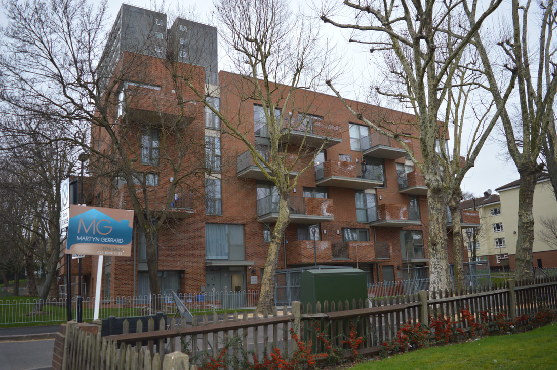
In this task we had to photograph what used to be bomb sites, it was interesting to see how much the area has changed. I looked at the map which I have attached below, there are tons of different places that used to be bombsites around our area and I photographed quite a few of them, I've made a list of the places I visited below also.
- Park Road
- Middle Lane
- Tottenham Lane
- Crouch Hill
www.bombsight.org/ <------ MAP OF BOMB SITES
park road
|
|
middle lane
|
|
tottenham lane
|
|
 crouch hill
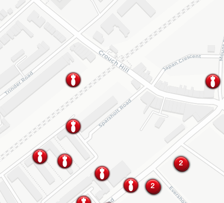
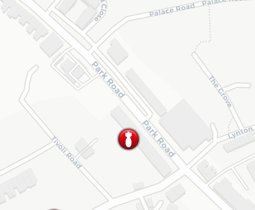
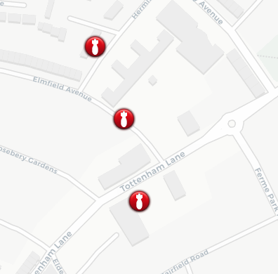
Below are the maps of the bombsites I photographed, where the red circles are is where bombs where found or where they were recorded close to. The locations are Crouch Hill, Park Rd and Middle and Tottenham Lane.
- High-Explosive Bomb recorded close to: Trinder Road, London Borough of Islington, N4 4BY, London
- High-Explosive Bomb recorded close to: Sparsholt Road, London Borough of Islington, N4 4BY, London
- High-Explosive Bomb recorded close to: Elmfield Avenue, Crouch End, London Borough of Haringey, NW3 4QG, London
- High-Explosive Bomb recorded close to: Park Road, Crouch End, London Borough of Haringey, N17, London
- High-Explosive Bombrecorded close to: Wolseley Road, Crouch End, London Borough of Haringey, N17, London
|
|
|
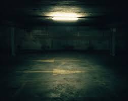
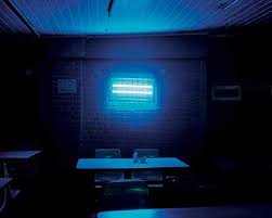
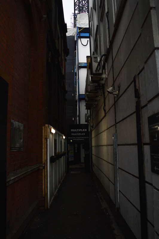
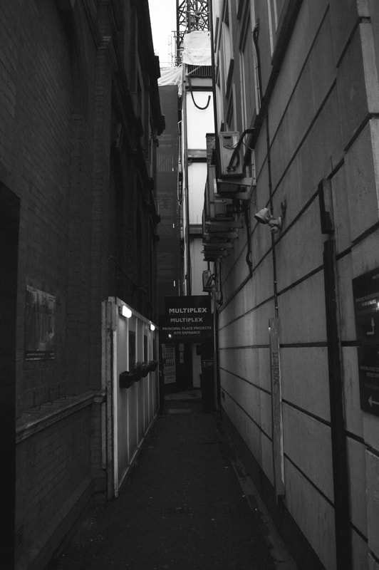
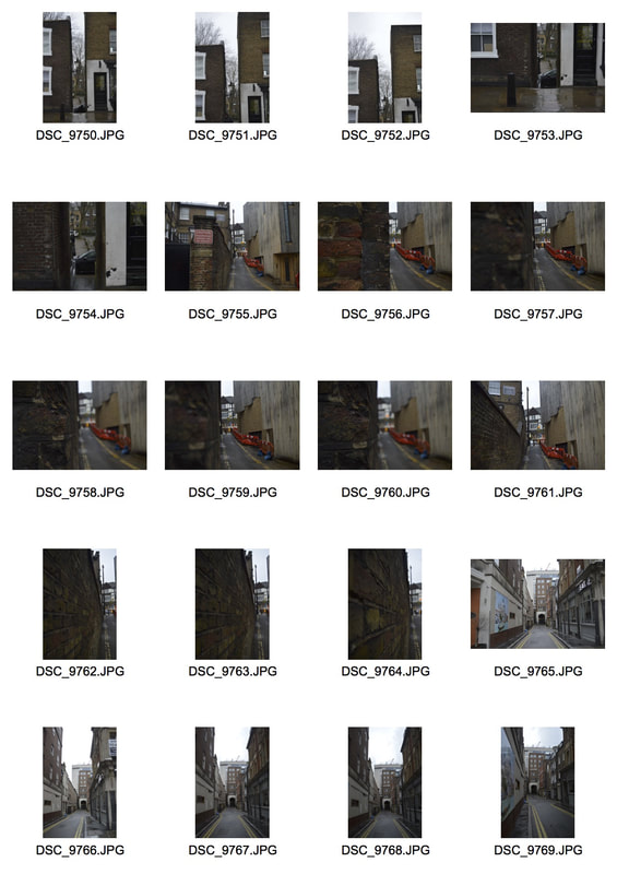
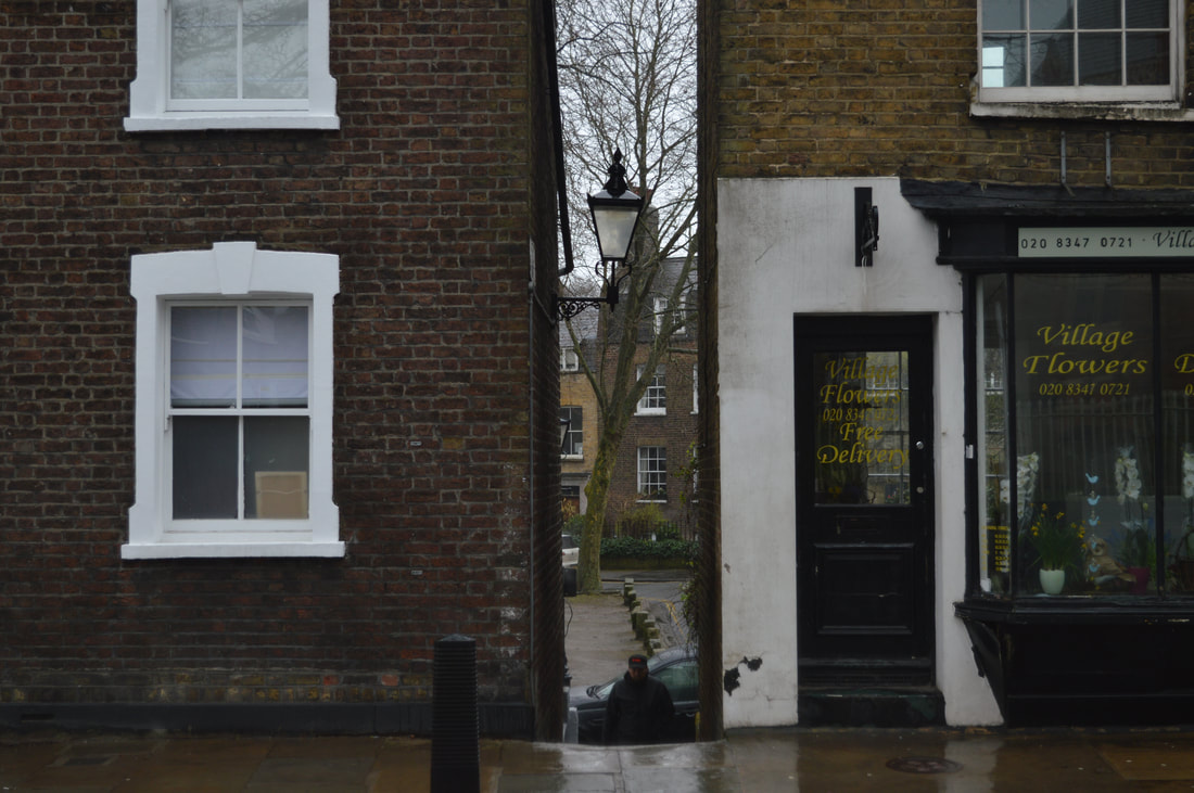
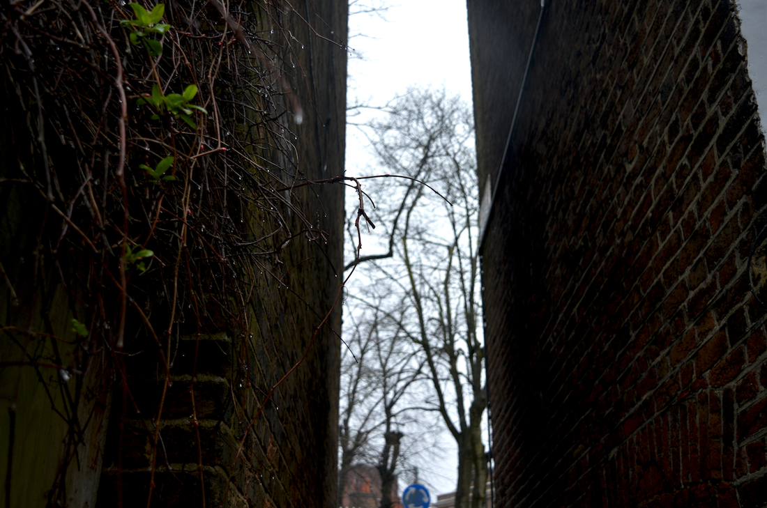
Hidden from normal view - set task
In his project 'White Night' - Giles Coulon takes photographs of hidden places that invite us to imagine the atmosphere of different parts of the city and of each spot lit place. Be it in a restaurant, in the entrance hall of a building, in the street or in an underground car park, each photograph inspires the viewer to look at these very familiar and unfamiliar places under a whole new light.
|
|
|
|
|
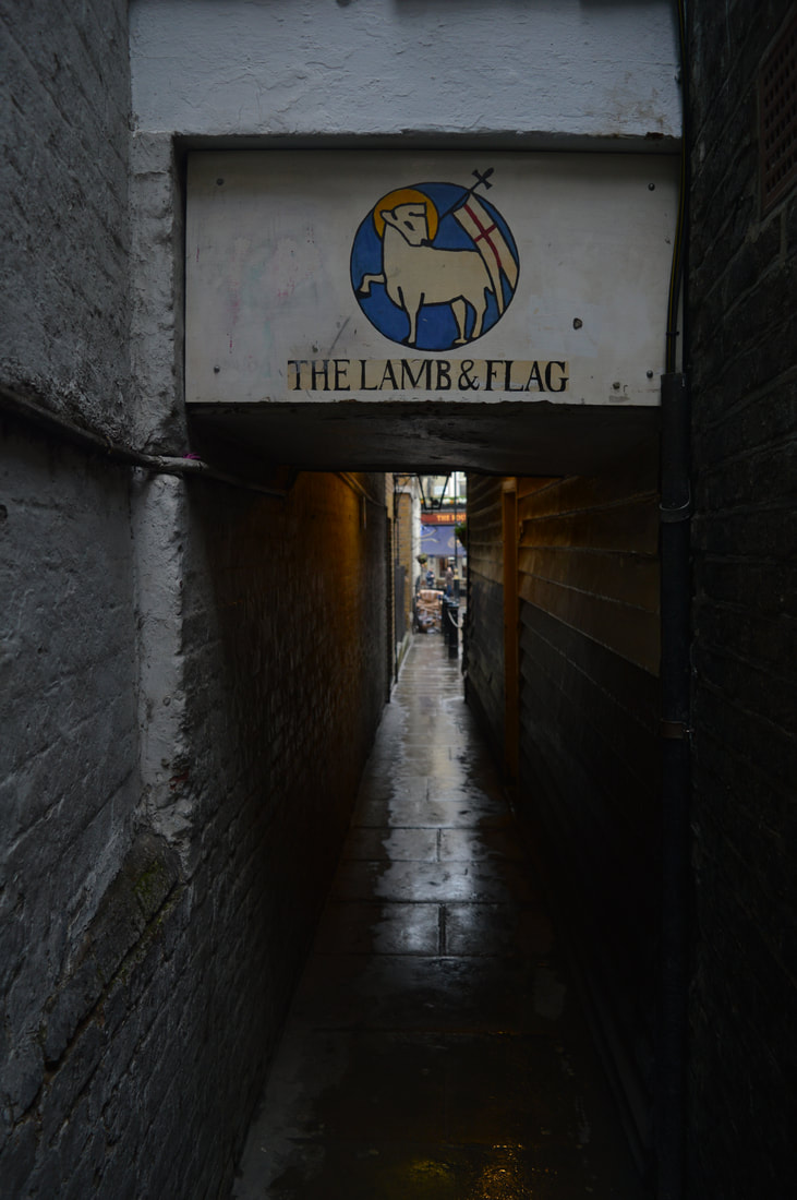
here are my responses taken along the southbank in london, I thought this would be a good place to take these photos as there are lots of small secret alleys and smaller spaces, also places that are hidden to plain sight, you have to look to find them.
|
|
|
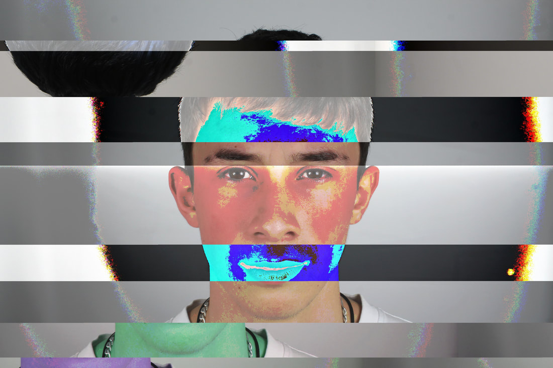
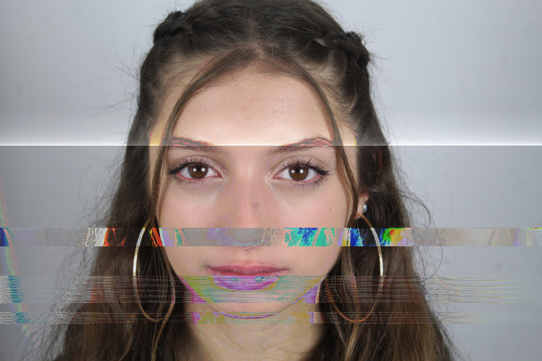
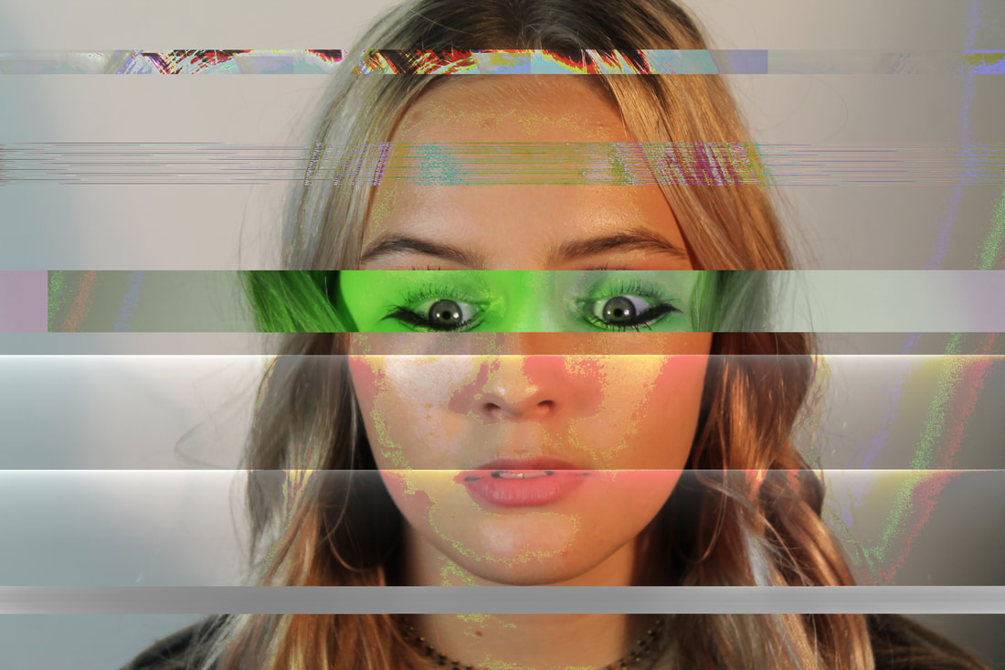
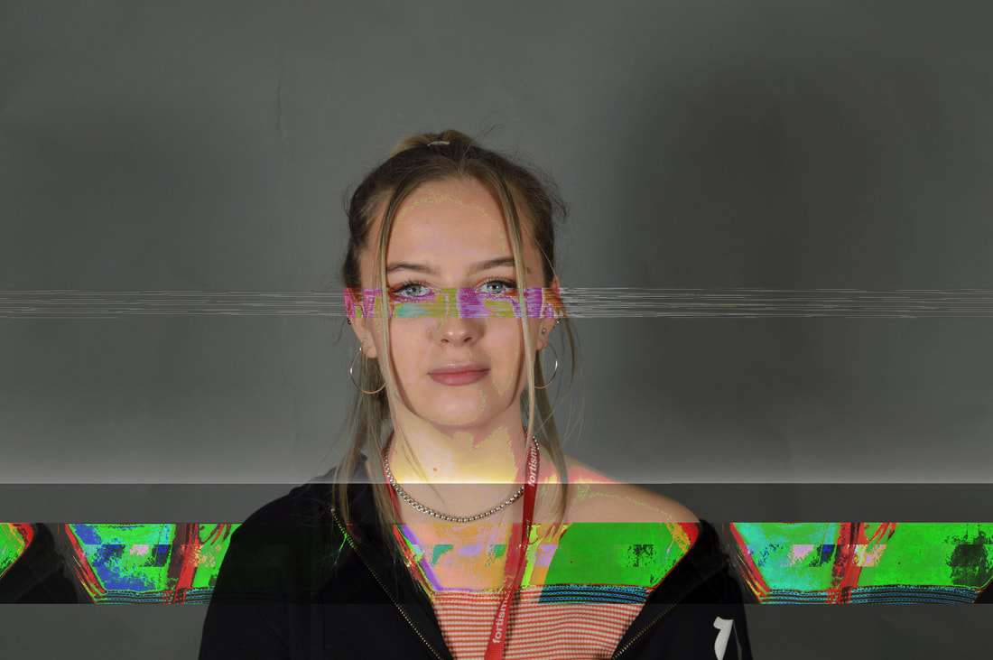
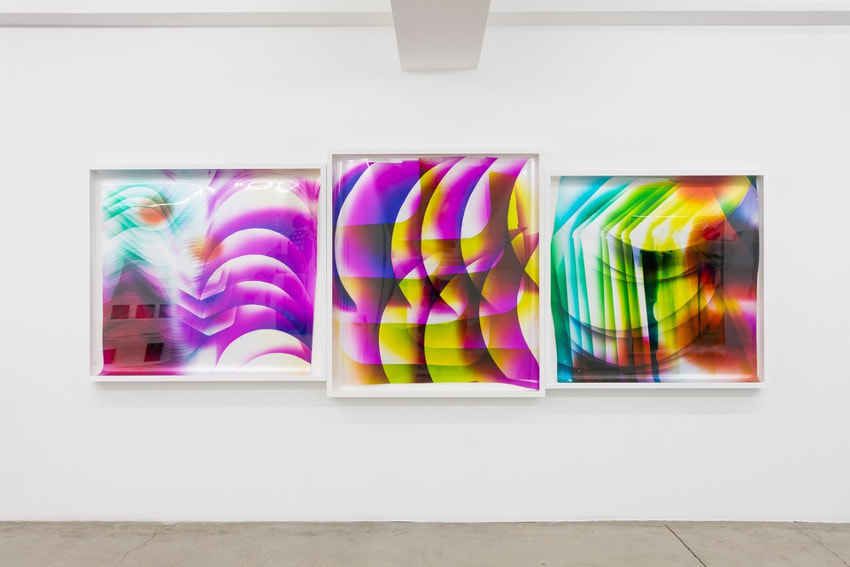
Glitch
link artist - Matthieu St Pierre
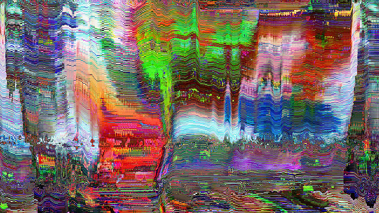
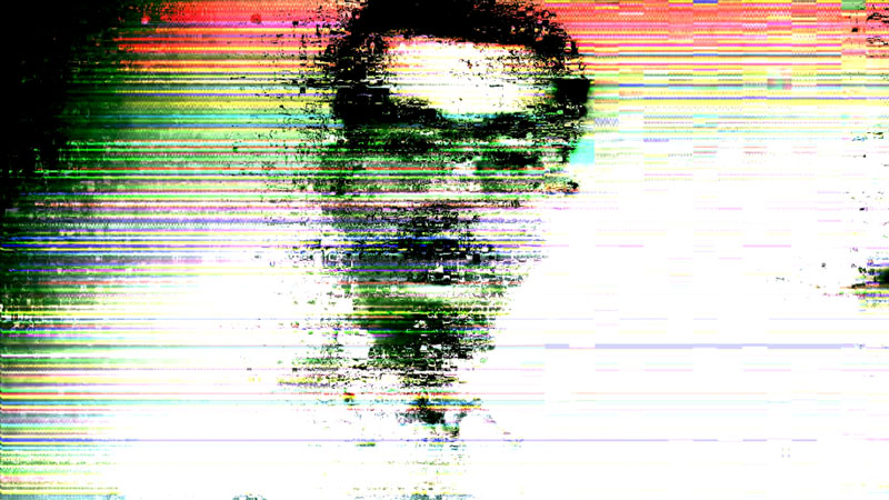
Mathieu St-Pierre is a Canadian experimental visual artist, specialising the fields of photography, art and video but specifically in glitch art. St-Pierre did a series called 'melting ice cream' in 2012 where the artist experimented with the video editing programme sony vegas. St-Pierre was responsible for making the Facebook group, Glitch Artists Collective, which has over 50,000 members. It is the largest Glitch Artists community ever created and houses sub-communities for glitch music and technical support for other artists. Glitch art is about using digital or analog errors for aesthetic purposes. You can do it by corrupting digital data or physically manipulating electronic devices.
I like the images produced using technical software, the outcomes are vibrant and detailed. I prefer the middle photo below as there is a focus in the image, and there is a contrast of colour. The black silhouette of the mans face looks really eye catching and effective with the colours going across it. The other two dont really have a focus and I think having a focus in an image is a key thing to make a photo good.
I like the images produced using technical software, the outcomes are vibrant and detailed. I prefer the middle photo below as there is a focus in the image, and there is a contrast of colour. The black silhouette of the mans face looks really eye catching and effective with the colours going across it. The other two dont really have a focus and I think having a focus in an image is a key thing to make a photo good.
|
|
|
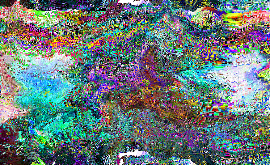
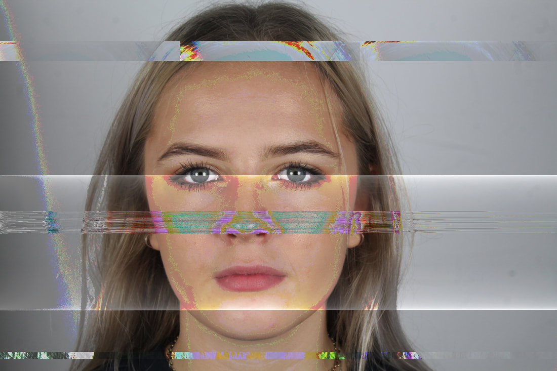
my edits: I made these in a programme called Audacity, underneath the photos I have shown the process of how I made them, step by step. In the programme Audacity you are presented with lots of different actions you can take to change the photo you're working on. Although you cannot see how you're changing the photo step by step. You just see it when its finished.
|
|
|
|
|
|
I really like my outcomes, I used all different actions on Audacity and produced these pictures. I love the colours and different patterns on the photo.
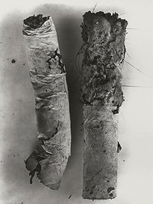
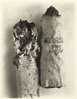
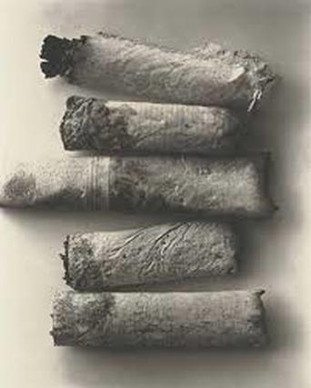
task 1 - Hidden Beauty, Perfection in the imperfect - Irving Penn
|
|
|
|
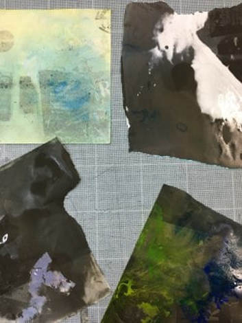
task 2 - compromises
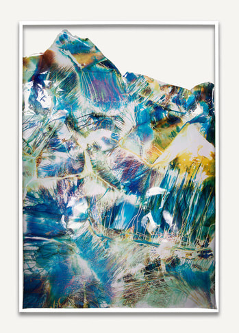
link artist - Mariah Robertson - chemical reactions
the intentions of this task was to create something like our link artist mariah robertson, below I have shown what my response was..
On the right and above is Mariahs work, its very colourful and pleasing to the eye. I think the work is abstract as there is nothing that grabs your attention, just a scatter of colour.
|
|
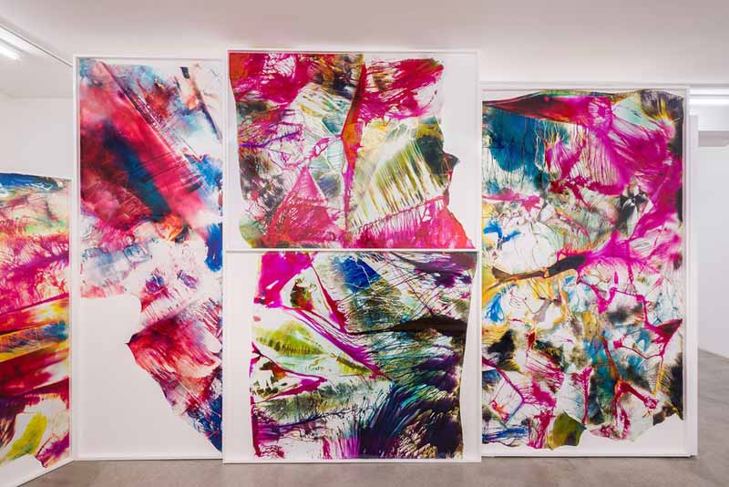
Above where there are lots of pieces of her work, it sort of looks as though there are jigsaw pieces of colour, all muddled up. She has experimented using colours that go together and which compliment eachother.
|
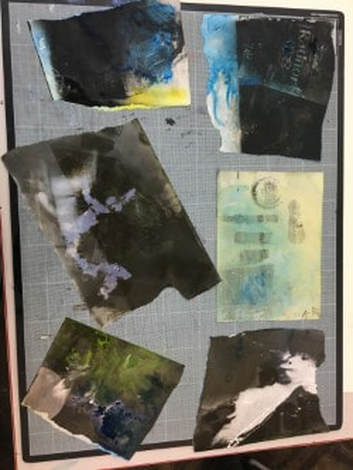
my response to Mariahs work
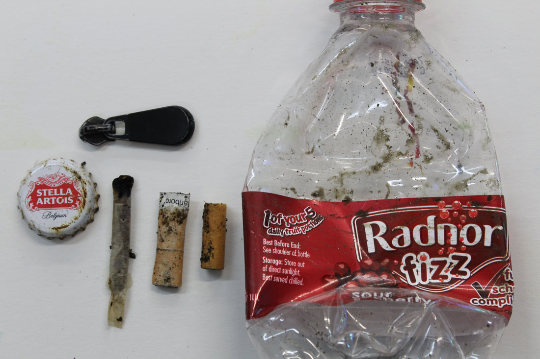
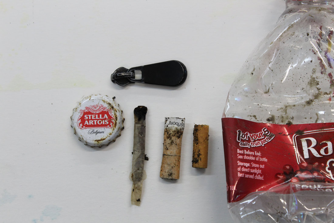
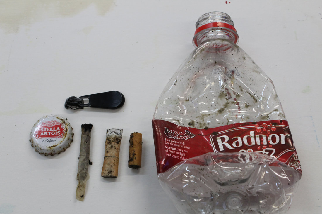
These are the objects I collected to photograph and then use in the darkroom to try and replicate Robertsons work. I chose two things with writing/logos, as I knew if I developed them properly with the chemicals the logo would stand out.
|
|
|
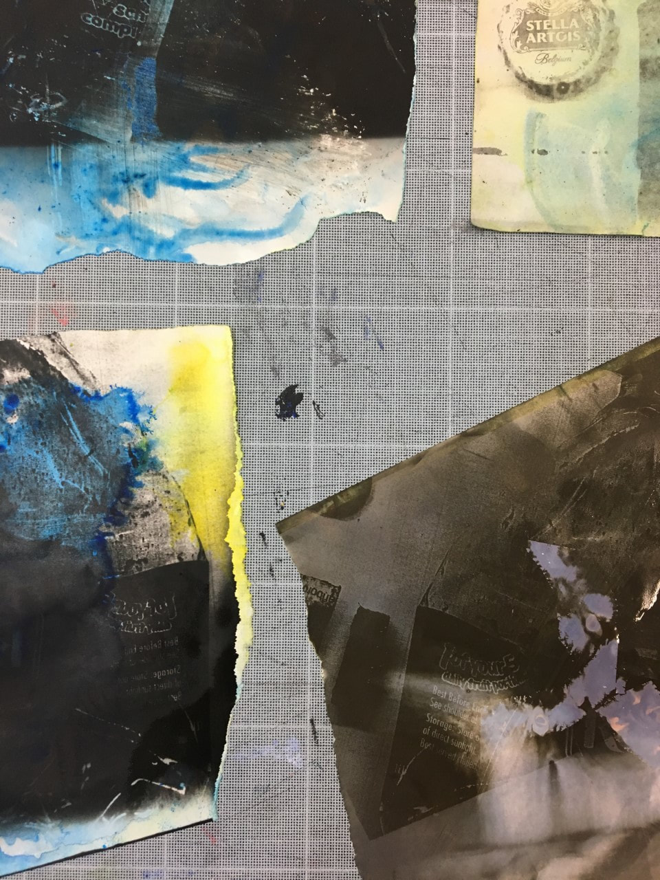
Here are my responses to Mariah Robertons work. I created these in the dark room using the chemicals DEVELOP, STOP & FIX. It was more of an experimentation than anything. I exposed the paper under the enlarger, once for 3.5 seconds, another time did 2.5 and then 4. I found that a higher number made the photo paper much darker when you put it in the develop chemical. I made a few darker images and some lighter ones so I could see the details in the objects, for example the Stella Artois bottle cap.
|
|
|
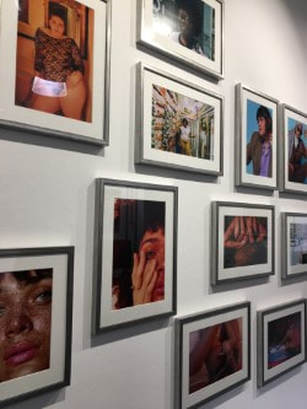
Exhibition Visit - THE FEMALE GAZE - The Getty Images Gallery
This exhibition was small but captured some beautiful and diverse images of 'female gaze'. 'The Female Gaze' celebrates female self-representation through a display of 70 photographs shot by women at the cutting edge of creative photography. The male gaze - the act of depicting the world and women in the visual arts and in literature from a masculine and heterosexual point of view - has dominated arts, media and culture for a long time. This exhibition, however, flips it with an attempt to communicate an honest visual truth about the nature of modern femininity. The striking exhibition features works by Amanda de Cadenet, Ashley Armitage, Lula Hyers, Mimi Haddon, Nina Leen and Rockie Nolan. I think the whole theme of the whole exhibition was Power and diversity in womanhood. I think the intentions of each individual photographer are different, but with the same idea, meaning they fit under the same big thought, hence why they are all grouped together in an exhibition.
I really enjoyed the exhibition, the only thing I would change was the amount of photos that were exhibited, I would've loved to have seen more of the photos as they were all beautiful,really inspiring and empowering to women. Also the photos were vaguely grouped, I wish there was more explanation of why the images went together and what the idea was behind the grouping of them.
I really enjoyed the exhibition, the only thing I would change was the amount of photos that were exhibited, I would've loved to have seen more of the photos as they were all beautiful,really inspiring and empowering to women. Also the photos were vaguely grouped, I wish there was more explanation of why the images went together and what the idea was behind the grouping of them.
|
|
|
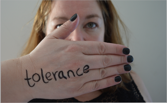
THREE STRANDS
Hidden Indentities
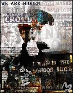
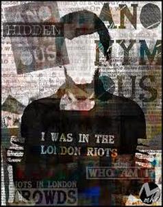
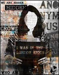
link artist - Michelle Robb
- Michelle Robb focuses on graphic desgin, photography and typography. She is from the United Kingdom.
- Michelle Robb has created Collages from information she collected from people who were in riots and crowds. In the photos the face of the person has been taken away, as they were anonymous people who spoke. I love this idea of taking a photo and asking information of people and creating an image that represents them but not knowing who they are, you only see certain words. The idea of a collage is also unique, I will either merge an image with the words or hand make a collage.
|
|
|
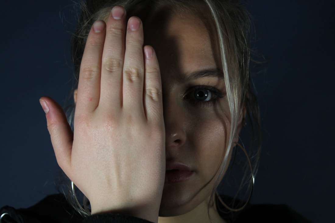
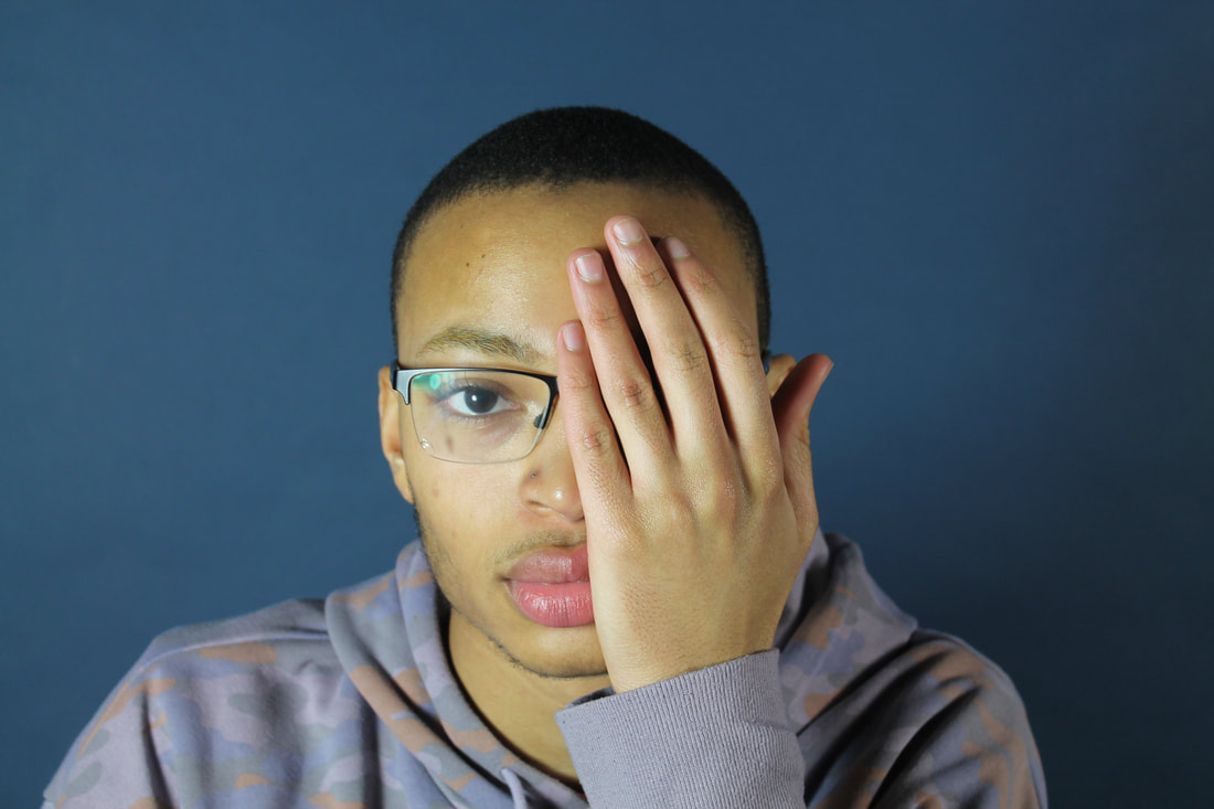
first idea - hidden identity
I told the models to cover a part of their face, either their mouth or completely one side of their face. I used a dark blue background so their faces would be highlighted. I used the studio lights so the light would be bright but I could control exactly how much light and how bright. I only edited these photos by changing the brightness on photoshop, as I reduced the amount of light, shadows would appear on the face, which I think is really effective, as we dont know whats underneath the shadow, for example in the photo on the far right, there is only a quarter of the models face showing as the mouth is covered by her hand and then the other is covered by the shadow. The expression on her face is slightly down. I wanted to look as though she was being stopped from speaking and that she was slightly trapped, and I think I did that well. What I would've liked to improve on is to take more photos and using a bigger variety of brightnesses so the shadows could be on different parts of the faces.
|
|
|
|
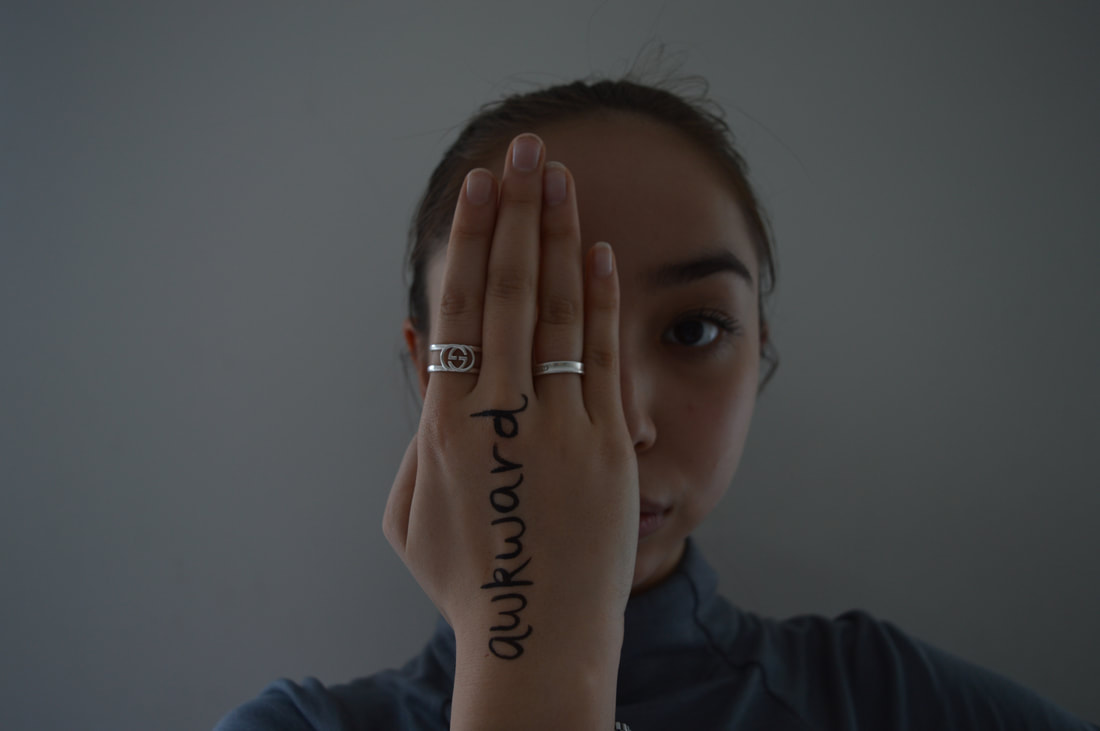
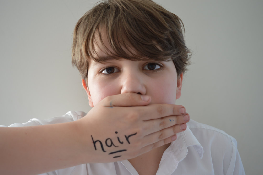
Detailed Faces - development
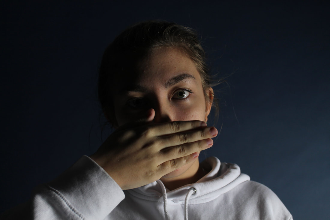
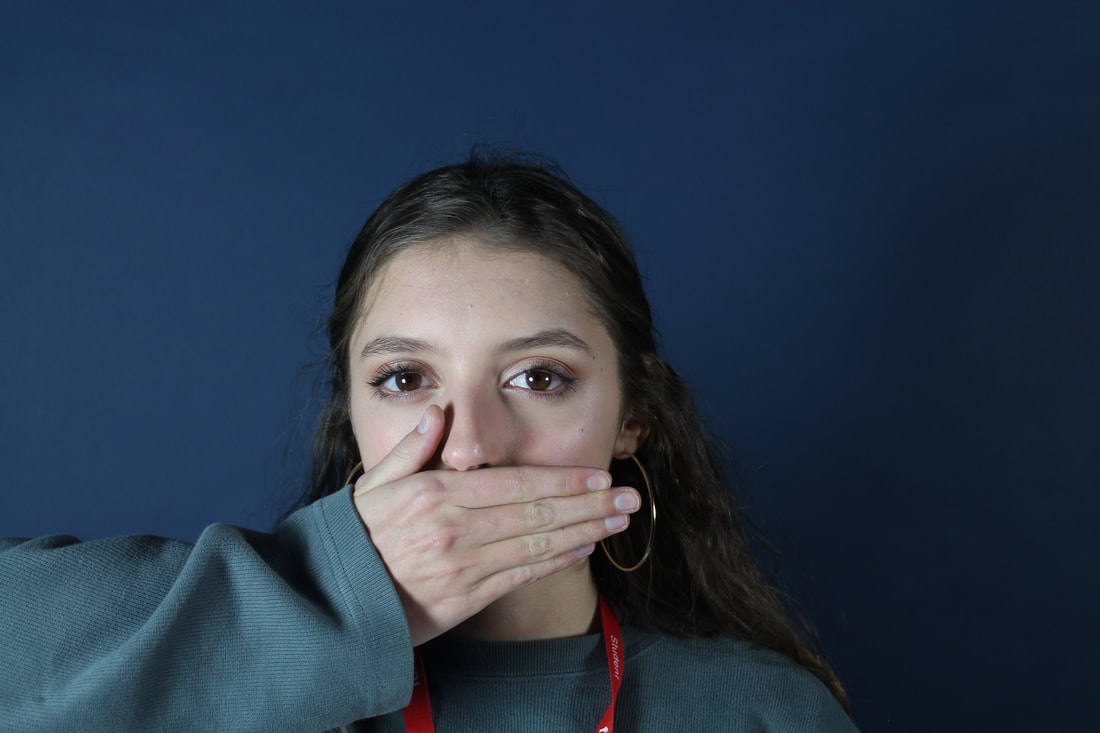
As a development for my hidden faces I got models and used the same poses e.g covering the mouth and half of the face, I then asked them what an insecurity of theirs was or asked for a word that they felt meant something to them or changed their personality. The idea of them covering a part of their face and keeping something secret but then also it being obvious what they are hiding is as it is right on their hand is the idea of secret vs open. Opposites together.
www- my shots came out just the way I wanted them,
EBI - use different backgrounds and lighting, also experiment and get more shots of different models. get a variety of people.
www- my shots came out just the way I wanted them,
EBI - use different backgrounds and lighting, also experiment and get more shots of different models. get a variety of people.
|
|
|
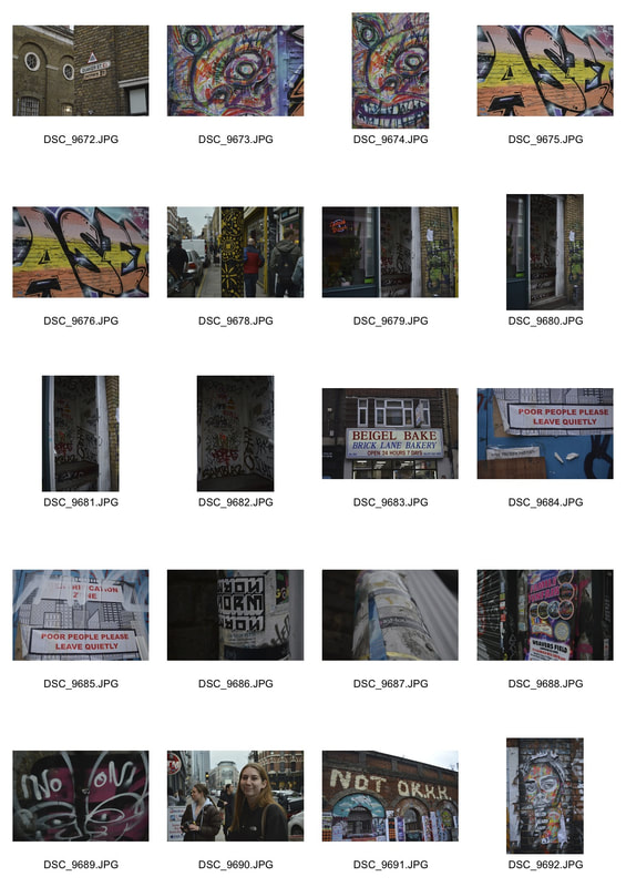
Strand 3 - Codes/Collage/Stickers&Graffiti-Going against conventions
link artist - Ian Cox
|
|
|
|
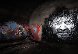
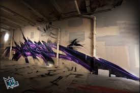
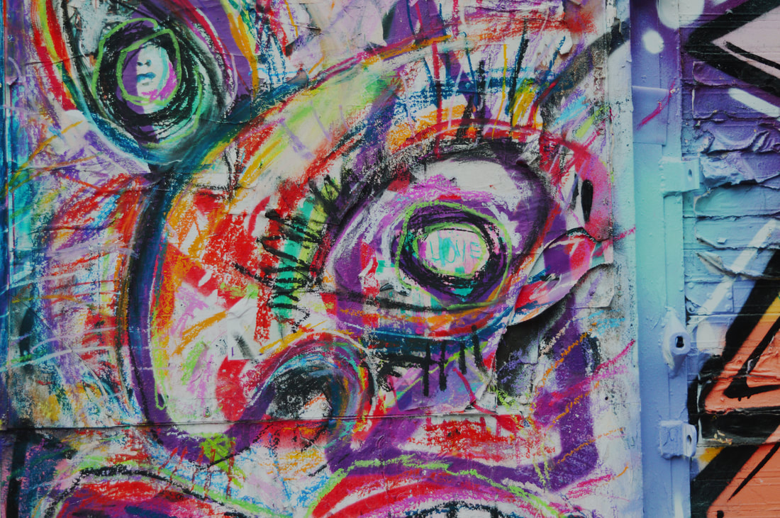
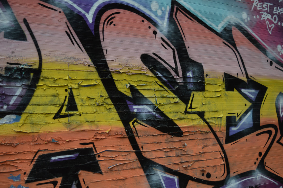
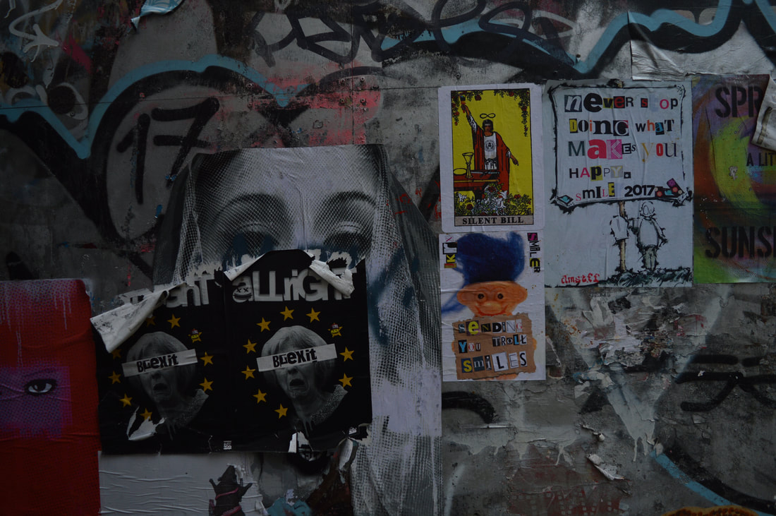
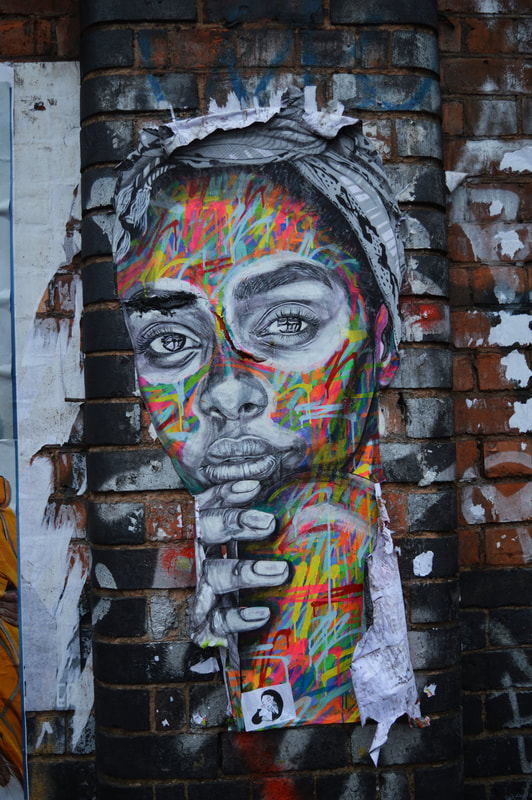
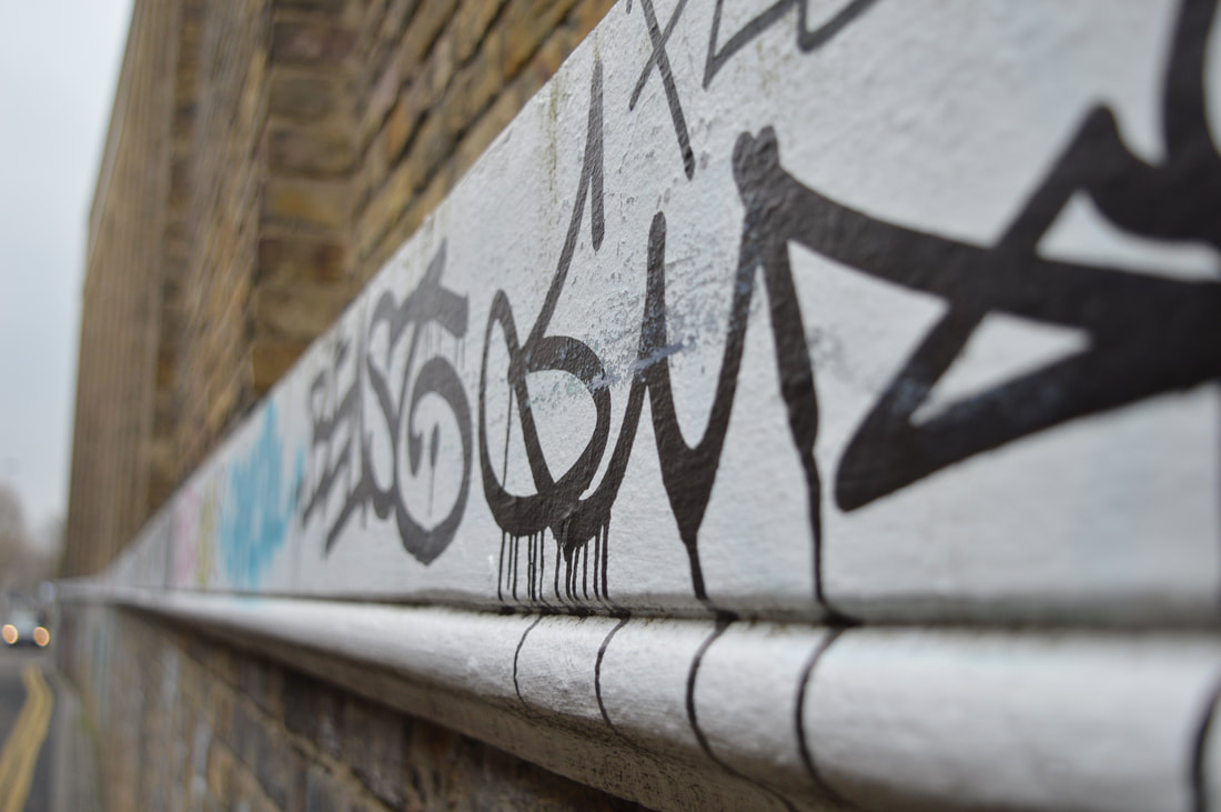
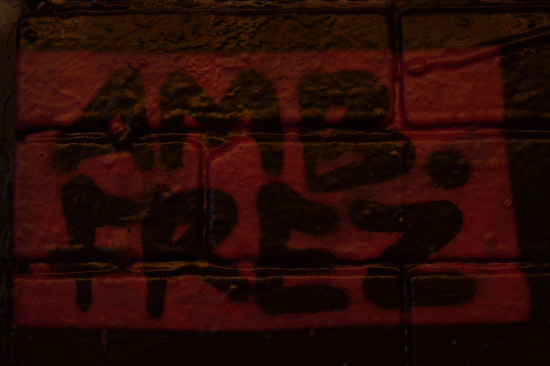
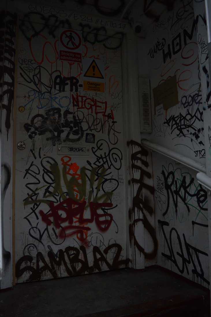
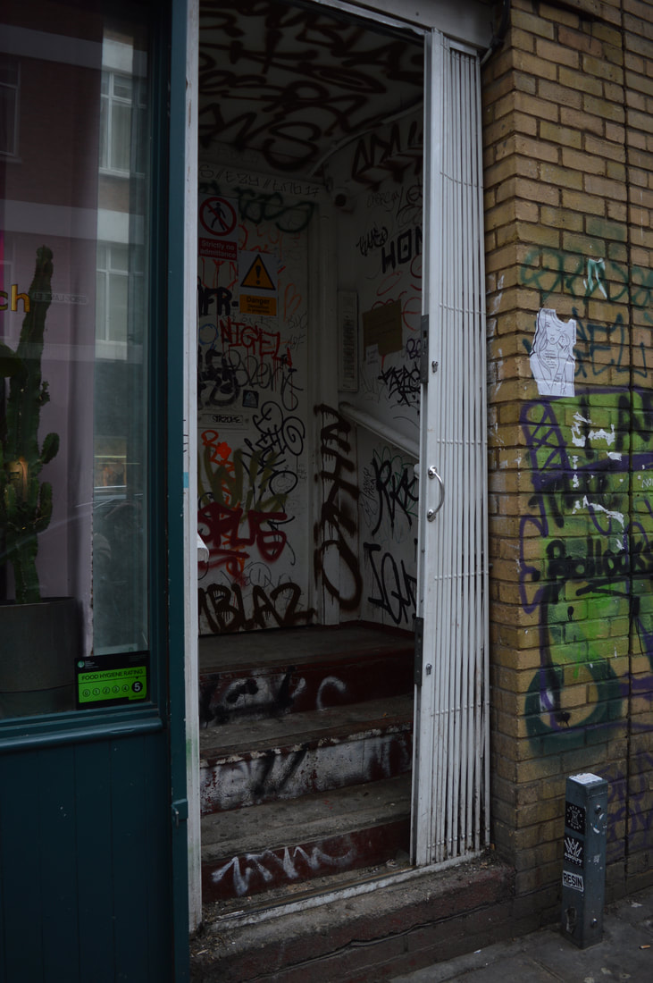
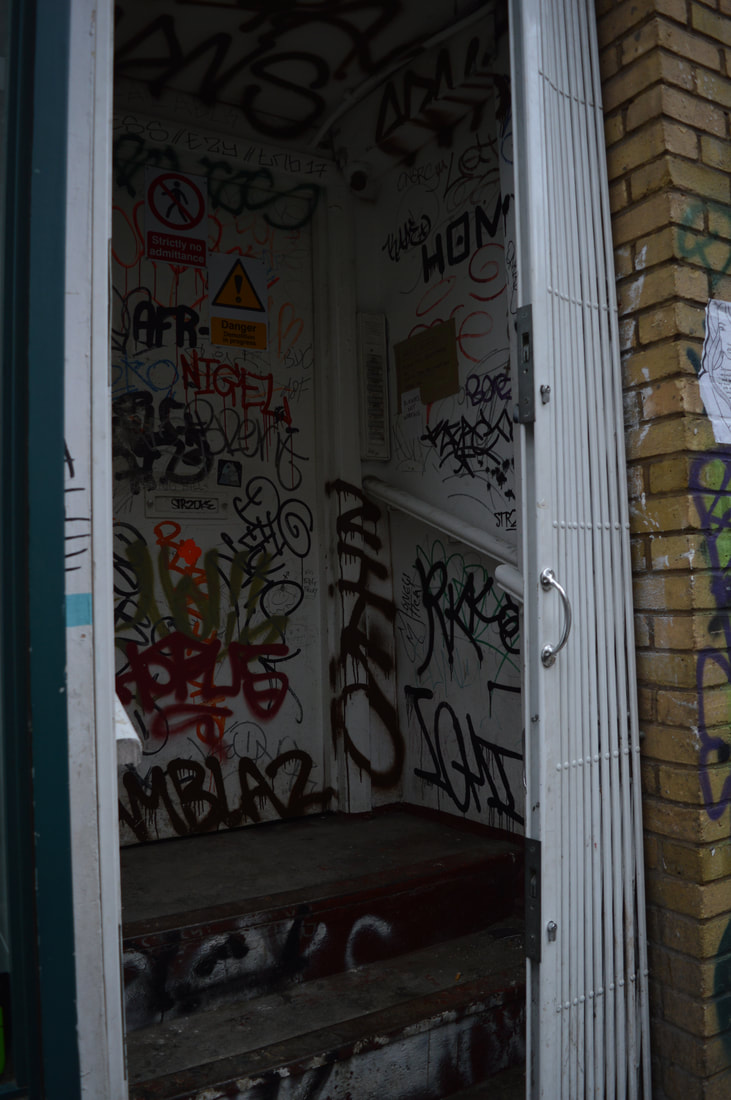
I chose to photograph Street art as one my three strands as its always very eye-catching and interesting. Street art tends to have secret messages or hidden meanings behind it. The whole act of doing graffiti is illegal so it actually goes against the conventions of the law, this is how i'm linking the strand to our exam title. When people actually use spray cans and paint they usually disguise themselves incase they were to get caught, the whole thing is really suspicious and there is an element of the unknown involved. Graffiti and street art is all around, especially in the city streets of London. The work produced is the ideas of an individual or a group of people. Some of the art is easy to understand and recognise but the majority of street art are secrets made into drawings, words, codes and symbols, here are some examples of what is made.
WWW: I used a low exposure so that my photos would come out darker, and then after in photoshop I changed the exposure and contrast so the colours would really stand out, the colours in the photos are really vibrant. Graffiti could be seen as a negative thing so i went against the idea and convention of it and made it bright and happy, also it could be seen as ugly or an eyesore, but I tried to edit it so it is aesthetically pleasing. Another thing I did well was I used a tripod whilst taking my photos, so I could ensure that there was no camera shake, and I could get the quality of the photos really clear. When editing the photos I used the tool in photoshop called Unsharp mask and this made the photos extra clear. EBI: I wish there would have been more sentences of words, more words grouped together in a place, as a lot of my theme is linked to words, as those words have meaning to someone else but has unknown meaning to me. Also would like to have visited more places with some duller looking graffiti, as all the work I have is very colourful. |
|
|
|
|
|
|
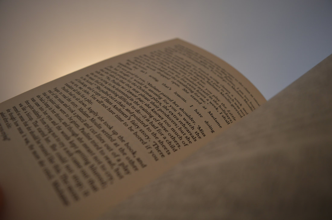
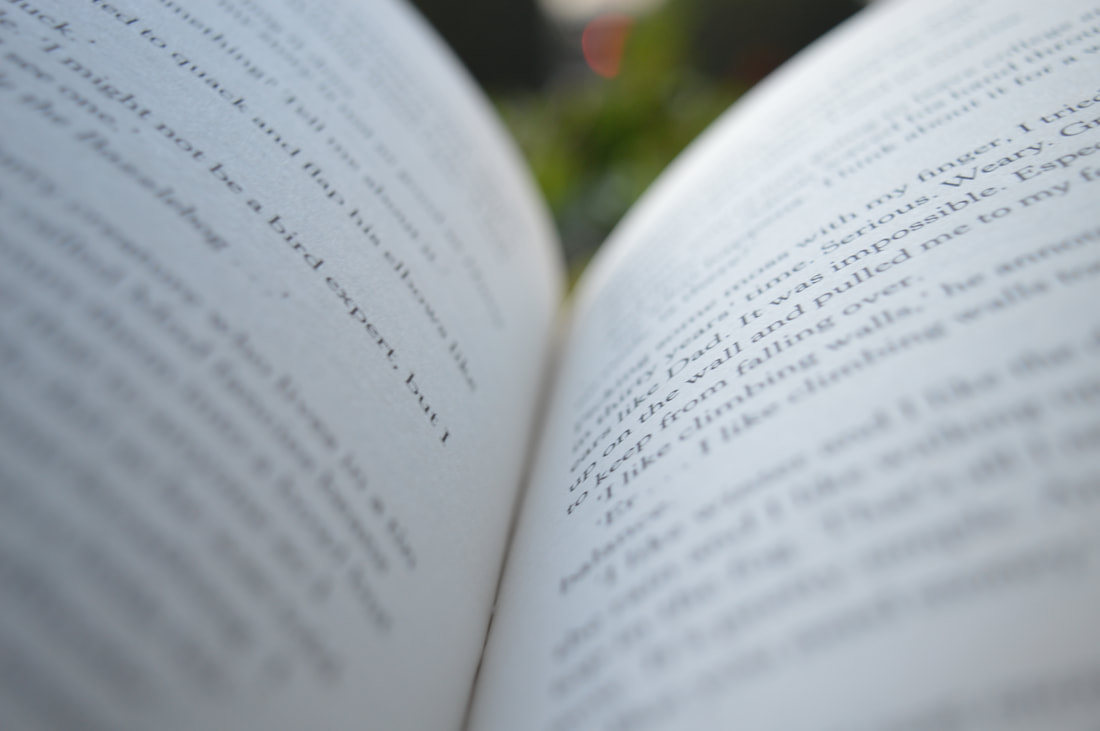
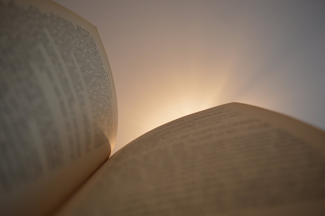
development - secrets in words
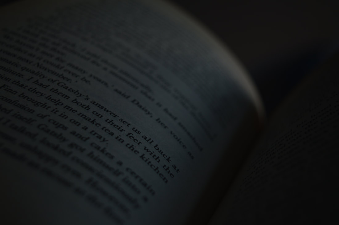
As a development for my graffiti strand I decided to photograph words on a page. Books are closed naturally but as you open them up and read its like a secret is being revealed. I tried to blur most of the words on the page but focus on certain ones, like they were being revealed. I like the idea of words with so many meanings and ideas behind them. It links to the theme as its all to do with secrets and codes.
|
|
www - good overall outcome, clear photos, lighting is effective
ebi - could take lots more photos, also experiment with backgrounds
ebi - could take lots more photos, also experiment with backgrounds
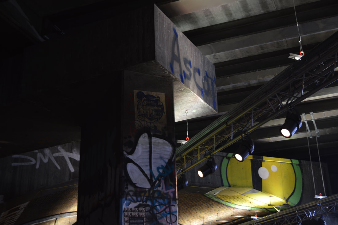
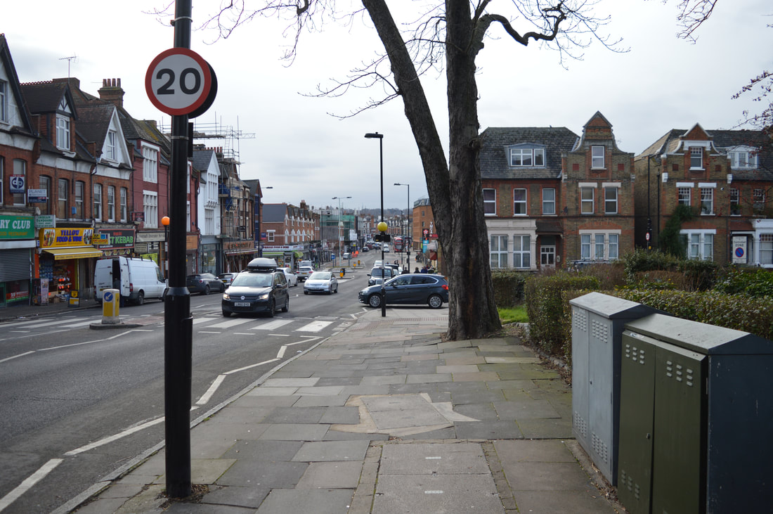
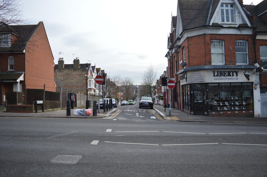
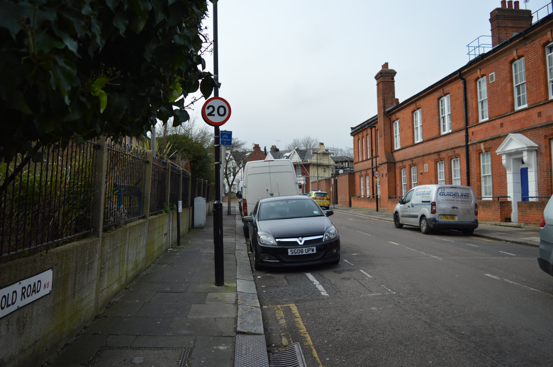
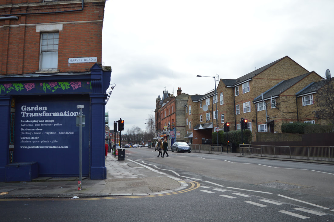
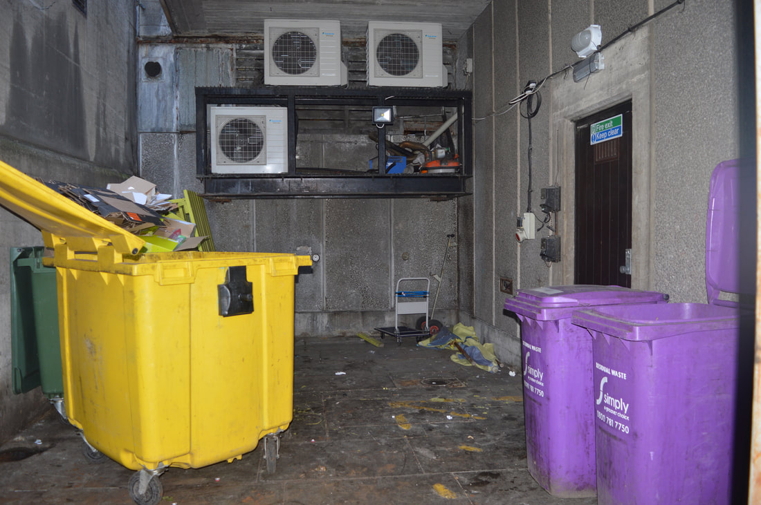
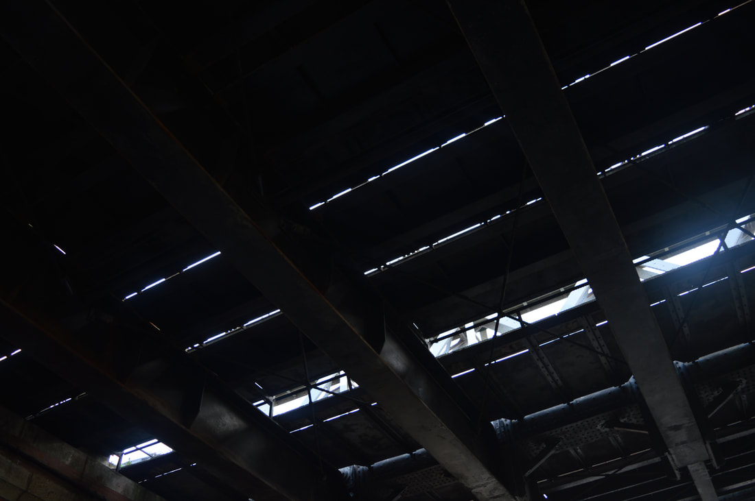
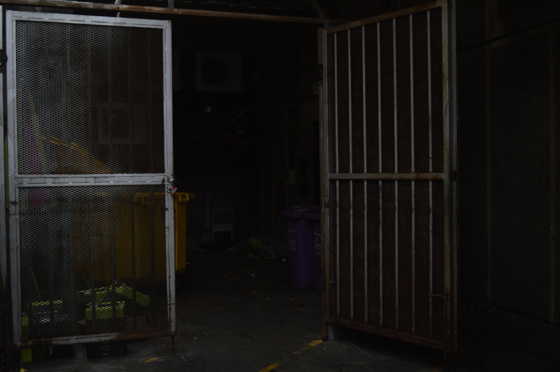
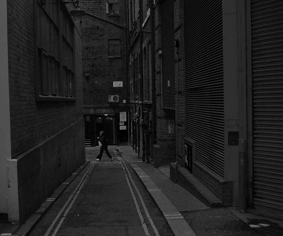
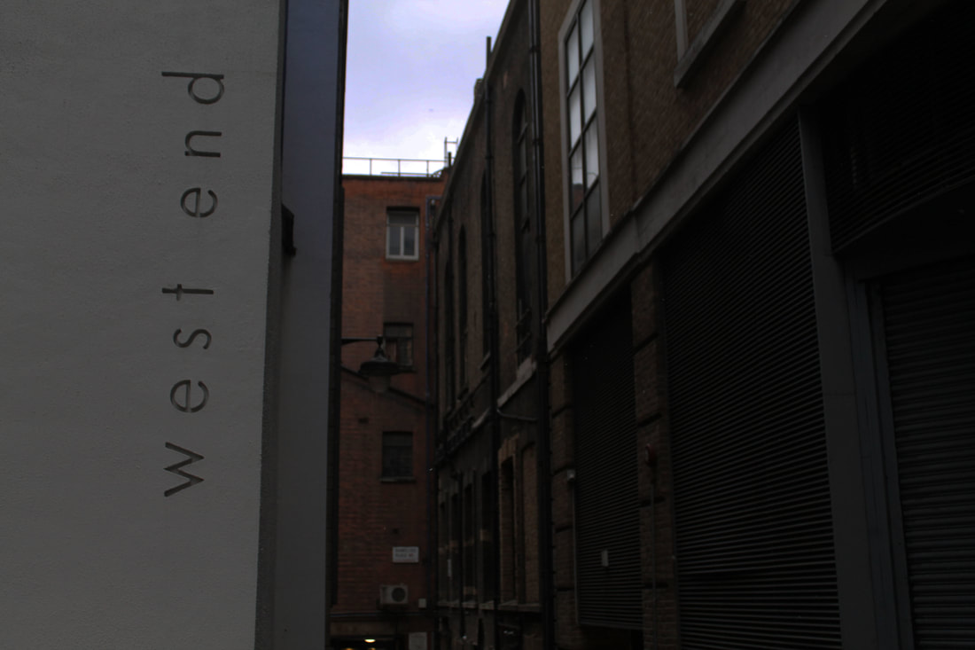
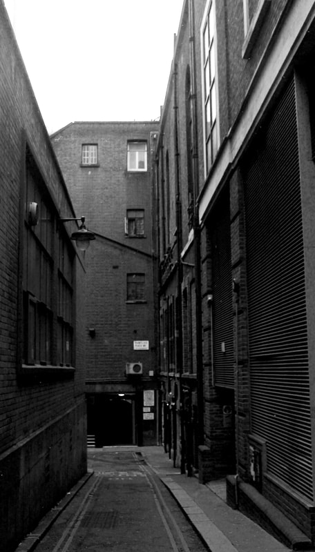
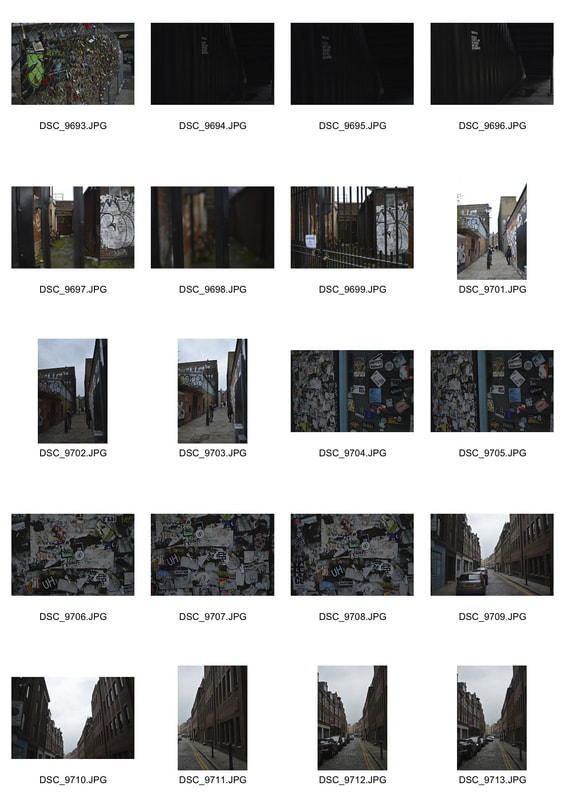
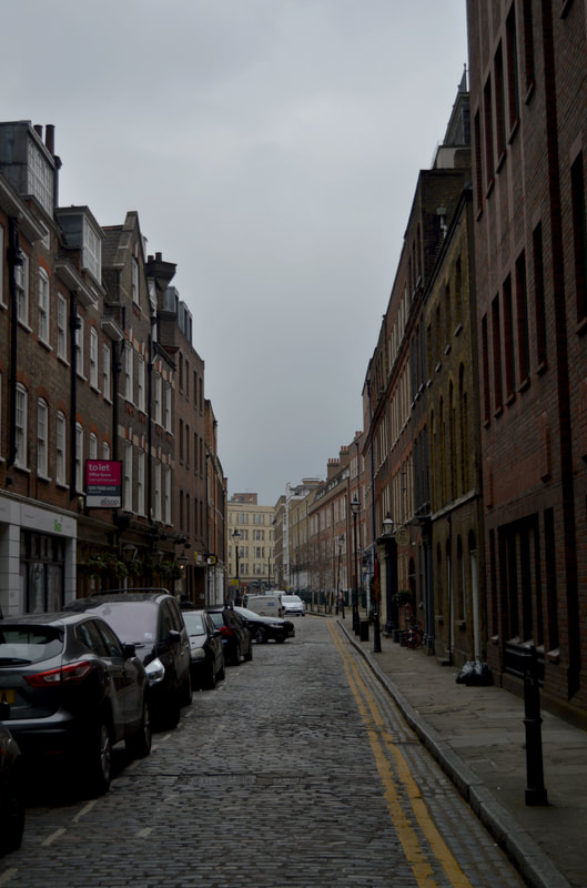
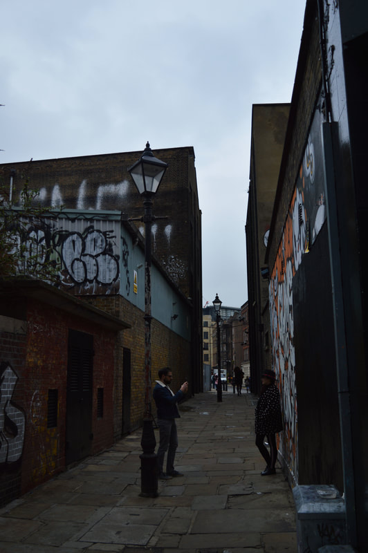
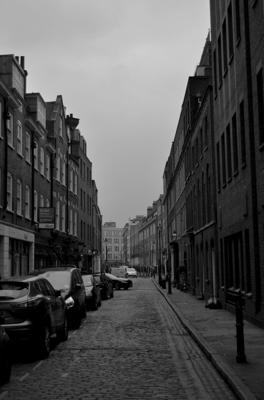
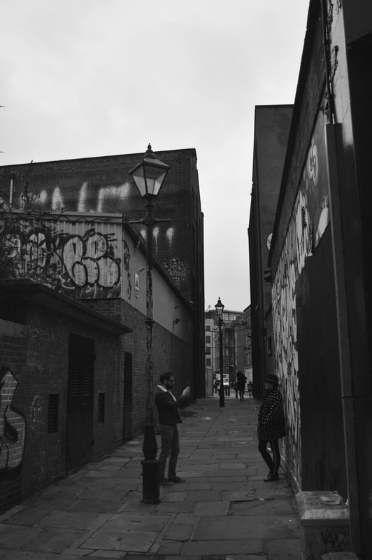
Unknown City
obscure alleyways and streets.
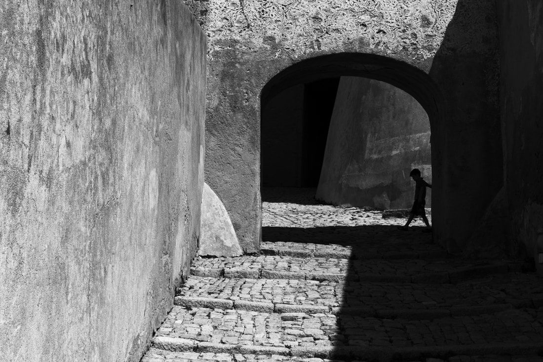
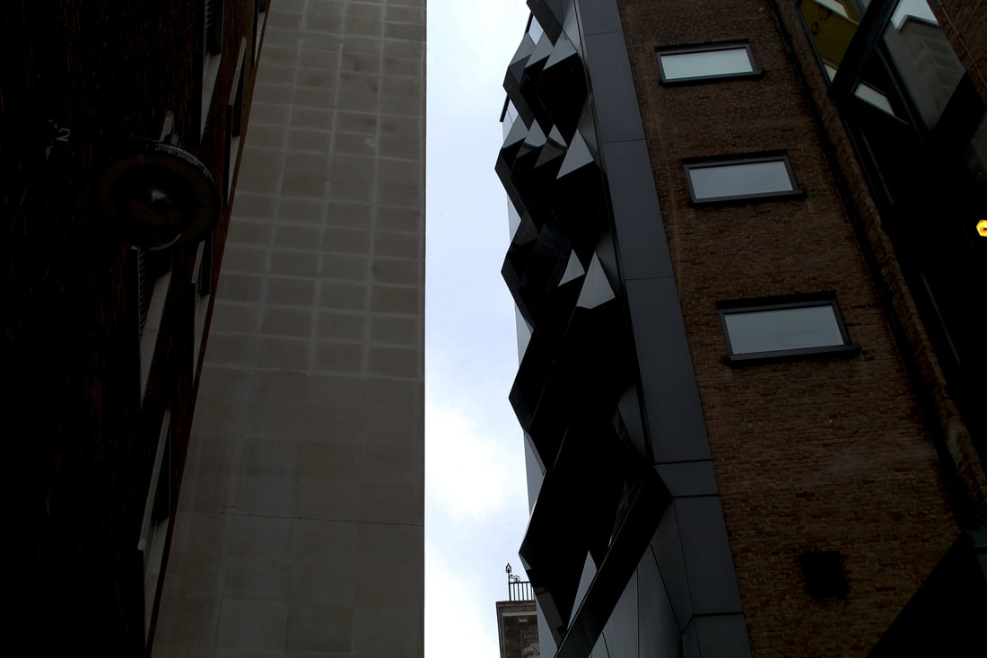
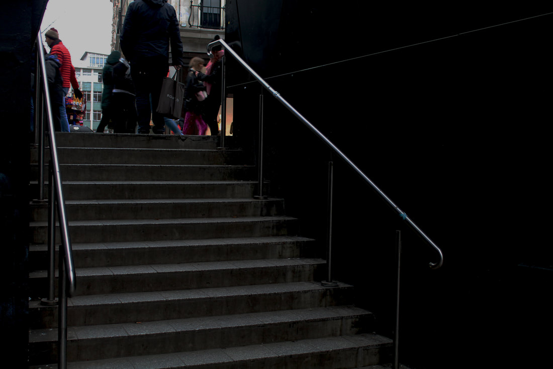
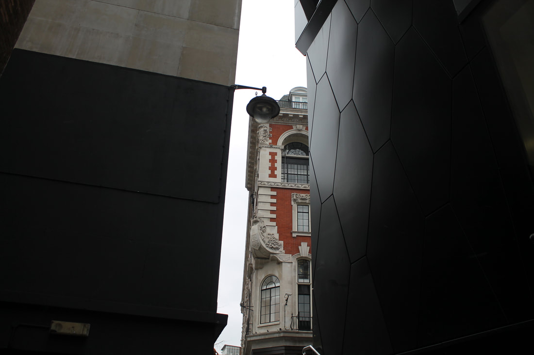
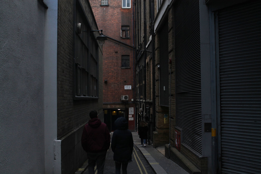
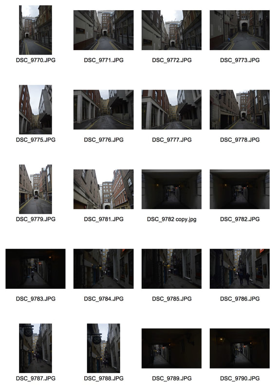
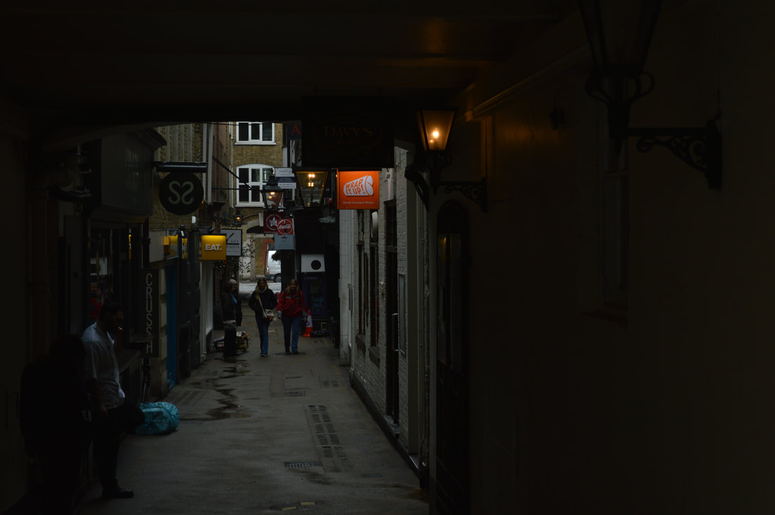
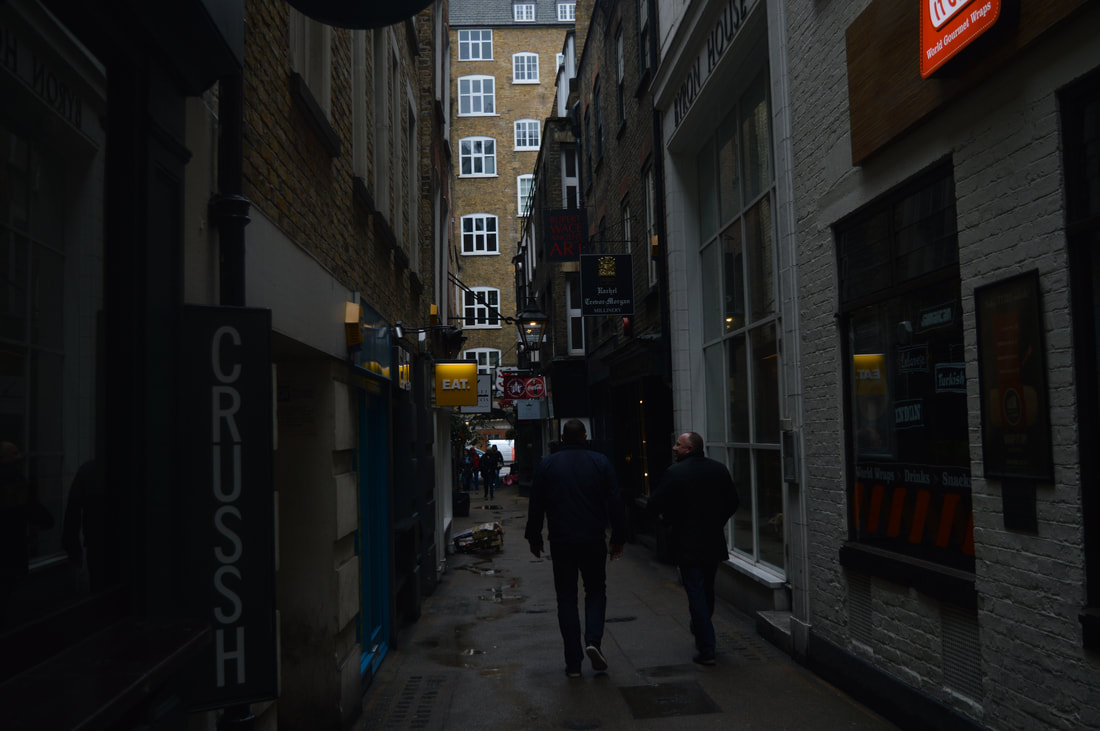
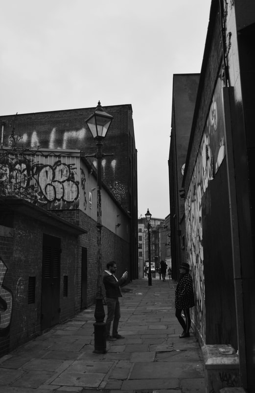
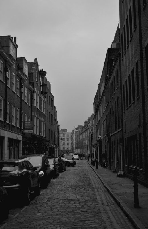
Street photography is always really interesting and every photo always looks completely different and individual to others. The whole idea behind my strand of the unknown city, mainly focusing on alleyways is perspective. Most of my photos are taken from an angle where you are looking down the street/alleyway, and the question that arises in my head and what I would like people to think is; What is beyond? Whats at the end of the tunnel? Thats the idea of the unknown. I have visited lots of different locations around London, mainly central London, and in the Covent Garden area, as there are endless oppurtunities to capture interesting streets and secret alleys.
street photography
Many street photographers look for scenes which trigger an immediate emotional or visual response, especially through humour or a fascination with ambiguous, odd, or surreal happenings. A series of street photographs may show a crazy world. Perhaps it’s a dreamlike world. Or edgy, or dark, or elegant, or mysterious. The paradox that these traits might apply to scenes found in the most everyday and real location —the “street”— is endlessly fascinating. Street photography is not reportage. For the street photographer there is no duty to document specific subject matter. The chief concern is life in general, and its reduction into frames that stand alone and visually work. This requires a careful selection of visual elements to include and exclude from the final composition, and great attention on the moment selected for exposure. These two factors may at first seem universal to all kinds of photography, but in street photography they are vital, for it is with these tools alone that the street photographer expresses meaning. There are no props or lighting, little preparation time, and ideally no preconceptions. Street photography is a genre of photography usually done candidly without permission and without your subject’s knowledge. However, street photography doesn’t rule out staged pictures. You may spot an interesting character that catches your vision; you can wander up to strangers and ask for permission to take their picture. This is a great way to get a more intimate portrait of someone in his or her environment.
Jean Phillipe Jouve
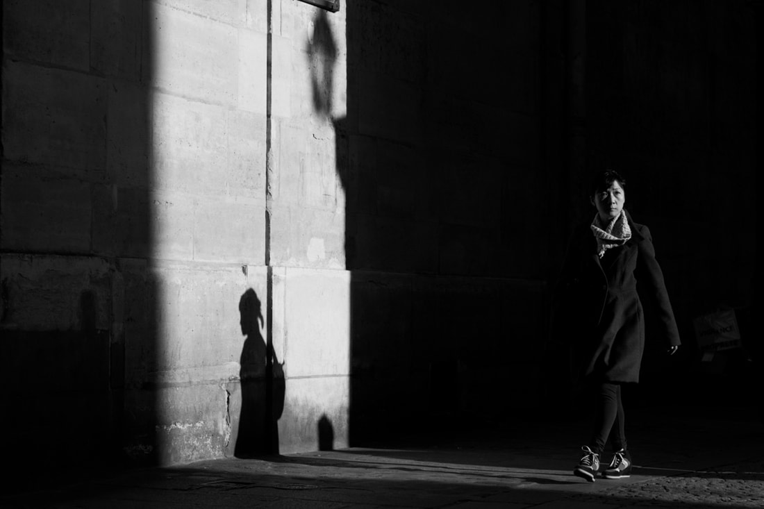
- Jouve is a french street photographer, born in Paris.
- He has had work published all around the world though. His photographs are monochrome because his main focuses are light and composition.
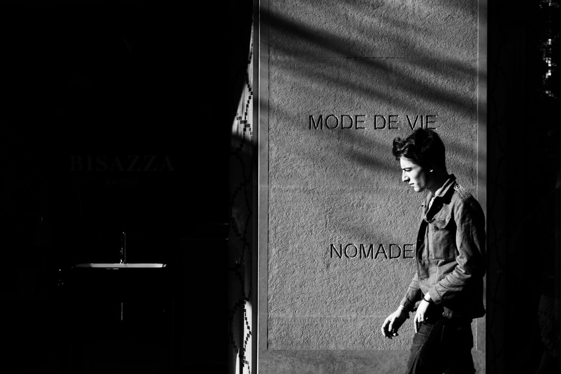
- I was inspired by Jouves work as I love the black and white theme and shadowing in his images. These images are from his collection called Street Photography. He photographs people without their knowing so they are candid and natural. He has captured them whilst they are moving but they are still and the photos are perfectly clear with no blur. The shadows and light in the photos have been perfectly captured so that the photos have some prominent light but plenty of shadow, making the theme of them mysterious and eerie. There are plenty of questions that come to mind when you look at the photos. Where are the people going? What time of day is it? Where are they? Who are they. Do they know they are being photographed? They are really thought provoking.
|
|
|
|
|
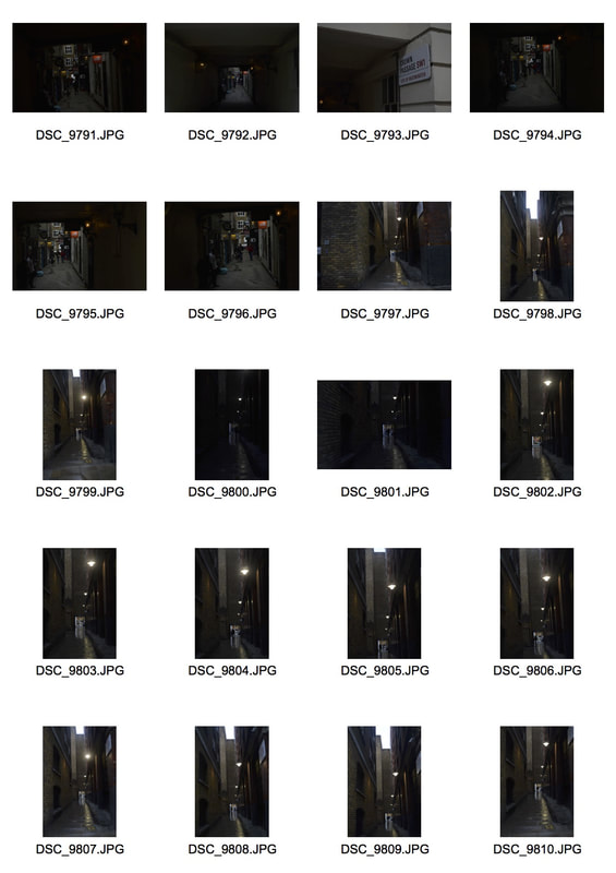
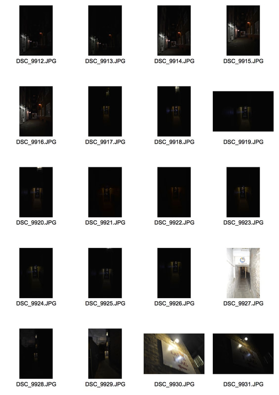
I took these photos in central London, there are endless streets and small alleyways. I have edited all of them changing the exposure, brightness and the contrast. I wanted to make them darker, to create a mood in all the pictures. The darker filter gives a certain atmosphere, it feels gloomy, dull and obsure. I like these photos because from the angle that they are taken there is always something beyond infront to look at. The main focus in the picture is on the small bursts of light coming through two buildings for example, and the rest is dark.
my responses
|
|
|
|
|
|
second development - brick lane - alleyways&streets
|
|
|
|
|
|
|
|
|
|
UNDERNEATH ARE MY COMPARISIONS
IN BLACK AND WHITE.
IN BLACK AND WHITE.
I decided to edit my photos in to black and white, as the photographer I got inspiration from Jean Phillipe Jouve, mostly all of his photos are in black and white and there are lots of shadows in the photos. They are also dark with low exposures. I have edited my photos to try and match his. Using photoshop I changed the exposure, contrast and brightness in all of them, to give the photos a gloomy and unilluminated feel.
|
|
|
Intentions for this strand- contact sheets?
third development - highgate
|
|
www, ebi, what's next
This builds on what I have done before as I visited different locations

|
|
|
|
The photos below show different alleyways Ive found around London, I looked for very small, narrow ones as when you're looking at it from a certain perspective you can get a really interesting shot.
select photos below.
|
|

|
|
|
fourth development - around central London/covent garden
www - When I went out on this journey, I ended up with some of my final pieces, I ended up getting shots I really liked and fitted the theme really well.
ebi - This was what I thought would be my last development but looking over I wasn't entirely happy with my shots, so I decided to take another journey and
ebi - This was what I thought would be my last development but looking over I wasn't entirely happy with my shots, so I decided to take another journey and
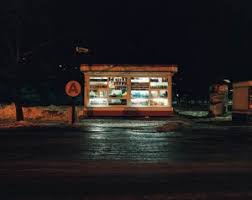
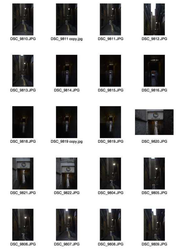
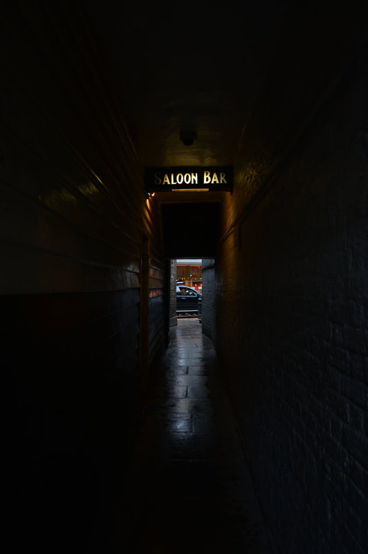
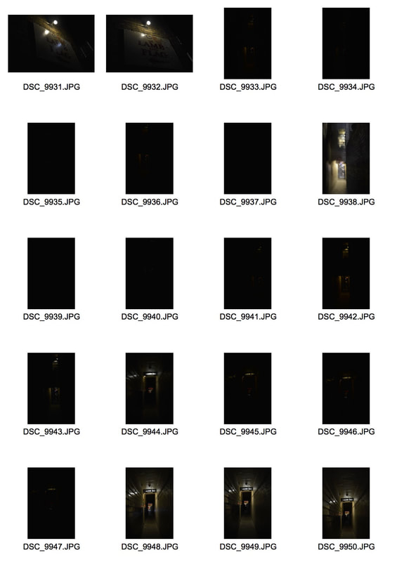
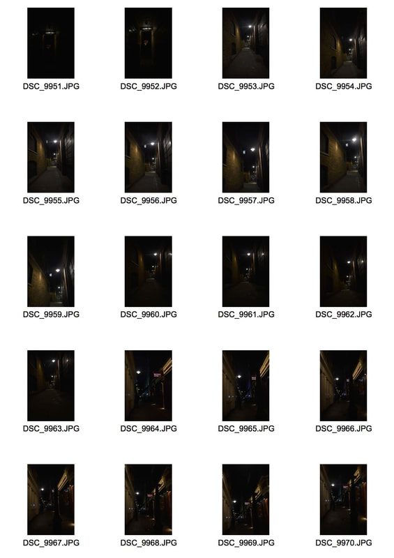
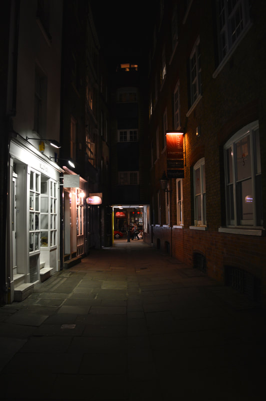
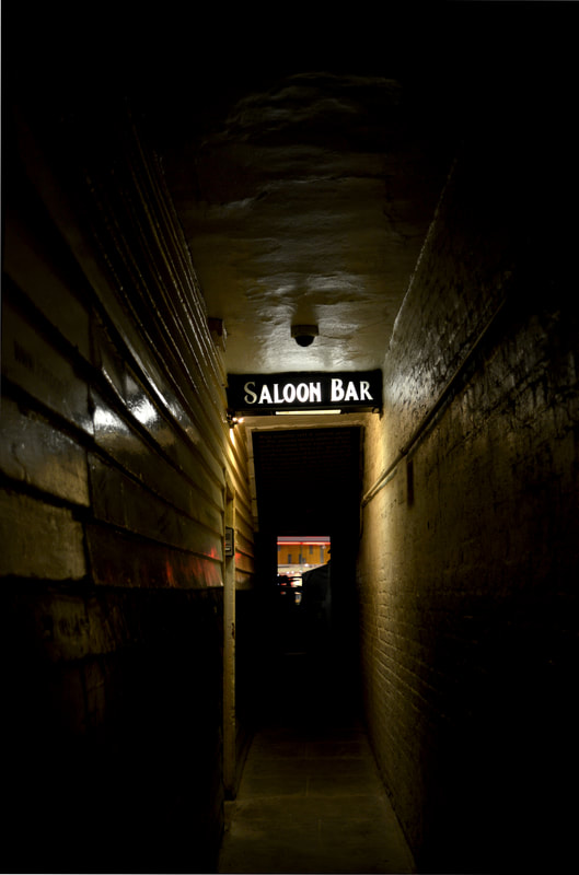
final development - night time response
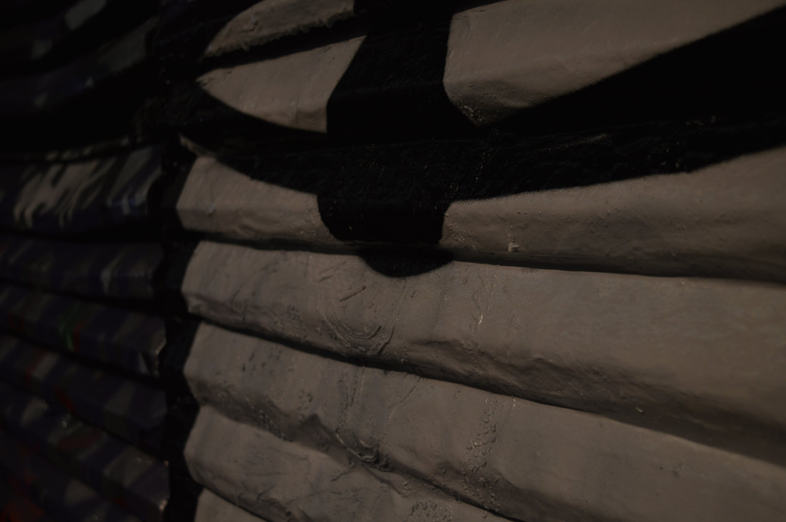
As all my other photos in this strand have been taken in the daytime and then edited after to make them darker, I decided to go round and photograph the same locations as before but in the evening, so the lighting was natural and the areas were unlighted and there was an inky filter on my photos. Something that went well with my photos is that I took a few photos of the same alley or street but from different perspectives or heights for example in some photos I am crouching and looking up at the street with my camera and others I am standing and looking straight on at the street. Its always interesting to see how different the same place can look but with a little movement. Secondly another thing that went well was that I played around with my exposure and aperture whilst shooting. There were lots of dim yellow street lights or shop lights in my photos which lit up the frame really well and as I changed the exposure, they highlighted different things in the frame.
|
|
|
select enlargements
|
|

|
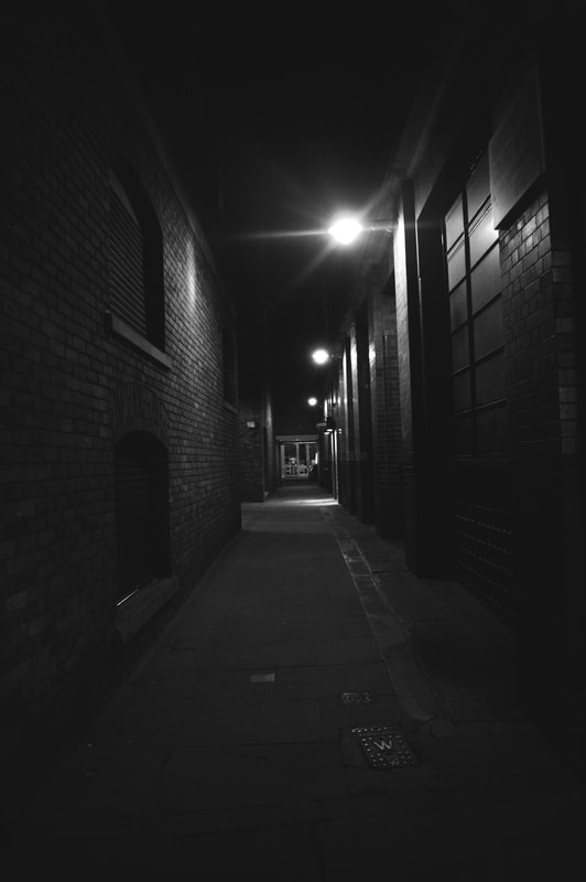
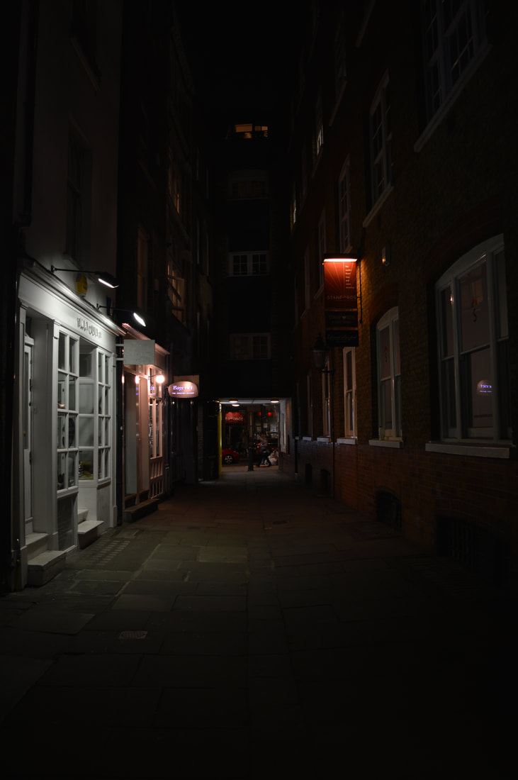
FINAL PIECES
I chose these images for my final pieces as my strand for streets and alleyways is the most developed of my three strands, so I had many different pictures from my different trips into London to choose from. As I went in daytime and at night I decided to chose 4 images with two of each, two at night and two in the day. I knew as soon as I started my Alleyways/streets strand that that was the one I would develop further, and I did, I did a few developments and I'm glad I did as each time, I got a better understanding of what kind of end product I wanted to produce, it also gave me more to work with when choosing my final piece. The whole idea of alleyways and streets in the city links to our exam title ' secrets codes and conventions ' as the perspective I photographed from really emphasises the alley or street and makes it look either long and daunting, where there are buildings on either side, it makes them look towering and menacing. Or the alley looks dark and gloomy, especially my photos from the evening. The lack of light and overall darkness of the photo makes the atmosphere seem full of secrets, like something is lurking in the shadows. I further edited them in photoshop, but only really changed the exposure and contrast, for example in the photo far right on the first row of my final shots I edited the photo and also changed the hue saturation filter so the yellows, oranges and reds are more vibrant.
WWW - I think I edited the photos well, the changes I made were subtle but effective. Secondly my photos are really clear and even though they are dark e.g edited into black and white and at nighttime, you can clearly see whats in the image, as the night images are well lit and the black and white photos contrast and exposure is edited so you can still see what is happening, but the editing gives it an eerie, look of mystery.
WWW - I think I edited the photos well, the changes I made were subtle but effective. Secondly my photos are really clear and even though they are dark e.g edited into black and white and at nighttime, you can clearly see whats in the image, as the night images are well lit and the black and white photos contrast and exposure is edited so you can still see what is happening, but the editing gives it an eerie, look of mystery.
|
|
|
|
